Tag: interactive excel dashboards

  • Microsoft Excel Site Catchment Analysis (Part 2)

    Techniques to implement the Site Catchment Analysis of Germany in Microsoft Excel
    Site Catchment Dashboard IntroI am sure you are already fed up with articles on Site Catchment Analysis here. I swear it was not my intention to have such an avalanche on this topic here. But it turned out to be a very good example to demonstrate different interesting ideas in Tableau and Excel. After using this example for a how-to tutorial on Calculated Fields in Tableau, I wrote an update for Tableau 6 (Site Catchment Analysis with Tableau 6) and Richard Leeke was kind enough to provide a fabulous guest post series (part 1, part 2, part 3) with excellent insights on how table calculations work in Tableau, also based on the Site Catchment showcase. I finally couldn’t resist to use the example again and showed how this would look like in Microsoft Excel: Microsoft Excel Site Catchment Analysis (Part 1). Since the Excel model is quite a complex workbook, I decided to split this up again into a 2-post series.

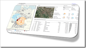
    So, please bear with me, I have to bring this to an end now. Today’s post provides some more details on the Site Catchment Analysis of Germany with Microsoft Excel.
    (more…)

  • Microsoft Excel Site Catchment Analysis (Part 1)

    The Microsoft Excel version of the Site Catchment Analysis of Germany including the calculation of the optimal center

    Site Catchment Analysis DashboardIn October 2010 I used a show case of a site catchment analysis of Germany to demonstrate the power of Calculated Fields in Tableau. During the weeks that followed we had quite an avalanche of follow-up posts on this article: Site Catchment Analysis with Tableau 6 described an upgrade of the original workbook to the new version 6 of Tableau, including the roadblocks I hit during the upgrade. In a fantastic guest post series called “Another Look at Site Catchment Analysis with Tableau 6” (part 1, part 2, part 3), Richard Leeke showed how to overcome most of the disadvantages in my implementation.

    I suspect you may already be fed up with this example. Despite the risk of boring you, I decided to stay a little longer with this topic, mainly for the following 3 reasons:

    • The use case turned out to be a very interesting and yielding example for the discussion of features, techniques, workarounds and performance facets of Tableau Software. I guess everything has been said (especially by Richard) with regards to Tableau. But what about Microsoft Excel?
    • Furthermore, finding data points within a certain radius from a given center has many more use cases than just a site catchment analysis. You may analyze sales performance KPIs, customer behavior or logistical statistics within a certain area. I am convinced, a Microsoft Excel version of the site catchment analysis can be very useful for some of your analyses of geographical data.
    • Last, but not least, the Tableau implementation allowed to display the results of any user selected postcode, but it lacked a feature to calculate the optimal center of any given radius. A task tailored for Microsoft Excel.

    Thus, today’s article will provide a Microsoft Excel workbook to conduct a site catchment analysis and to compare the results of the optimum with any given center, including some nice interactive features on the dashboard. As always the Excel workbook is provided for free download.

    (more…)

  • Bluffing Tableau Actions with Microsoft Excel

    Selected techniques to emulate a Tableau lookalike dashboard using Microsoft Excel, including some interactive features similar to Tableau Actions

    Actions - Clapperboard ExcelThe recent post described the power of Tableau Actions. Tableau actions allow you to add context and user-defined interactivity features across your workbook. If the user clicks on one of your visualizations, Actions give you full control over what should happen on other worksheets or visualizations. Setting up a Tableau dashboard with various actions like filtering, highlighting and linking to web pages is a piece of cake.

    How about Microsoft Excel? Is it possible to implement a similar interactivity on a Microsoft Excel dashboard? Yes it is.

    Today’s post describes a set of techniques and tricks to build a replica of the Tableau 50 most prominent summits on earth dashboard using Microsoft Excel. As always, including the workbook for free download.

    (more…)