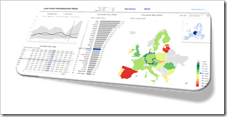
Highlight one selected item across all charts and views of an Excel Dashboard: an example and the how-to
 Very often, a dimension is displayed on more than one view of a dashboard.
Let’s say you want to analyze data of the European Union. Chances are that you will have the dimension “member state” on more than one of your charts.
If you pull these charts together into one dashboard, highlighting a selected member state across all charts is very helpful to explore and analyze the data. It supports the user to easily focus on the selected state and to identify its position in the context of all members at a glance.
Highlighting is the very simple act of selecting one item out of many (by e.g. clicking) and automatically seeing this item emphasized in all views across the entire dashboard. This is a very effective and user-friendly visualization technique and should be available on every interactive dashboard.
Today’s post shows how to implement highlighting on an Excel dashboard. As always, including the Excel workbook for free download.