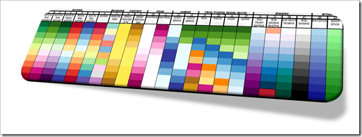
More sophisticated Color Scales to increase the analytical insights provided by Heat Maps or Choropleth Maps – a Guest Post by Ron Whale
The workbook posted with the recent article Geographical Flow Maps in Excel (Part 3 of 3) provided new color scales, I never published before. Truth be told, I did not develop these schemes. Ron Whale did. Ron generously agreed to share them here and he is even kind enough to explain the scales, their use cases and the value they add to analytical Heat Maps in today’s guest post. Enjoy.
 Just a few months ago, I found this website and discovered a great Choropleth mapping spreadsheet. I really like the color mapping schemes that have been developed. As I worked through the program and played with the mapping colors, I began to understand that the colors could be used to highlight additional data details in the map.
So, I came up with a number of special purpose color schemes designed to enhance specific aspects of the data and added them in with some of the original color scales. As the color schemes grouped into different visual purposes, I named the new colors to better describe the type of data that would be highlighted when using that scale.
I thought I would share my twist on the color scales and will explain my thoughts about the different scale types below.