Tag: charts

  • Animate cumulative data with Tableau

    Use a custom SQL data connection to animate cumulative data on the page shelf in Tableau

    The Growth of Walmart - click to enlargeInspired by Nathan's Walmart growth movie, Daniel Ferry recently had a very interesting post at his outstanding blog Excel Hero. Daniel presented a beautiful Excel implementation of animating the growth of Walmart, plotting dynamic named ranges on an XY scatter chart against a background image map of the US.

    There is nothing to add to Daniel’s great post and implementation with regards to the use of Microsoft Excel. But how about Tableau? Can you create animations like this with Tableau Software?

    At first sight this should be a piece of cake: If you think of animating data with Tableau, of course the page shelf is the first thing that comes to your mind, isn’t it? Dragging a field (the year of the opening date of the stores in our example) to the page shelf allows you to either manually navigate through all the years or to use the playback controls for a slide show. 

    However, the page shelf creates a view on the currently selected page. Thus, dragging the opening date on the page shelf would show an animation only displaying the location of the new Walmart stores in the current year. At the end of the animation, for instance, the visualization would include solely all stores opened in 2006 instead of all stores opened since 1962.

    Therefore the page shelf and Tableau’s built-in mapping functionality are only half the battle won. We need a little tweak to visualize and animate the cumulative data, i.e. all Walmart stores from the very beginning.

    Today’s post presents a way of emulating Daniel’s Excel implementation with Tableau. As always including the Tableau packaged workbook for free download.
    (more…)

  • Bullet Graphs for Excel: A Simple Way?

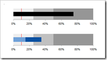
    A guest post by Matt Grams discussing an alternative solution of creating bullet graphs with Microsoft Excel

    Bullet Graphs - click to enlargePreamble:

    We proudly present the first guest post here on  Clearly and Simply: Matt Grams describes a very interesting alternative approach of creating bullet graphs in Microsoft Excel without using VBA.

    When you need one or more horizontal bullet graphs in an Excel spreadsheet, what do you do if…

    1. you work exclusively in Excel 2003 or earlier, 
    2. you don’t want to use a 3rd party add-in,
    3. you want your spreadsheet to be free of VBA, and
    4. your bullet graph must have a professional appearance?

    Faced with this scenario of apparently limited options, you’re sure to come across Charley Kyd’s tutorial at ExcelUser. Attempting to build a bullet graph with this method was a useful exercise for me, but the approach left me flustered at the complexity of the data arrangement and chart set-up. If making just one bullet graph was that hard, what are you going to do when you have multiple bullet graphs to implement? Furthermore, not having the bullet graph data values in a single row was far from ideal.

    This post describes an alternative and simpler approach of how to create bullet graphs with Microsoft Excel, including step-by-step tutorials and an example workbook for free download.

    (more…)

  • Visiting a friend

    Chandoo's KPI Dashboards revisited – the Box Plots

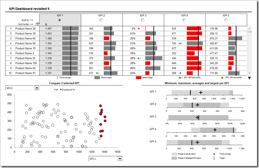
    In summer 2008 my friend and Microsoft Excel MVP Chandoo was kind enough to give me the opportunity of contributing guest posts to his excellent blog Chandoo.org. Actually Chandoo even featured a whole 6 post series on how to create interactive KPI dashboards with Microsoft Excel. Here is a screenshot of the final dashboard:

    PHD KPI Dashboard - click to enlarge


    The last part of the series was about box plots to visualize the distribution of the data (Box Plots Excel Dashboards Tutorial), including average and target values. At that time Chandoo and I decided to apply Occam’s razor and we restricted the tutorial to a simplified version of box plots, working only for data sets with positive values.

    This follow-up post on my own blog is about how to create these box plots for all kind of data distribution, i.e. positive and negative values.

    (more…)