Tag: animation in excel

  • Animated Races of the 4 Big Football Leagues

    Complementing the previous post: Animated Races of the 4 big Football Leagues in Europe: Premier League, Serie A, La Liga and Bundesliga

    297 words, ~1.5 minutes read

    4 League Logos

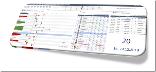
    The previous article showed an an Alternative to the Bar Chart Race in Microsoft Excel.

    As an example, the workbook visualized the results of the English Premier League of this season (2019/2020) in an animated chart.

    A few people apparently liked the visualization. I received a couple of emails and LinkedIn messages asking, if I could also provide the same workbook for other football leagues.

    No sweat.

    Here are the according Excel workbooks for Italy’s Serie A, Spain’s La Liga and the German Bundesliga:

    Download Animated Serie A 2019/2020 (zipped Excel workbook, 1.4MB)

    Download Animated La Liga 2019/2020 (zipped Excel workbook, 2.6MB)

    Download Animated Bundesliga 2019/2020 (zipped Excel workbook, 1.6MB)

    And for the sake of completeness, here is the link to the Premier League version again:

    Download Animated Premier League 2019/2020 (zipped Excel workbook, 2.8MB)

    Please note that

    • Except for the Bundesliga, all leagues are still ongoing. The data in the workbook contains only the results up to July 9, 2020. If you want to have a full view of the season, you will have to complete the results on the worksheet [Data] during the upcoming weeks. The fixtures of the remaining matchdays are there already, but the results are missing
    • The workbook for Italy’s Serie A contains an inaccuracy. Just like in the other three leagues, teams tied in points are ranked by Goal Difference first and Goals scored second. This is not correct for Italy: in Serie A, the tie breaker are the matches of these two teams (head-to-head records). Thus, the final table shown in the workbook might not be the official / correct one

    Stay tuned.
  • An Alternative to the Bar Chart Race

    An alternative solution to the controversial animated Bar Chart Races in Microsoft Excel

    1,276 words, ~ 6.5 minutes read

    Alternative to the Bar Chart Race - Intro

    The other day, I watched an as interesting as entertaining dispute between Andy Kirk and Andy Cotgreave about the popular Bar Chart Races: Data Viz Debate: Is the bar chart race more than just a gimmick?

    Although I truly admire Andy Kirk’s work, I am with Andy Cotgreave, here. I wouldn’t go so far to call them the “fidget spinners of data visualization”, but I find them hard to follow, especially when the speed of the animation is too fast.

    Last week, Philip Treacy of MyOnlineTrainingHub published a post and a workbook, how to do a Bar Chart Race in Microsoft Excel. Philip visualized the 2019/2020 Premier League results in an animated Bar Chart. I am a big fan of Mynda and Philip’s MyOnlineTrainingHub, which is definitely one of the best Excel websites worldwide.

    This made me think. Although I love Philip’s work, I am not a fan of the Bar Chart Race. So, how would I approach this? Today’s post provides my solution of an alternative for animated Bar Charts. As always, the post comes with the Excel workbook for free download.

    (more…)

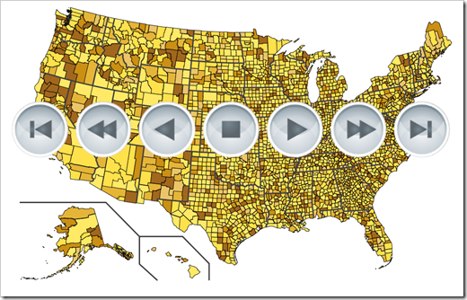
  • Animated Maps in Microsoft Excel

    How to create an animated Choropleth Map (aka Heat Map, Filled Map, Thematic Map or Statistical Map) in Microsoft Excel

    1.006 words, ~5 minutes read

    In one of the recent articles (All Peaks of the Alps visualized in Excel), I tried to show how to combine different advanced techniques in Microsoft Excel (posted here or elsewhere) to create highly interactive Excel dashboards.

    I will tell you no lies: that one was a washout. The interest in that post and workbook was next to nothing. Now, you certainly expect I would have learned my lesson and try something else. I did learn something, but the stubborn old man I am, I can’t let it go yet. Thus, I decided to give the idea another shot.

    Animated Choropleth or Heat Maps have become quite popular, especially in the past few weeks. So, there is nothing more obvious than providing a template with an animated Choropleth Map in Excel, is it?

    Animated Maps in Microsoft Excel Intro

    Today’s post will briefly explain how to combine two advanced Excel techniques which have already been published here: a Choropleth Map and the animation of visualizations in Excel.

    As always, the article comes with the workbooks for free download: an animated map of Germany by districts (Kreise und kreisfreie Städte) and one of the United States by counties.

    (more…)