• Week in, week out, Microsoft Excel

    Week numbers with Microsoft Excel
    © Claudia Hautumm / www.pixelio.deFor analyzing and visualizing data on a timeline we are often consolidating the data on a monthly basis. Especially for monitoring and reporting, however, you need a higher level of detail, i.e. you will have to analyze and visualize your data by weeks.

    Unlike the months of the year, the definition of a week is not fully standardized. There are different approaches of how to calculate the numbers of the weeks. The results of the data analysis and the according visualizations depend on the week numbering method you are using.

    This post describes 3 different methods of numbering weeks and shows their impact on the resulting data visualization.

    (more…)

  • Gantt Charts are learning to fly

    How to export a Microsoft Project Gantt Chart to PowerPoint

    mpp_to_pptThe recent post Bring your tasks in a row showed a way of how to import a project plan from Microsoft Project into a preformatted Microsoft Excel template with ease. Today we are taking the opposite direction. This post provides a tool to export a project plan from Microsoft Project. This time however the target application is not Microsoft Excel. It is Microsoft PowerPoint. And I am not talking about a simple macro that copies the project plan as a picture and pastes it into a PowerPoint slide. The tool converts an mpp-file into a full editable Gantt chart in Microsoft PowerPoint with one single mouse click. On the fly.

    (more…)

  • You can’t start a fire without a spark (2)

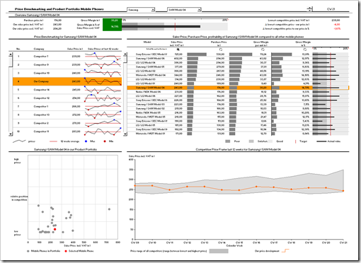
    A Price Benchmarking Tool for Mobile Phones – A Sparklines for XL Showcase

    In my recent review of Sparklines for XL, I announced a second post, providing a real life example of a model and a dashboard using Sparklines for XL. Here it is.

    This showcase is a price benchmarking tool I implemented for a mobile phone retailer. Limited in size (number of products and competitors), but regarding the functionality pretty close to the original implementation.

    This is a screenshot of the dashboard:

    Price Benchmarking Dashboard - click to enlarge

    Since it is a real life example, not all charts and visualizations are sparklines. The showcase uses a combination of different techniques and visualizations to create a professional price benchmarking dashboard. It is not exclusively dedicated to sparklines, but from my point of view this model provides a good impression of how to use sparklines in real life dashboards.

    Interested in getting on fire for a dashboard with Sparklines for XL?

    Here you go.

    (more…)

  • Sparklines for XL – Chart Gallery

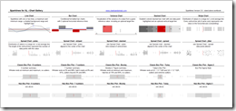
    An amendment to “You can't start a fire without a spark (1)” – The Chart Gallery for free download

    Sparklines for XL Gallery - click to enlarge After I recently published the review of Fabrice Rimlinger’s Sparklines for XL, I received a couple of emails from readers asking me for the Excel workbook with the chart gallery. I haven’t thought of providing a download link to this file, because it is a pretty simple workbook, only putting together the most important chart types of Sparklines for XL on one sheet, using dummy data. No explanation of the syntax of the UDFs included, no real life examples and only a very brief description of the chart types. Its only purpose was to create a quick overview of Sparklines for XL.

    Fabrice provides much better and more detailed information on how to use Sparklines for XL with his manual and all the posts and examples on his blog.

    Anyway, if you think my chart gallery workbook would be helpful as well, here is the file for free download:

    The workbook is an Excel 2003 stand-alone file, i.e. the VBA code is included, no need for installing the add-in.

  • You can’t start a fire without a spark (1)

    A Review of Fabrice Rimlinger's Sparklines for XL

    sparkline Please don't be confused by the title of this post. This is not off topic. This post is not about the lyrics of a 25 year old Bruce Springsteen song. It is the first of two posts on using sparklines in professional Business Intelligence dashboards.

    There is more than one way to heat a map recently described – among other techniques – how to use Fabrice Rimlinger's brilliant open source Sparklines for XL to create a 2-dimensional tabular heat map with Microsoft Excel. Back then I announced that I will have one or two more posts dedicated to Sparklines for XL here on Clearly and Simply.

    This is the first one, a brief review of Sparklines for XL.

    (more…)