• FIFA World Cup Statistics with Tableau

    FIFA World Cup statistics by team from 1930 to 2006 visualized with Tableau Software

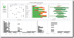
    World Cup Statistics per Team - click to enlarge I have to admit, I am a little late: The FIFA World Cup 2010 in South Africa already started yesterday. And of course there have already been a couple of interesting posts on visualizing the World Cup statistics elsewhere:

    Chandoo had a couple of nice posts using Microsoft Excel: FIFA World Cup Excel Spreadsheets, Football Betting Sheet Template and Official FIFA World-cup Soccer Balls since 1930 in an Excel Chart.

    Ross Perez provided a very interesting visualization of the History of the World Cup on Tableau’s own blog, focused on winning and tie percentages.

    Better late than never. Today’s post includes my 2 cents: a visualization of the FIFA World Cup Statistics since 1930, using Tableau Software and focused on the performance and match statistics per team.

    (more…)

  • Combine Tables and Charts on Excel Dashboards

    Visualize Football League statistics on an Excel Dashboard integrating charts directly into a table

    Allianz Arena - Home of FC Bayern Munich - click to enlarge Combining tables and charts is a very powerful technique for creating Microsoft Excel dashboards. It allows you to integrate texts, values and visualizations into one table. This ensures to have the maximum of information at a glance, including a direct comparability row by row.

    I already used this technique in several posts before, like the Sparklines for XL showcase or the Software Project Dashboard examples. Today’s article provides another showcase for a dashboard combining tables and charts.

    Football rules the world, especially these days. We are all impatiently waiting for the FIFA World Cup in South Africa, aren’t we? My friend Chandoo recently had a very nice post on visualizing the different footballs used in the World Championships since 1930. That’s remarkable, because Chandoo lives in India and I suppose he is more interested in cricket than football. But as I said, football rules the world these days.

    That’s why it somehow suggests itself to use a football-related visualization for today’s post. But I will not go for the FIFA World Cups. Not yet. Today’s article shows how to visualize national football league statistics using a dashboard that combines tables and charts. As always including the Microsoft Excel workbook for free download.

    (more…)

  • Where the rubber meets the road

    A self organizing feature map for Travelling Salesman Problems implemented in Microsoft Excel

    Self organizing feature map for TSPs - click to enlargeIn the recent post we discussed the question whether Microsoft Excel is a viable platform for developing and testing models and algorithms for complex combinatorial optimization problems.

    The Travelling Salesman Problem (TSP) is probably one of the most popular challenges in combinatorial optimization and Operations Research. Why? I suppose because it is so easy to describe, but hard to solve.

    There are hundreds or even thousands of different algorithms (exact solutions or heuristics) for the basic TSP or its variants. One approach is a so called self organizing feature map also known as a Kohonen Map: an artificial neural network using unsupervised learning to solve combinatorial optimization problems.

    I selected this approach not only because I have done some studies on this topic back in the 1990s, but rather because both, the problem itself and the self organizing algorithm are very well fitting for an interesting visualization model that is fun to watch working.

    Today’s post describes such a self organizing feature map for Travelling Salesman Problems. I will not discuss the math in detail, but rather try to explain the approach itself, the algorithm’s mode of operation and the implementation with Microsoft Excel. As always, the result (i.e. the Microsoft Excel workbook) is provided for free download.

    (more…)

  • Optimization Models and Algorithms using Microsoft Excel and VBA

    Is Microsoft Excel (including VBA) a viable platform for the development of complex mathematical optimization models and algorithms?

    © Rainer Sturm / pixelio.de

    Whenever it comes to implement business calculation models, probably everyone immediately considers using Microsoft Excel. Excel is widely spread in corporate environments and most people are familiar with using it to a greater or lesser extent. The most exciting thing about Excel, however, is its apparently unlimited flexibility. Excel does the math, imports, stores and exports data, creates visualizations, provides a predefined tabular structure, includes a built-in programming language, etc.

    Sometimes this flexibility is boon and bane. The fact that it seems as if you could do anything with Microsoft Excel does not mean you should. I have seen people misusing Microsoft Excel as a word processor, a database, a project planning software or a graphical application. Most of those workbooks reminded me of the following quote by Abraham Maslow (The Psychology of Science, 1966):

    “If the only tool you have is a hammer,
    you tend to see every problem as a nail.”

    Having said this, it is definitely appropriate to always question in advance whether the tool you are intending to use is the right one for the task you are facing.

    Besides financial planning, simulation models, visualization and project management, optimization models and algorithms always played an important role in my professional life. Thus, the question whether Microsoft Excel is an appropriate option for developing optimization models and algorithms for complex combinatorial problems suggests itself. Today’s post discusses this question, including the pros and cons as well as the possible use cases.

    (more…)
  • Animate cumulative data with Tableau

    Use a custom SQL data connection to animate cumulative data on the page shelf in Tableau

    The Growth of Walmart - click to enlargeInspired by Nathan's Walmart growth movie, Daniel Ferry recently had a very interesting post at his outstanding blog Excel Hero. Daniel presented a beautiful Excel implementation of animating the growth of Walmart, plotting dynamic named ranges on an XY scatter chart against a background image map of the US.

    There is nothing to add to Daniel’s great post and implementation with regards to the use of Microsoft Excel. But how about Tableau? Can you create animations like this with Tableau Software?

    At first sight this should be a piece of cake: If you think of animating data with Tableau, of course the page shelf is the first thing that comes to your mind, isn’t it? Dragging a field (the year of the opening date of the stores in our example) to the page shelf allows you to either manually navigate through all the years or to use the playback controls for a slide show. 

    However, the page shelf creates a view on the currently selected page. Thus, dragging the opening date on the page shelf would show an animation only displaying the location of the new Walmart stores in the current year. At the end of the animation, for instance, the visualization would include solely all stores opened in 2006 instead of all stores opened since 1962.

    Therefore the page shelf and Tableau’s built-in mapping functionality are only half the battle won. We need a little tweak to visualize and animate the cumulative data, i.e. all Walmart stores from the very beginning.

    Today’s post presents a way of emulating Daniel’s Excel implementation with Tableau. As always including the Tableau packaged workbook for free download.

    (more…)