How to display a Chart in the Tooltips on Microsoft Excel Tables visualizing the selected value within the context of the data distribution
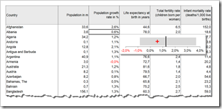
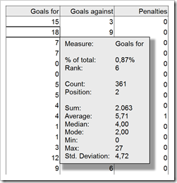
 The recent post Tooltips on Microsoft Excel Tables showed a way of how to create tooltips in Microsoft Excel tables displaying additional information on the selected cell / value and some aggregated measures for the data in the active column, like sum, average, standard deviation and others.
If you are particularly interested in setting the selected value into the context of the distribution of the entire data, you may want to have a visualization in your tooltips. In other words a chart as a tooltip on a numeric data table. Sounds like turning the whole tooltip idea and concept upside down, doesn’t it? However, from time to time this can be a great alternative for adding more analytical power to your Excel tables.
Today’s post provides a short tutorial how to create a tooltip displaying a chart. As usual, including the Microsoft Excel workbook for free download.
 Tooltips are a very helpful feature when exploring and investigating data. On charts and on plain data tables. When referring to tooltips, I am talking about additional details on the data currently selected or hovered over using the mouse. Tooltips could include other dimensions and measures, calculations or aggregated information like totals or averages.
 Dragging and dropping fields to the different shelves is the heart of user interaction in Tableau Software. In general, Tableau is predominantly designed for using the mouse.
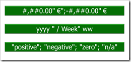
 Tableau provides a variety of built-in number and date formats. There are the standard formats “numbers”, “currency”, “scientific” and “percentage”. For scientific and percentage you can only change the decimal places, but for numbers and currencies you can also define the way negative values are displayed, the displayed units, the thousand separator and you can add a prefix and/or suffix to the number. For date fields, Tableau offers 17 different standard formats.
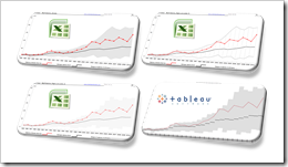
 Band chart, range chart, high-low line chart, corridor chart. I don’t know whether there is a standard term for this type of charts, so let me call it a band chart hereafter.