• Drill Up and Down on Choropleth Maps in Excel

    Interactive drill up and down geographical hierarchies on a Choropleth Map in Microsoft Excel
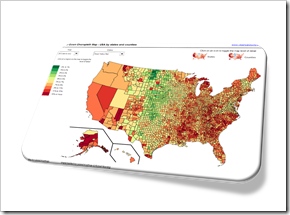
    Drill Down Choropleth Map USA

    The post Faster Choropleth Maps with Microsoft Excel provided a faster version to update a Choropleth Map in Microsoft Excel. The approach made it possible to use Choropleth Maps with several thousand regions on an interactive Microsoft Excel dashboard in production.

    This also opened up new possibilities to enhance the maps with additional features. Leonid Koyfman contributed a couple of great enhancements in the follow-up article Fast Choropleth Map with Enhanced Features like filtering the data by value bin, showing tooltips and letting the user decide whether the map shall be colored by state or by county.

    Very soon after this follow-up article was published, Leonid came up with another great idea. He suggested to take the user selection of how to color the map to the next level: let the user easily drill up and down the geographical hierarchy by simply clicking on the map. One click toggles from coloring the entire state to the counties in that state and vice versa. I have to admit, I am sitting on this nugget for one and half years already and never found (well, more precisely never took) the time to publish it. But finally the time has come. Here it is.

    Today’s article explains Leonid’s idea and implementation how to drill up and down geographical hierarchies on a Microsoft Excel Choropleth Map.

    The article includes two example workbooks for free download: the USA by states and counties and Germany by the two common ZIP-code levels PLZ2 and PLZ5 (first two digits of the ZIP-code and the entire five digits ZIP-code).
    (more…)

  • String Calculations in Tableau

    Concatenation, Conversion, Analysis and Extraction –
    44 Formulas to work with Strings in Tableau’s Calculated Fields

    NY Mag Crossword - Photograper: Lori L. Stalteri (flickr.com)“String Calculations” is a somehow weird expression. Calculations on texts sounds like a contradiction in terms.

    Of course you do not really calculate strings. You manipulate and analyze them like concatenating texts, changing texts (e.g. to upper, lower or proper case), converting texts or parts of texts to numbers or dates, extracting parts or analyzing them (e.g. how many words or do they contain a number), etc.

    If you do not have the option to do this type of things directly in your database, you will use Calculated Fields in Tableau Software to get what you want from the text dimensions in your data source. That’s why I called this post String Calculations in Tableau.

    Today’s post contains a set of 44 more or less practical examples of concatenation, conversion, analysis and extraction of texts. I will not go into the basic string functions of Tableau, like LEFT, FIND, LEN, REPLACE, etc. You can easily look up how they work in the manual or read the explanations directly in the Calculated Field editor.

    I rather tried to pull together a small library of 44 more complex formulas you may find useful when you have to work with strings in Tableau, like concatenate strings and a date, convert a string to a date, reverse words in a string, extract parts of a string, remove line feeds, check if a string contains a number, count the number of words in a string and many more.

    The article lists and explains all 44 formulas. I do not delude myself into believing anyone would read today’s article from start to finish. It is more a reference type of post and this is on purpose.

    However, I recommend having a brief look inside, even if you are not looking for a certain string calculation in Tableau at the moment. I am starting the article with a little text visualization example and I am also providing a Tableau packaged workbook (on Tableau Public ) including all examples for free download at the end of the post.

    (more…)

  • 99 Blog Posts and 1000 Comments

    A Celebration Post: Looking back at 99 Blog Posts and 1,000 Comments since this Blog started

    100 fotos de My Buffo - Photographer: Julio César Cerletti García (flickr.com)This will be an unusual post.

    Not only that we had 99 articles since this blog started, we also received the 1,000th comment recently. I am talking about reader comments only, i.e. my replies are not included in this number. A perfect coincidence for a celebration post, isn’t it?

    So, no Excel or Tableau tips and techniques today.

    Wait! Where are you headed? Hang on.

    Be assured that today’s post will not be a simple self-adulation. Well, at least not only. It will – of course – provide some hopefully interesting data analyses and data visualizations, too.

    Now, starting point was the question what to analyze and visualize in this celebration post. My first idea was showing some web analytics dashboards. However, I decided to refrain from that because those numbers are embarrassingly low. Instead, today’s dashboards will focus on the content of this blog: both the articles and the comments. And while we’re on it, we will also have a look on my performance: again regarding the posts and the comments.

    So please have a look inside. The visualizations are a mixture of “sitemap-like” views (allowing to browse and access all content and comments) and some performance analytics. The dashboards are provided online via Tableau Public, so you you can explore them directly here in your browser, even if you don’t have Tableau installed.

    (more…)

  • Pivot-like Marimekko Charts in Excel

    How to create an interactive “Pivot-like” Marimekko Chart in Excel allowing the user to select the visualized dimensions and measure on the fly

    Rubik's Cube - Photographer: Clemens Koppensteiner (flickr.com)The previous post Marimekko Charts in Microsoft Excel described and provided a VBA-based template to create a Marimekko chart in Excel made up of freeform textboxes. In the article I claimed, the used approach would offer some flexibility. Action speaks louder than words, so let’s turn this rhetoric into action.

    A Marimekko chart visualizes one measure (numerical) by two dimensions (categorical). The original template provided in the previous post was based on a data source arranged in a crosstab.

    Now let’s say you have a data source with several dimensions and measures organized in a flat table. That’s the norm, isn’t it? If you want to quickly analyze this data in Excel, you will probably use a Pivot Table and maybe a Pivot Chart allowing you to easily select which dimensions shall go to rows and columns and which measure shall be summarized in the values area. Now this is exactly the feature we want to bring to our Marimekko chart template.

    Today’s post describes how to enhance the existing template with interactive features to enable the user to easily define what shall be displayed in the Marimekko chart. As always, the article includes the Microsoft Excel workbook for free download.

    (more…)

  • Marimekko Charts in Microsoft Excel

    A VBA based Microsoft Excel Template to create a Marimekko Chart aka Matrix Chart aka Mosaic Chart for free download

    marimekko #2 - Photographer: 4WheelsofLux (flickr.com)A Marimekko or Matrix or Mosaic Chart (called Marimekko hereafter) is a combination of a 100% stacked column chart and a 100% stacked bar chart combined in one view. It works like a 100% stacked column chart, but additionally the width of a column is proportional to the total value of this column.

    Microsoft Excel does not provide a built-in chart type for Marimekko charts, but there are several workarounds available to accomplish this. For instance, Jon Peltier shows in his article Marimekko Charts how to turn a combination of a stacked area and a line chart into a Marimekko chart. My friend Chandoo, Conditional Formatting aficionado he is, uses the cell grid, formulas and cell value based formatting rules to create a pseudo Marimekko chart in his post Market Segmentation Charts using Conditional Formatting. Of course there are also a couple of other blog posts on this topic and also commercial Add-ins available.

    Although Jon’s and Chandoo’s solutions work well and are available for a long time already, I decided to add my 2 cents with another approach: a VBA based solution creating a Marimekko chart made up of freeform text boxes. The main advantage: reduced set-up time and more flexibility, if the number of rows and columns of the Marimekko chart changes.

    Today’s article provides a VBA based solution to create a Marimekko chart in Microsoft Excel and explains how to use and customize the template to suit your requirements. As always, the workbook is available for free download and the VBA code is without password protection.

    (more…)