How to display a Chart in the Tooltips on Microsoft Excel Tables visualizing the selected value within the context of the data distribution
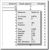
 The recent post Tooltips on Microsoft Excel Tables showed a way of how to create tooltips in Microsoft Excel tables displaying additional information on the selected cell / value and some aggregated measures for the data in the active column, like sum, average, standard deviation and others.
If you are particularly interested in setting the selected value into the context of the distribution of the entire data, you may want to have a visualization in your tooltips. In other words a chart as a tooltip on a numeric data table. Sounds like turning the whole tooltip idea and concept upside down, doesn’t it? However, from time to time this can be a great alternative for adding more analytical power to your Excel tables.
Today’s post provides a short tutorial how to create a tooltip displaying a chart. As usual, including the Microsoft Excel workbook for free download.
The Idea
 The basic idea is providing additional information in Excel data tables after clicking on one cell.
The previous post described how to show a text box close to the active cell, displaying additional calculation results for the selected value and aggregations of the active data column. This is a very helpful interactive feature when you are exploring and investigating large data sets.
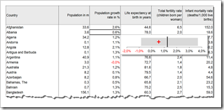
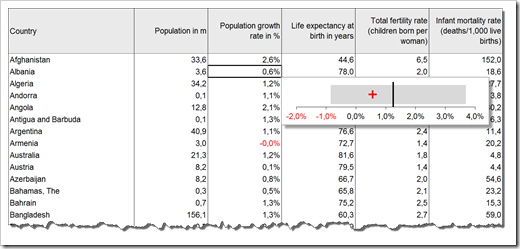
If have a special focus on how the selected value is related to the distribution of the entire data, you might prefer a visualization instead of raw numbers. For visualizations of data distributions, a box-whisker plot is probably the first chart type that comes to your mind. To keep the implementation as lean as possible, we will use a simplified version of the box plot, but enhanced with the selected value. The chart will show
- the range of the data from minimum to maximum as a grey bar
- the average as a black vertical line and
- the actual selected value as a red cross
I already used a similar version of this simplified box plot in the KPI dashboard series on Chandoo’s blog (Adding Box Plots to Show Data Distribution in Dashboards).
I can’t tell you no lies: I truly like this chart type. In my humble opinion it is easy to implement, very intuitive, easy to understand and very effective. If you want to, you can call it the little brother of the band chart (see An Underrated Chart Type: The Band Chart), horizontally orientated and limited to one value.
The simplified box plot shows you where the selected data point is located in the data distribution:
- how close is it to the minimum (or how far is it away)?
- how close of is it to the maximum (or how far is it away)?
- is it above or below average and how far is it from the average (the arithmetic mean, to be more precise)?
A lot of additional information at a glance. Automatically displayed after selecting a value.
However, if you prefer a real box plot or any other chart type, you can still use the technique described in this article. The simplified box plot is just one chart type example. Simply create the chart type you would like to see in the tooltips on the worksheet. The technique stays the same.
The Implementation
The implementation of a table tooltip showing a chart is pretty much along the lines of the previous post. The main difference is the fact that we are using a chart instead of a textbox. Surprisingly, using a chart in a table tooltip is easier to implement than texts and numbers.
Here are the main preparation steps on the worksheets in a nutshell:
- Bring your data on a worksheet and assign a name to the range. Since we want the tooltip to be shown for numbers only, the range name does not cover the entire table, but only the numeric columns
- Add another worksheet ([calculation] in our example, like we did in approach 2 of the previous post) and define 2 cells to be filled with the row and the column number of the active cell by VBA. Assign names to these two cells, too
- Write some simple formulas to calculate the relative row and column in our defined data range based on the active row and column number and on the start cell of the data table
- Write the necessary formulas to create the data source of your chart. For our simplified box plot we need
- the actual value (INDEX)
- the average (AVERAGE and INDEX)
- the minimum (MIN and INDEX)
- the maximum (MIAX and INDEX)
- the value of the invisible stacked bar (MAX)
- the negative part of the stacked bar (MAX)
- the positive part of the stacked bar
- and two constants serving as chart dummies
- Create and format your chart. I will not go into the details here. There are tons of tutorials available how to create a box plot in Microsoft Excel. As usual, Jon Peltier provides a very nice how-to: Box Whisker Plots
- Assign a name to your chart and bring it to the worksheet with the data
That’s it for the worksheets. Finally we have to adapt the VBA code we used in the previous post. In fact, we have to delete a lot of lines and change some of the remaining ones.
In one module we write a sub to simply transfer the row and the column of the active cell to the cells on worksheet [calculation] we defined in step 2 above.
In the sheet module of the worksheet containing the data table, we use the event procedure Worksheet_SelectionChange to trigger an update whenever the user selects another cell. Here are the main steps within this event sub:
- Check if the active cell is outside of the defined table range.
- If so, hide the chart and exit the sub
- Otherwise update the row and column of the active cell by calling the update sub in the module (see above), position the chart to the bottom right of the active cell, assign the number format of the active cell to the tick marks of the horizontal chart axis and make the chart visible
Done.
Easy, isn’t it? 23 lines of VBA code and you are good to go. Every time you click into a numeric cell of the data table, the chart is displayed, visualizing the actual number within the distribution of the entire column.
Download
Here is the Microsoft Excel workbook for free download:
Download Chart in Excel Table ToolTips (Microsoft Excel 2003, 86.5K)
More ideas on how to improve user interactivity on your Excel dashboard tables coming soon here on Clearly and Simply.
Stay tuned.

Leave a Reply