A sneak preview of my entries for Tableau’s “Viz as Art” Contest
 It is visualization contest time again over at Tableau Software. This time it is a “Vis as Art” contest.
I have published a couple of Tableau workbooks visualizing art here on Clearly and Simply in the last few years:
Tableau Replica of Curtis Steiner’s 1,000 Blocks
Dice Portraits of the Tableau Management
Since I had a little selection to pick from without much extra work, I decided to take part in the contest this time and I submitted three entries: one as it is (replica of Curtis Steiner’s 1,000 blocks), a revised and enhanced one (Tableau Management Dice Portraits) and a new one (La Linea goes Tableau).
I have seen the great quality of the shortlisted entries and the winners of former contests. Therefore I am not pitching my hopes too high, one of my visualizations could make the cut for the 10 best entries which will be published on the Tableau Public Blog. Hence, I thought I’d share my entries with you here.
Entry 1 – The Tableau Replica of Curtis Steiner’s 1,000 blocks
This is a Tableau workbook I already published in June 2010:
Tableau Replica of Curtis Steiner’s 1,000 Blocks
Curtis Steiner’s installation uses 1,000 identically patterned walnut blocks to create different images. The sculpture can be seen at the Seattle Art’s Museum.
Here is my Tableau replica:
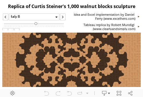
What does it show?
Use the drop down to select one image or the slider to walk through all 78 images. The images are on the page shelf. So, if you have Tableau Desktop or the free Tableau Public installed, you can also download the workbook and use the play buttons for an animated version looping through the images.
How is this done?
The heart of the solution are Custom Shapes of all used walnut tiles (created with Microsoft PowerPoint) and a data set of 78 different images defined by the image name, the tiles and their positions (i.e. 78,000 data rows).
As soon as you have the Custom Shapes and the data, the realization in Tableau is a walk in the park: The horizontal and vertical positions of the blocks go to the Columns and Rows Shelf. The tiles of the walnut blocks are on the Marks Card with the type of the marks set to Shapes. The Custom Shapes (walnut tiles) are selected as the Shape Palette. Finally, the name of the image is dragged to the Pages Shelf. No rocket science, just a couple of clicks necessary.
Acknowledgement
Many thanks go again to my good friend and Excel MVP Daniel Ferry of the Excel Hero Blog, who manually created the data source (with a lot of support from his family) and published an Excel replica of the 1,000 blocks installation here. Daniel’s article was the inspiration for this Tableau workbook. He was kind enough to let me “steal” his idea and use his data. Thanks, Daniel!
Entry 2 – Tableau Management Dice Art Portraits
This entry is also relying on a Tableau workbook I already published before:
Dice Portraits of the Tableau Management
It visualizes the portraits of Tableau’s Management using the different faces of a dice, based on the work of Frederick McSwain (please refer to the original article for more details).
This time, however, I revised my visualization a little bit:
-
There is an additional view now, showing all members of Tableau’s Management team at a glance
-
The new workbook uses a much higher resolution then the original. You will not immediately see anymore that these are Dice Art portraits, but they still are. Each image consists of only six different shapes: the faces of a dice. There are just many more of them and this makes the images look much better.
Here is the result:

What does it show?
This view simply shows the Dice Art portraits of all members of Tableau’s Management at a glance. No interactive features here.
There is a second dashboard in the workbook, though, which displays one larger version of a portrait. The member of the team can be selected by hovering over thumbnails on the left side of the dashboard. I didn’t include this in the view shown above on purpose, because due to the big data source (728,064 rows), loading times would be too long for publishing it directly here in the article.
That being said, please be advised that there is absolutely no performance problem if you download the workbook and have a look at it with Tableau Desktop or Tableau Public.
How is this done?
The implementation is pretty much along the lines of the 1,000 blocks workbook. The major part of the installation is creating the data source. There s a short step-by-step description of how I have done this in the original article.
The only interesting technique in the Tableau workbook may be the Calculated Fields and the Table Calculations used to create the 3×3 matrix of 9 images in one view. I won’t go into the technical details here. If you are interested, please download the workbook and have a look for yourself.
Entry 3 – La Linea goes Tableau
Entry 3 is the only really new approach. It visualizes a short sequence of one episode of La Linea.
“La Linea ("The Line") is an Italian animated series created by the Italian cartoonist Osvaldo Cavandoli. […] The cartoon features a man (known as "Mr. Linea") drawn as a single outline around his silhouette, walking on an infinite line of which he is a part.” Read the entire article on Wikipedia here: La Linea article on Wikipedia.
The challenge of converting an animated cartoon into a Tableau visualization is the sheer amount of data, even if it is a short episode and the cartoon as simple as La Linea (in terms of pixels). I did it for one whole episode and ended with more than 14 million data rows.
Good news: the animation worked well in Tableau even with this huge data source. Bad news: no chance to upload this to Tableau Public. Thus, I had to restrict my workbook for the contest to a very short sequence of only 56 images (taken from the episode “La Linea 211”). Here it is on Tableau Public:

What does it show?
The first dashboard shows the 56 images one by one. Unfortunately the play buttons of Tableau’s Pages Shelf are not available on Tableau Public, so you have to manually walk through the sequence. If you have Tableau Desktop or the Tableau Public installed, you can download the workbook and use the play buttons for an animated version looping through the images. This is much more fun, of course.
The second tab displays a storyboard of 16 consecutive images of the sequence in a 4×4 matrix. You can select the starting image at top left of the dashboard.
How is this done?
The main work was again preparing the data. I converted the video into images and used a similar technique as I did for the Dice Art portraits (with a slightly adjusted code). No Custom Shapes needed this time, the standard filled circle shape does the job.
The first view is then as simple as can be in Tableau: the positions on Rows and Columns Shelf and the images on the Pages Shelf. For the second view I used the same Calculated Fields and Table Calculations I already developed for the first Dice Art view. Again, I will not go into the details here, please have a look for yourself.
Acknowledgement
Many thanks go to Roberto Mensa of the FrankensTeam, who used a short La Linea sequence on the Excel Charts Gallery site of the FrankensTeam. This provided me with the idea of transferring a La Linea episode into a Tableau visualization. Many thanks, Roberto.
Brief Remark
Finally, please be advised that the entries I submitted to the contest are larger versions than the ones shown above. My blog’s layout is very limited (500px width), so I created two versions of each workbook: one for the blog and one for the contest. If you are interested in the larger version, you can find the workbooks on my Tableau Public profile.
Stay tuned.
Leave a Reply