How to create an animated Choropleth Map (aka Heat Map, Filled Map, Thematic Map or Statistical Map) in Microsoft Excel
1.006 words, ~5 minutes read
In one of the recent articles (All Peaks of the Alps visualized in Excel), I tried to show how to combine different advanced techniques in Microsoft Excel (posted here or elsewhere) to create highly interactive Excel dashboards.
I will tell you no lies: that one was a washout. The interest in that post and workbook was next to nothing. Now, you certainly expect I would have learned my lesson and try something else. I did learn something, but the stubborn old man I am, I can’t let it go yet. Thus, I decided to give the idea another shot.
Animated Choropleth or Heat Maps have become quite popular, especially in the past few weeks. So, there is nothing more obvious than providing a template with an animated Choropleth Map in Excel, is it?

Today’s post will briefly explain how to combine two advanced Excel techniques which have already been published here: a Choropleth Map and the animation of visualizations in Excel.
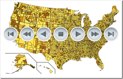
As always, the article comes with the workbooks for free download: an animated map of Germany by districts (Kreise und kreisfreie Städte) and one of the United States by counties.
Technique 1 – The Choropleth Map
Not so much to explain here, I think. We had almost 2 dozens of blog posts about how to create Choropleth Maps in Excel and how to enhance their functionality. Check out the category Choropleth Maps for more details.
Technique 2 – Animation in Excel
The article Motion Chart Excel Template provided a very simple, generic template for managing animations in Excel. There was a more fun example, too (La Linea in Excel), but the generic template is the one we need today.
The implementation is simple. Several small VBA subs are assigned to play buttons (like forward, fast forward, stop, etc.) and manage the value in one cell, depending on the icon the user clicked. The animation, i.e. which data to display, is then based on the current value of this cell with a simple INDEX formula. Please have a look at the original post for the details.
If you like the idea of animating charts in Excel, you may also be interested in this post, which uses the exact same technique: Gapminder Replica in Microsoft Excel
How to combine the Techniques in one Workbook
Now, since we have the techniques available already, we only have to combine them in one workbook.
Here is a step-by-step:
- Use the Choropleth Map workbook as the master
- Delete the form control combo box to select a year from the dashboard. This will not be needed anymore, since the selection of the year will be done by the animation
- Open the animation template workbook
- Go to the Visual Basic Editor (ALT-F11). In the Project Explorer, select the module modAnimation and drag it to the choropleth map project
- In modAnmiation go to the sub IncreaseCounter and find the following statement: [myCurrentValue] = myCurrentValue] + 1
- Insert the statement UpdateMap right after this line
- Insert the statement UpdateMap also at the end of the subs ForwardToEnd and BackToStart
- Close the VBE and drag the entire worksheet animation template to the choropleth map workbook
- Change the stop value to the maximum number of data columns in the map workbook (i.e. the count of years you want to animate)
- Go to the worksheet data. In the column [Selection], change the INDEX formula as follows: =INDEX($D6:$M6,1,myCurrentValue). This replaces the cell which was the target cell of the form control combo box by the cell the animation subs are managing (name “myCurrentValue”)
- Copy down the formula to cover the entire data range
- Go to the sheet [animation template], copy the play buttons and the loop checkbox and insert in on your dashboard
That’s it. The rest is just formatting and cleaning up.
The Result
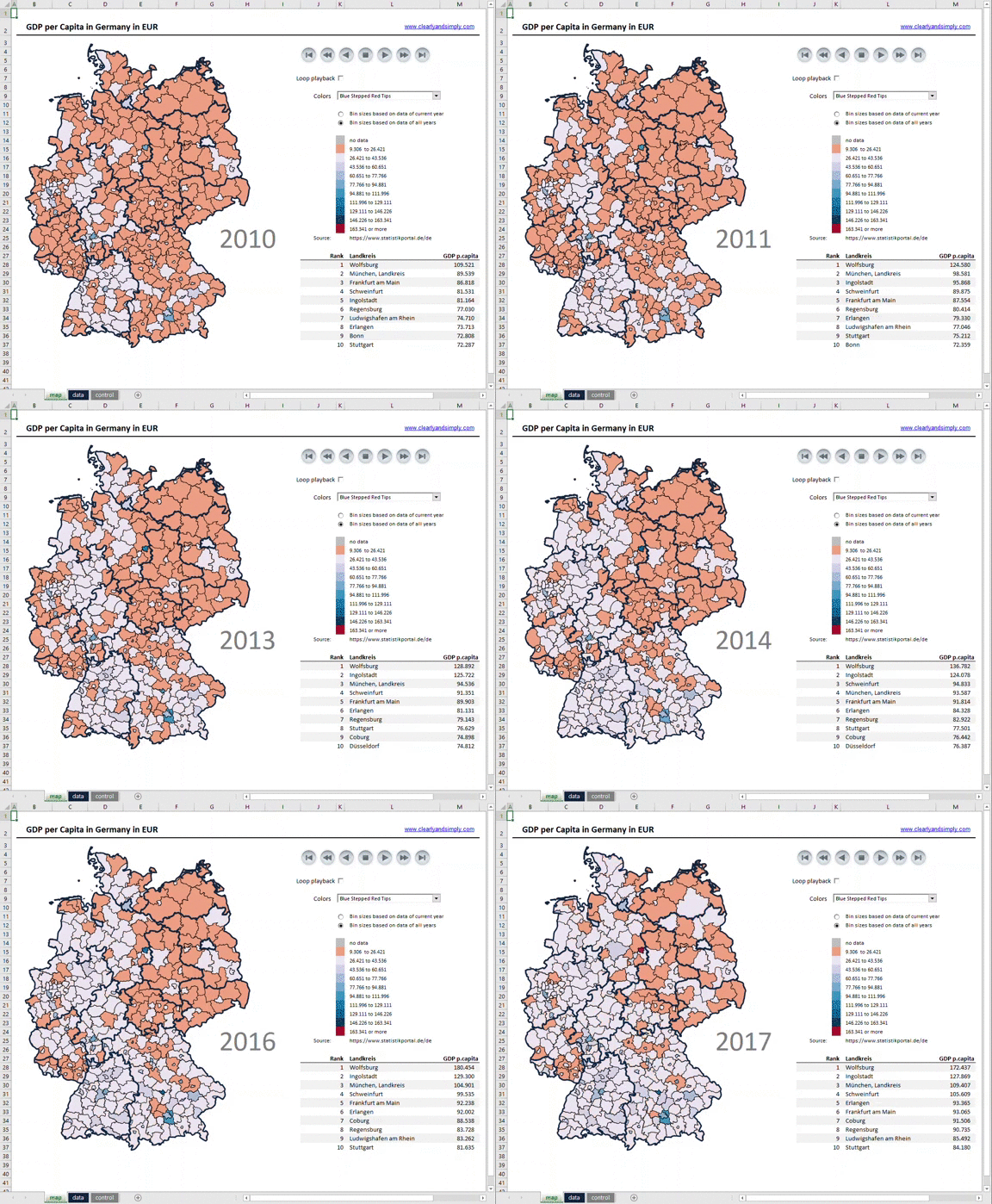
Here is what you get. As an example, an animation of the development of GDP per capita in Germany by districts (Kreise and kreisfreie Städte):

And yes, this is Microsoft Excel. Not native, enhanced by some VBA code, but still a stand-alone workbook without the need to install an Add-In or anything else. Just enable macros and you are good to go.
Downsides
The animation works very well for maps with a small to medium number of regions, like Germany by districts (401 regions).
That being said, it is not working smoothly for maps with a lot of regions like the United States by counties. The algorithm has to recolor more than 3,100 shapes in each step and this takes some time. The updates during the animation are slower and certainly not perfect, but the technique does work. For maps with that many regions, you may want to use the fast forward and fast backward button instead of forward and backward or set the value of [myDelay] to zero.
What’s the Point?
Besides providing two templates with animated maps of Germany and the United States, this post is supposed to demonstrate how easy it mostly is to combine different techniques and tricks in Microsoft Excel for creating something new.
Get familiar with the 2 already available techniques and the example workbooks. 12 simple steps or a couple of minutes later you have a new chart type in Excel: an animated Choropleth Map.
So, here is my point: keep on going to look out for new tips, tricks and techniques in Microsoft Excel on blogs, websites, forums and YouTube. But don’t stop after you learned the new trick. Think about how you can combine it with something else you already have learned and create something new.
Microsoft Excel is the most flexible software application ever. Take advantage of this flexibility.
Download Links
If you are interested in the workbooks, here they are:
Download Animated Map Germany by Districts (zipped Microsoft Excel workbook, 916K)
Download Animated Map USA by Counties (zipped Microsoft Excel workbook, 2.9MB)
Stay tuned.
Leave a Reply