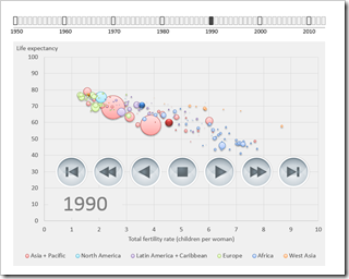
A Gapminder-lookalike animated chart in Microsoft Excel, based on the generic Motion Chart Excel Template

The recent article Motion Chart Excel Template provided a generic template for a motion or animation chart in Microsoft Excel. The examples in that post visualized episodes of the Italian cartoon series La Linea (La Linea article on Wikipedia).
Today’s article will put the motion chart template to a more serious, business like use: a Gapminder replica in Microsoft Excel.
For those of you who do not know Gapminder: Gapminder is a data visualization software to animate statistics. It was originally developed by Prof. Hans Rosling and his team and Prof. Rosling presented it in this famous TED talk:
Hans Rosling shows the best stats you have ever seen
Today’s article rebuilds this data visualization and animation in Microsoft Excel using exactly the same metrics. As always, the Microsoft Excel workbook is provided for free download.
The Features of the Dashboard
I recently read this great quote by @IconFinder:
“A user interface is like a joke. If you have to explain it, it’s not that good.”
Well, if I would be sure my visualization and the interactive features would be fully self-explanatory, I shouldn’t need this section. But I am not.
So here are a few hints what you can do with this dashboard:
- The heart of the dashboard is the Bubble chart on the left side. Like the example presented by Prof. Hans Rosling, it visualizes fertility rate in children per woman on the horizontal axis, life expectancy in years on the vertical axis and the countries as bubbles. The size of the bubbles represent the population of the countries. The bubbles are color coded by continent and the selected 3 countries to be highlighted (see below)
- The rectangles above the chart visualize the time line and the current year and let you select one specific year by simply clicking on any given rectangle
- With the play buttons at top right you can start and stop the animation, move forward or backwards, go to the first or last year. You can also choose whether you want the animation to loop with the checkbox, i.e. start at the beginning after reaching the last year in the data
- In the highlight section beneath the play buttons you can define 3 countries with the drop down lists to be highlighted in different colors and you can use the “Show highlighted countries only” checkbox to only display these 3 countries in the chart
- The table right to the drop down lists shows the measures of the highlighted countries and visualizes the maximum value of fertility rate and life expectancy with a grey fill color
- In the “Filter by region” section you can select which continents shall be displayed
- Like in the highlight section, the table shows the metrics (weighted averages of fertility rate and life expectancy, sum of population). Again, the maximum values are marked with a grey fill color
The Implementation
Calculations
In order to keep the calculations as simple as possible, I added a unique identifier to the data: a combination of country and year makes it easy to find the relevant data.
Most calculations are pretty simple formulas, mainly INDEX, MATCH and IF. Nothing new under the sun. The most relevant calculation for the chart is the column “Filter” on the calculation worksheet which defines which countries will be displayed in the chart and which won’t.
The only complex part are the array formulas to calculate the weighted averages. The formulas are creating a vector with the product of the measure and the population for each relevant country and year, sum this vector up and divide the result by the sum of population in the given continent. They may look complicated but as soon as you know how arrays work in general, they should be easy to understand.
Bubble Chart
The chart is a standard Excel Bubble chart with one data series for each continent, one for each highlighted country and a scale dummy series to keep the size of the bubbles in relation to the population of all countries in the data, even if a filter is active, i.e. not all countries are displayed.
Animation
Not much to say here, I guess. The workbook is based on the generic Motion Chart Excel Template. If you are interested in the details, please have a look there. The animation control parameter in the Gapminder replica is the year (of course).
The Interactive Time Line
This is the only part of the workbook which needs additional VBA code. Each of the rectangles has a certain shape name (e.g. “Rectangle_1950”) and the sub ClickOnTimeBox is assigned to each rectangle. The sub identifies which rectangle has been clicked on (using Application.Caller), changes the value of the current year, updates the fill colors and stops the animation. Only 2 subs with only 5 lines of code. This should be easy to understand.
The Download Link
Here is the workbook for free download:
Download Gapminder Excel Replica (Microsoft Excel 2007-2013, 824.5K)
Stay tuned.
Leave a Reply