How to create a customizable S-shaped Function in Tableau
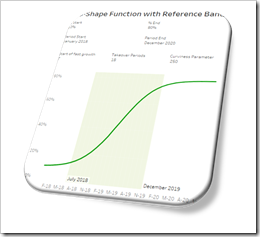 The speed of adoption of an innovation usually follows an S-shaped function. Such a function shows an initial exponential growth until the inflection point, followed by an exponential decay until it converges to an upper target value. In other words, a curve looking like an S-shaped pattern.
Typical examples for business measures following an S-shaped function are adoption rates of new products, market shares of new companies, the effects of new processes or new organizational practices and the like.
Providing a customizable (i.e. user-defined) S-shaped function in a Tableau workbook can be very helpful across all stages of advanced analytics: in descriptive and diagnostic analyses, the S-shaped function can be used as a customizable reference line for the actual historical development and for analyzing deviations. In predictive and prescriptive analytics, the S-shaped function can be used to model and forecast expected future developments and to perform sensitivity and what-if analyses.
Having a ready to use S-shaped function in Tableau is a must-have for your Advanced Analytics Toolbox.
Today’s post provides a Tableau workbook template with a fully flexible user-defined S-shaped function. The workbook is published on Tableau Public and also available for free download.
The Data
The only source data you need for an S-shaped function in Tableau is one date dimension. For my minimalistic template (see below), I used a one-column table with all dates from January 2017 to December 2021. If you want to implement an S-curve in your own Tableau workbook, simply use a date dimension of your database or blend in a list of dates similar to what I used.
The Parameters
An S-shaped function is defined by the date dimension and seven variables defining how the curve shall look like:
- [Period Start] defines the month when the S-shaped function starts, e.g. the launch date of the product or the market entry date of a company
- [Period End] defines the end of the period under consideration
- [Percentage Start] is the start percentage value. If you are modelling the launch of a product or company, this parameter will usually be set to 0%. The parameter and the formulas, though, also allow to start at a percentage greater than 0%
- [Percentage End] sets the final percentage value, i.e. the long-term value the S-curve will tend to
- [Start of fast growth] is the number of the month (after [Period Start]) when the value will begin to increase exponentially
- [Takeover Periods] defines the number of months the value will rapidly increase before it will slowly converge to the final value
- [Curviness Parameter] is a constant defining the slope of the curve. The higher the value, the steeper the gradient of the curve and vice versa
To give the user the option to customize the entire S-shaped curve, we need one parameter in Tableau for each of these variables, i.e. two date parameters, two float (percentage) parameters and three integer parameters.
How to shape the function using the parameters
The effect of the first four parameters ([Period Start], [Period End], [Percentage Start] and [Percentage End]) on the S-curve should be mostly self-explanatory, so let’s have a look at the other three: [Start of fast growth], [Takeover Periods] and [Curviness Parameter].
A picture says a thousand words or – as Albert Einstein said – “Example isn’t another way to teach, it is the only way to teach.” So here are a few examples which hopefully help to understand how the parameters shape the function.
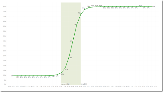
In all following examples, the period under consideration is set to January 2018 until December 2020 and the percentage value increases from 10% to 80%.
Example 1:
Let’s start with an arbitrarily chosen set of parameters. If we set [Start of fast growth] to 7, [Takeover Periods] to 18 and the [Curviness Parameter] to 500, we get the following S-curve: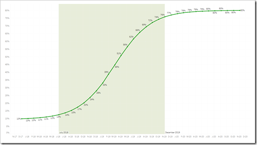 The rapid development starts in July 2018 (i.e. the 7th month after [Period Start], because [Start of fast growth] is set to 7) and lasts until December 2019 (i.e. for [Takeover Period] = 18 months).
Example 2:
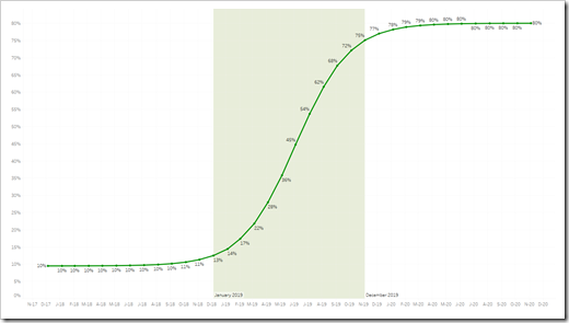
Let’s increase [Start of fast growth] to 13 and decrease [Takeover Periods] to 12 and we get an S-curve where the rapid growth starts later but only lasts for one year:
With a further decrease of [Takeover Periods] down to 6, the S-curve looks like this:
So far, we only changed [Start of fast growth] and [Takeover Periods]. What about the [Curviness Parameter]? As mentioned above, the curviness defines the gradient of the function. Let’s get back to the first example and set the [Curviness Parameter] to a few selected values. Here is how the curviness affects the function:
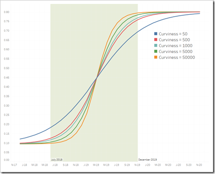 Now you see it: the higher the curviness, the steeper the ascent of the function.
I hope these examples will give a first impression of how the curve can be manipulated by changing the parameters. To get a better feeling how this works, please play around with the parameters on the Tableau Public dashboards (see below) and see how the shape of the function changes.
The Calculated Fields
Although it takes 7 parameters, we only need three Calculated Field for a user-defined S-shaped function:
[Date Year and Month]
The data I am using is on a daily basis (see section The Data above). If we want to enable the user to enter the parameters [Start of fast growth] and [Takeover Period] in months, we need a Calculated field to convert the daily data to monthly data with this formula:
DATETRUNC(‘month’,[Date])
The Calculated Field simply truncates the day from each date, i.e. only year and month are left.
[S-shaped calculated]
This Calculated Field is the heart of the solution:
[Percentage Start]+
([Percentage End]-[Percentage Start])/
(1+[Curviness Parameter]^
(([Start of fast growth]+[Takeover Periods]/2-
(AVG(DATEDIFF(‘month’,[Period Start], DATEADD(‘month’,1,[Date Year and Month])))))/
[Takeover Periods]))
I won’t go into the detail of the mathematical background here. If you are interested, check out the Wikipedia page on the Logistic Function or the Wolfram article on the Sigmoid Function as a starting point.
Please note that the Calculated Field uses the truncated date. All days of the same month thereby get the same percentage value. You can also use [Date] from the data source instead of [Date Year and Month] in the formulas, but you would then have to enter [Start of fast growth] and [Takeover Period] in days instead of months. I found that a bit cumbersome, that’s why I went with the monthly data.
[Valid Date]
[Valid Date] is finally a simple Boolean Calculated Field used on the filter shelf to restrict the visualized data to the defined time period.
[Date Year and Month]>=[Period Start] AND [Date Year and Month]<=[Period End]
The Tableau Public Workbook
Now, enough storyboarding. Let’s shoot something: here is the workbook with an S-shaped function on Tableau Public:
The workbook contains four variations of the S-shaped function (please note the four tabs at the top of the visualization):
- The first dashboard uses the Calculated Field described above on the Rows Shelf and YEAR ([Date]) and MONTH([Date]) on the Columns Shelf
- The second dashboard uses only MONTH([Date]) on the Columns Shelf, converted to continuous. This way, you get to a solid line of the function without the gaps between the panes (years) as in the first dashboard
- Dashboard 3 adds a Reference Band to visualize the takeover period. Two additional Calculated Fields are necessary for this, which are used as “Band From” and “Band To” in the Reference Line definition dialogue:
- [Start Fast Growth]
DATEADD(‘month’,[Start of fast growth]-1,[Period Start]) - [End Fast Growth ]
DATEADD(‘month’, [Takeover Periods]+[Start of fast growth]-2,[Period Start]
- [Start Fast Growth]
- Finally, dashboard 4 is a completely different approach (leading to the same results): instead of the Calculated Fields described above, two alternative calculations are used, which are based on a RANK calculation. I won’t go into the details here. If you are interested, please download the workbook and have a look for yourself
Stay tuned.
Leave a Reply