Interactive zooming in and out on Charts in Microsoft Excel
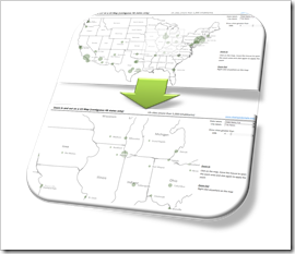 If you have an XY scatter chart with a lot of data points in Microsoft Excel or even using an XY scatter chart mimicking a map in Excel, an interactive zooming function (allowing to magnify user-defined parts of the chart) can be very helpful.
Microsoft Excel does not provide such a feature natively. There have been a few workarounds published. Most of them use interactive controls like spinners or sliders to change the axes scales with OFFSET formulas and dynamic cell ranges or by VBA.
A more intuitive way of zooming into a chart would be to select an area on the chart with the mouse and zoom exactly into this user-defined part of the chart (or map).
We recently had a couple of posts taking advantage of Andy Pope’s stellar idea to use a label control on top of a chart for interactive chart features:
Another Technique for Interactive Excel Charts
Selecting and Highlighting Areas on Excel Charts
Select Areas on a USA Map in Microsoft Excel
Andy’s technique is very versatile and can be a viable solution for many different use cases, including the requirement of an interactive zooming feature.
Today’s post describes an implementation of an interactive zooming feature for a map (XY scatter chart) in Microsoft Excel. As always, the workbook is provided for free download.
The Features
The example workbook to demonstrate the interactive zooming feature shows a map of the 48 contiguous United States and all cities with a user defined minimum of inhabitants. The sizes of the bubbles represent the population of the cities:
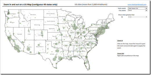 With the drop down lists at top right, you define which data labels shall be displayed for the states (none, full names, abbreviations) and for the cities (none, city name, city name and population). The slider beneath the drop downs lets you change the number of cities shown on the map by defining a minimum number of inhabitants:
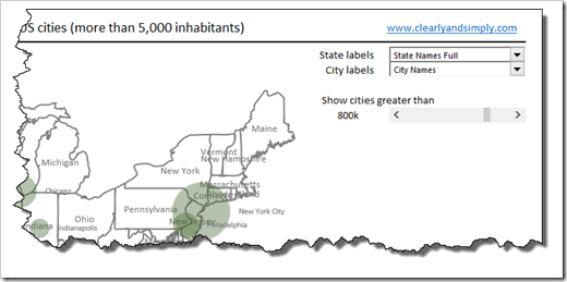
The database contains all cities in the United States with more than 5,000 residents.
The most interesting feature is of course the zooming function. Hover over the map with your mouse cursor and it will turn into a cross. Click somewhere on the map and move the mouse right and down. A transparent rectangle appears to define the area you want to zoom into:
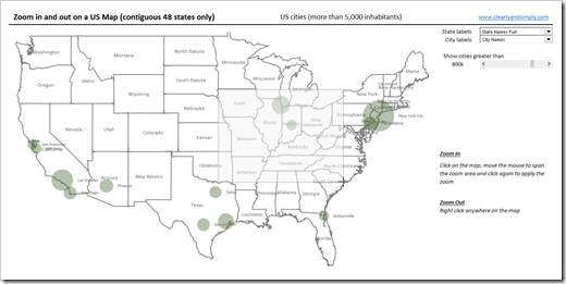 If you are done with selecting the zoom area, simply click again and the code zooms into this area:
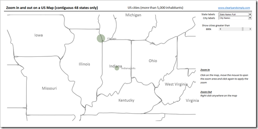 You can zoom again and again to higher level of details. Right clicking somewhere on the map resets the zoom and takes you back to the original map.
The Implementation
The Basic Idea
Mouse interactions with Excel charts are usually done with the mouse event subs of the Chart Object. Microsoft Excel MVP Jon Peltier provides the necessary VBA code for free here: Get XY on any Chart. The downside of using the Chart Object events is the requirement of activating the chart first, before the mouse events are fired.
Microsoft Excel MVP Andy Pope had a stellar idea how to overcome this: instead of using the mouse events of the chart, he inserts an invisible ActiveX label control on top of the chart and uses the mouse events of the label control instead. No activation of the chart necessary anymore.
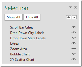
The US cities map workbook (download link see below) has two charts (XY scatter chart for the borders and the state labels and a bubble chart for the cities) and the label control. The size and the position of the label control has to be identical with the size and position of the plot areas of the charts. Furthermore the order of these objects is crucial. The charts are in the background and the label is sitting on top of them. The Selection Pane looks like this:
The Charts and the Label Control
The charts are standard Excel chart: an XY scatter (with lines) and a bubble chart. The data series of the state centroids is formatted to be invisible (no marker, no fill, no line).
The label control needs to be invisible, too, i.e. no border, and transparent fill (BackStyle):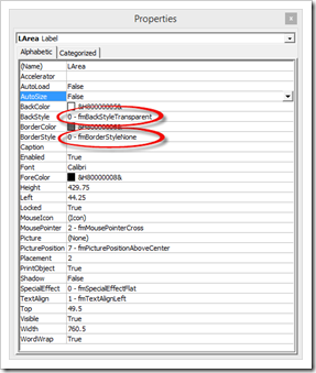 The Data
The workbook contains 3 data sheets:
- Data Cities
The names of the cities, the positions (latitude and longitude) and the population. In an additional column, a simple CHOOSE formula creates the data labels based on the user selection. The table is sorted descending by formulas. This is important for the option to let the user define the minimum number of residents. So, please do not change the sort order here. - Data Centroids
This sheet contains the centroids of the states. The data is used to display the state names in the middle of the states. Again, an extra column creates the labels by formulas based on the user selection. - Data Polygons
This table contains the polygon data of all states and is used in the XY scatter chart to draw the state borders.
Worksheet [control]
On the control worksheet, the form controls (drop down and slider) are managed and a few simple formulas calculate the minimum and maximum latitudes and longitudes and the size of the plot area.
The Named Range / Named Formulas
The workbook contains 4 named formulas. Two of them (“myLatitudes” and “myLongitues”) are dynamic ranges based on the user selection of the minimum number of residents (using OFFSET). The other two names (“myChtAxesScales” and “myChtPlotAreaSize”) are simple range references used in the VBA code.
The VBA Code
Finally the heart of the solution: the VBA code. The basic idea is to manipulate the axes scales, i.e. the minimum and maximum values of both axes according to what the user selected during the zoom, respectively to set it back when the user zooms out.
The mouse events of the label control are defined in the sheet object of worksheet [map]. The mouse move event resizes the rectangle to define the zoom area. The mouse down event manages the clicks. The code is pretty slim (104 lines), open and commented. Hence, I think I do not have to go into the details here. If you are interested in how this was implemented, download the workbook and have a look. If you have any questions, please leave me a comment.
The Disadvantages
Andy’s technique of using a label control sitting on top of one or several charts is very versatile and works well. However, it is still just a workaround and comes with some considerable disadvantages:
- Worksheet zoom level has to be 100%:
The simplified way I implemented it, the technique works only at a worksheet zoom level of 100% and if the entire label is visible in the active Excel window. You can zoom into the chart itself, but the native zoom of the worksheet has to be 100%. The code takes care of this requirement by forcing the zoom level to 100% and by maximizing the size of the application window. But this is still a substantial disadvantage. - Unusual way of selecting the zoom area:
The usual way of selecting areas or zooming into charts in other applications is to click somewhere, keep the mouse key pressed, span the area and apply the zoom by releasing the mouse. Users will probably expect that the zooming works the same way in this Excel implementation, but it doesn’t. You have to click once, define the area by moving the mouse and click again to apply the zoom. Root cause for this is a little annoyance (or shall I say bug) of the label control: if you click on it, it either changes the background from transparent to opaque or disappears. I do not exactly know what is happening here. The only workaround I could find for this strange behavior is making the label invisible and visible again with every click and mouse move. As clunky as this may sound, it works well, but you are losing the option to use the mouse up event. That’s why the extra mouse click is necessary. - Limited options (directions) to define the zoom area
The rectangle defining the zoom area can only be resized South-East, i.e. to the right and down from the point you started. There is no flipping over above or left to the position where you clicked first. - No step-by-step zooming out
You can zoom in more than one time, but you cannot get back step-by-step. For instance: if you zoomed in to the South West of the US, then zoomed into New Mexico and finally into the region around Albuquerque, you cannot go back to the “New Mexico selection”. A right click on the map will always take you back to the original map. - The polygon data:
The technique itself will also work for standard XY scatter charts, but if you want to have a map to zoom in, you need the polygon data to draw the borders. That means, you have to organize the polygon data for your country and regions, you have to keep this data set in the workbook (which can get huge, depending on the map you want to plot) and you can’t color the map by regions.
Some serious disadvantages, no doubt about it. However, it works and provides an interesting feature to directly interact with an Excel chart. If you have an idea how to improve the workbook and code and/or how to overcome some of the limitations, please share it with us in the comment section.
The Download Link
The user defined labeling of the data points (states and cities) can be achieved in Excel 2013 without VBA by using the new Excel feature of linking data labels to a cell range (“Label contains Value From Cells”). Excel versions 2010 or earlier do not provide this option. With some extra VBA code, it is still possible, though. That’s why I created 2 versions of the workbook, one for Excel 2010 and one for Excel 2013. Here are the workbooks for free download:
Download Zoom on a Chart 2010 (zipped Microsoft Excel 2010 workbook, 937K)
Download Zoom on a Chart 2013 (zipped Microsoft Excel 2013 workbook, 996K)
Acknowledgements
Special thanks go again to Andy Pope for sharing this stellar idea.
Stay tuned.
Leave a Reply