Category: Visualization

  • Color Coded Bar Charts with Microsoft Excel

    Different techniques of how to color encode data points of a bar chart based on a second data series in Microsoft Excel
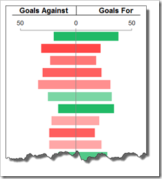
    Colored Bar Chart IntroColor encoding can be a very powerful technique for data visualization. Heat Maps or Choropleth Maps are classical examples of visualizing data by color encoding.

    However, you can add color encoding to almost any kind of visualization. For instance, using colors on bar charts can display additional information of the data and – if used carefully – considerably improve the significance of the visualization without requiring further real estate on a dashboard.

    With Tableau Software, color encoding your charts is a piece of cake. Simply drag the dimension or measure to the color shelf and you are done. Microsoft Excel has no comparable built-in functionality. However, this doesn’t mean you can’t use color encoding in your Excel charts. Of course you can.

    Today’s post describes different techniques of how to color encode Microsoft Excel bar charts, with or without using VBA. As usual, all described techniques are coming with an example workbook for free download.

    (more…)

  • Premier League Historical Statistics

    Interactive Visualization of 15 years of England’s Football Premier League – a non-competitive Contribution to Tableau’s “Interactive Sports Viz Contest”

    Premier League LogoLast week, Tableau announced a new visualization contest: The Tableau Interactive Sports “Viz” Contest.
    Intrigued with the very attractive prices Tableau announced, I would have loved to contribute a workbook. Unfortunately, I am not allowed to, because the contest is open to US residents only.

    If you are a regular reader of this blog, you may have noticed that I love using sports data for my examples. We had several visualizations (Tableau and/or Excel) of Football statistics and even one article using Baseball data:

    Since I am so into visualizing sports data, I decided to publish the workbook I would have contributed to the contest: a Tableau visualization of 15 years of historical data of the English Premier League.

    Today’s article provides the workbook for direct interaction here or for download from Tableau Public. A follow-up post later this week will describe step-by-step tutorials of some of the most interesting techniques I used for the implementation.

    (more…)

  • An Underrated Chart Type: The Band Chart

    Why band charts should be used more often and how to create them with Microsoft Excel and Tableau Software

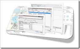
    Band Chart IntroBand chart, range chart, high-low line chart, corridor chart. I don’t know whether there is a standard term for this type of charts, so let me call it a band chart hereafter.
    What is a band chart?

    Basically a band chart is a standard line chart enhanced with a shaded area displaying the upper and lower boundaries of groups of data (e.g. the range between the minimum and the maximum of all members of the category). Band charts are very often supplemented by another line showing the arithmetic mean (the average).

    What is the big whoop?

    Band charts provide by far more context to your visualization and more insight into your data. Especially if you have to explore unknown data sets. They are easy to implement, very intuitive, very effective and do not require one pixel more of your dashboard real estate than a standard single line chart.

    This being said, I have always been wondering why I do not see these charts more often in my professional environment. Are people underrating the benefits of band charts or am I overrating them?

    Today’s article discusses the benefits and the use cases of band charts and provides tutorials of how-to implement this type of chart with Microsoft Excel and Tableau Software. As ever, including the Excel workbooks for free download and the Tableau visualization for direct access via Tableau Public.

    (more…)

  • Microsoft Excel Site Catchment Analysis (Part 2)

    Techniques to implement the Site Catchment Analysis of Germany in Microsoft Excel

    Site Catchment Dashboard IntroI am sure you are already fed up with articles on Site Catchment Analysis here. I swear it was not my intention to have such an avalanche on this topic here. But it turned out to be a very good example to demonstrate different interesting ideas in Tableau and Excel. After using this example for a how-to tutorial on Calculated Fields in Tableau, I wrote an update for Tableau 6 (Site Catchment Analysis with Tableau 6) and Richard Leeke was kind enough to provide a fabulous guest post series (part 1, part 2, part 3) with excellent insights on how table calculations work in Tableau, also based on the Site Catchment showcase. I finally couldn’t resist to use the example again and showed how this would look like in Microsoft Excel: Microsoft Excel Site Catchment Analysis (Part 1). Since the Excel model is quite a complex workbook, I decided to split this up again into a 2-post series.

    So, please bear with me, I have to bring this to an end now. Today’s post provides some more details on the Site Catchment Analysis of Germany with Microsoft Excel.

    (more…)

  • Microsoft Excel Site Catchment Analysis (Part 1)

    The Microsoft Excel version of the Site Catchment Analysis of Germany including the calculation of the optimal center

    Site Catchment Analysis DashboardIn October 2010 I used a show case of a site catchment analysis of Germany to demonstrate the power of Calculated Fields in Tableau. During the weeks that followed we had quite an avalanche of follow-up posts on this article: Site Catchment Analysis with Tableau 6 described an upgrade of the original workbook to the new version 6 of Tableau, including the roadblocks I hit during the upgrade. In a fantastic guest post series called “Another Look at Site Catchment Analysis with Tableau 6” (part 1, part 2, part 3), Richard Leeke showed how to overcome most of the disadvantages in my implementation.

    I suspect you may already be fed up with this example. Despite the risk of boring you, I decided to stay a little longer with this topic, mainly for the following 3 reasons:

    • The use case turned out to be a very interesting and yielding example for the discussion of features, techniques, workarounds and performance facets of Tableau Software. I guess everything has been said (especially by Richard) with regards to Tableau. But what about Microsoft Excel?
    • Furthermore, finding data points within a certain radius from a given center has many more use cases than just a site catchment analysis. You may analyze sales performance KPIs, customer behavior or logistical statistics within a certain area. I am convinced, a Microsoft Excel version of the site catchment analysis can be very useful for some of your analyses of geographical data.
    • Last, but not least, the Tableau implementation allowed to display the results of any user selected postcode, but it lacked a feature to calculate the optimal center of any given radius. A task tailored for Microsoft Excel.

    Thus, today’s article will provide a Microsoft Excel workbook to conduct a site catchment analysis and to compare the results of the optimum with any given center, including some nice interactive features on the dashboard. As always the Excel workbook is provided for free download.

    (more…)