Category: Microsoft Excel

  • Multicolored Choropleth Maps with Excel

    The Pop, Soda or Coke Visualization with Microsoft Excel

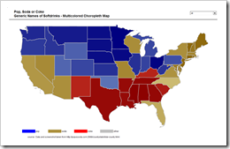
    Multicolored Choropleth Map - click to enlargeThe previous post discussed Choropleth Maps in general, briefly described how to implement them with Microsoft Excel and provided a couple of templates for free download.

    The post was focused on the classic version of a Choropleth Map, visualizing the measurements of a statistical variable in different geographical regions on a map by color intensity: the greater the measurement, the darker the color.

    The classic version is limited to one variable. This follow-up post describes how to enhance a Choropleth Map in order to visualize more than one variable by using several colors and includes the visualization of “The Great Pop vs Soda Controversy” as an example for free download.

    (more…)

  • Choropleth Maps with Excel

    A Set of Choropleth Map Templates for Microsoft Excel

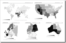
    Choropleth Map Templates - click to enlargeThe dashboard of Lithuania at a glance used a county based map of Lithuania to visualize the geographical distribution of the population by color intensity: the darker the color, the higher the value.

    Very often, this type of geographical visualization is called thematic map, heat map or statistical map. The less known, but correct expression however is Choropleth Map.

    The idea of how to create Choropleth Maps with Microsoft Excel – as brilliant as it is simple – is the brainchild of Tushar Mehta, Microsoft Excel MVP. I simply “borrowed” his idea and code and put it to effective use on the Lithuanian Dashboard.

    Many readers of Clearly and Simply have been interested in this technique, but unfortunately I was not allowed to provide an unlocked workbook of the Lithuanian Census Dashboard (see comments on Lithuania at a glance). That’s why I thought it might be a good idea to write this post including a couple of templates for Choropleth Maps with Microsoft Excel for free download.

    (more…)

  • Sparklines for XL – Chart Gallery updated

    Chart Gallery of Sparklines for XL version 3.3
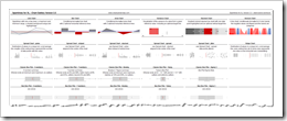
    Chart Gallery of Sparklines for XL version 3.3 (pdf, 42.3K)

    As a follow-up to my review of Fabrice Rimlinger’s Sparklines for XL, I recently published a post including a download link to the Excel workbook with the chart gallery used in the review article.

    I didn’t provide a download link to the chart gallery in the original post, because I was convinced nobody would be interested in this simple list of Sparklines for XL chart types. What a misjudgment! The Sparklines for XL Chart Gallery is the most popular download here on clearly and simply.

    Recently Fabrice and Nixnut published a new version of Sparklines for XL (3.3 alpha 7), including two new chart types: area charts and horizon charts. I thought you might be interested in an updated version of the chart gallery as well.

    Here is the file for free download:

    Download Chart Gallery Sparklines for XL version 3.3 (Excel 2003, zipped, 382.5K)

    The workbook is an Excel 2003 stand-alone file, i.e. the VBA code is included, no need for installing the add-in.

    Please be advised that I made some minor changes to Fabrice’s and Nixnut’s original implementation:

    • Sub Workbook_open

    I commented out a couple of lines of code to have a stand-alone workbook without asking for installing the add-in and without creating the menus and the toolbar

    • Sub DrawStripeChart() – Class Module StripeChartClass

    I made a minor change of the code, because the shapes have not been grouped to one object with the original implementation

    • Public Function ScaleLineBottomLog – Module Utility

    I changed the first parameter of the function ScaleLine from “t” to “b”

    All of these changes are highlighted by a comment and should be easy to find.
  • Week in, week out, Microsoft Excel

    Week numbers with Microsoft Excel

    © Claudia Hautumm / www.pixelio.deFor analyzing and visualizing data on a timeline we are often consolidating the data on a monthly basis. Especially for monitoring and reporting, however, you need a higher level of detail, i.e. you will have to analyze and visualize your data by weeks.
    Unlike the months of the year, the definition of a week is not fully standardized. There are different approaches of how to calculate the numbers of the weeks. The results of the data analysis and the according visualizations depend on the week numbering method you are using.

    This post describes 3 different methods of numbering weeks and shows their impact on the resulting data visualization.

    (more…)

  • You can’t start a fire without a spark (2)

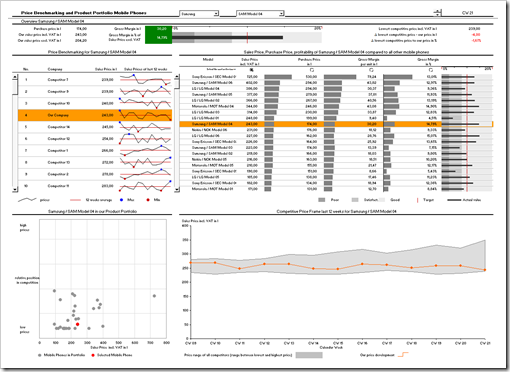
    A Price Benchmarking Tool for Mobile Phones – A Sparklines for XL Showcase

    In my recent review of Sparklines for XL, I announced a second post, providing a real life example of a model and a dashboard using Sparklines for XL. Here it is.

    This showcase is a price benchmarking tool I implemented for a mobile phone retailer. Limited in size (number of products and competitors), but regarding the functionality pretty close to the original implementation.

    This is a screenshot of the dashboard:

    Price Benchmarking Dashboard - click to enlarge

    Since it is a real life example, not all charts and visualizations are sparklines. The showcase uses a combination of different techniques and visualizations to create a professional price benchmarking dashboard. It is not exclusively dedicated to sparklines, but from my point of view this model provides a good impression of how to use sparklines in real life dashboards.

    Interested in getting on fire for a dashboard with Sparklines for XL?

    Here you go.

    (more…)