Category: Microsoft Excel

  • Wordle Tag Clouds in Microsoft Excel

    Create dynamic Tag Clouds in Microsoft Excel using advanced Wordle
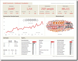
    10k Comments Excel DashboardOne week back, my friend and Excel MVP Chandoo published a post to celebrate the very impressive milestone of the 10,000th comment on his blog: 10k Comments Excel Dashboard. Who dared to think he would do this without providing a dashboard? Of course he did.

    Chandoo provided a very nice dashboard showing all kinds of analysis and visualization of the comments received on his blog so far. By the way: Kudos on the marvelous success of your blog, Chandoo!

    Great layout and very interesting insights on an at a glance dashboard. Chandoo also included a tag cloud showing “what do they say”. He obviously created the cloud using Wordle, but he inserted it as a static image.

    This made me think. Is it possible to create tag clouds in Excel dynamically?  Yes it is.

    Today’s post shows a way how to include Wordle tag clouds into your Excel workbook, dynamically based on texts in any cell ranges. As always, the article includes the Excel example workbook for free download.
    (more…)

  • Scroll and Search in Excel Dashboard Tables

    How to add a search bar and search functionality to a scrollable table on a Microsoft Excel Dashboard

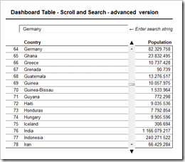
    Scroll and Search in Excel Dashboard Tables - click to enlargeMore than 2 years back my friend and Microsoft Excel MVP Chandoo gave me the opportunity to publish a series of 6 articles on how to implement interactive Microsoft Excel dashboards on his excellent blog Chandoo.org: KPI dashboards with Microsoft Excel. To my surprise these articles still seem to be very popular over at Chandoo.org and Chandoo’s readers even keep on commenting these posts.

    Yesterday Milind raised an interesting question: Is it possible to add a search bar to the dashboard to look up values in the source data and automatically scroll up or down to the according row of the search result?

    Although Hui already explained how to do this in a comment, I decided to elaborate a little bit on the possible options in this additional article here on Clearly and Simply. Today’s post describes 2 different techniques on how to add a search functionality to a dashboard with a scrollable data table. As always, including the Microsoft Excel workbooks for free download.

    (more…)

  • Bluffing Tableau Actions with Microsoft Excel

    Selected techniques to emulate a Tableau lookalike dashboard using Microsoft Excel, including some interactive features similar to Tableau Actions

    Actions - Clapperboard ExcelThe recent post described the power of Tableau Actions. Tableau actions allow you to add context and user-defined interactivity features across your workbook. If the user clicks on one of your visualizations, Actions give you full control over what should happen on other worksheets or visualizations. Setting up a Tableau dashboard with various actions like filtering, highlighting and linking to web pages is a piece of cake.

    How about Microsoft Excel? Is it possible to implement a similar interactivity on a Microsoft Excel dashboard? Yes it is.

    Today’s post describes a set of techniques and tricks to build a replica of the Tableau 50 most prominent summits on earth dashboard using Microsoft Excel. As always, including the workbook for free download.

    (more…)

  • The Revenue Potential of Billing Increments

    A Microsoft Excel simulation model to reveal the revenue potential of billing increments in mobile or fixed-line tariffs

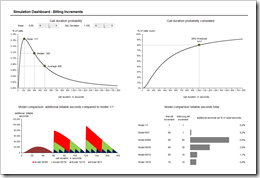
    Billing Increment Simulation Dashboard - click to enlargeBe honest: do you know which incremental billing model is included in your mobile phone or fixed line tariff? No worries, I suppose most people do not know. However, incremental billing models represent a considerable part of mobile or fixed line operators’ revenues.

    But what is incremental billing? It means that carriers are pricing calls in slices longer than a second. Full minute billing means – for instance – that you are paying two full minutes, although your call was only 61 seconds long.

    How big is this effect of additional revenues? How much revenues do carriers make by using incremental billing?

    Today’s post presents a simulation model to reveal and evaluate the revenue potential of different billing increment models. As always including the Microsoft Excel workbook for free download.

    (more…)

  • Combine Tables and Charts on Excel Dashboards

    Visualize Football League statistics on an Excel Dashboard integrating charts directly into a table

    Allianz Arena - Home of FC Bayern Munich - click to enlarge Combining tables and charts is a very powerful technique for creating Microsoft Excel dashboards. It allows you to integrate texts, values and visualizations into one table. This ensures to have the maximum of information at a glance, including a direct comparability row by row.

    I already used this technique in several posts before, like the Sparklines for XL showcase or the Software Project Dashboard examples. Today’s article provides another showcase for a dashboard combining tables and charts.

    Football rules the world, especially these days. We are all impatiently waiting for the FIFA World Cup in South Africa, aren’t we? My friend Chandoo recently had a very nice post on visualizing the different footballs used in the World Championships since 1930. That’s remarkable, because Chandoo lives in India and I suppose he is more interested in cricket than football. But as I said, football rules the world these days.

    That’s why it somehow suggests itself to use a football-related visualization for today’s post. But I will not go for the FIFA World Cups. Not yet. Today’s article shows how to visualize national football league statistics using a dashboard that combines tables and charts. As always including the Microsoft Excel workbook for free download.

    (more…)