Category: Microsoft Excel

  • Excel Multiple Value Filters with Invert Selection

    How to enhance a multiple value filter check box control with an invert selection option in Microsoft Excel

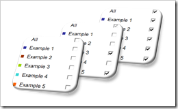
    Invert SelectionThe comments and emails I received on the recent post Excel Dashboard Controls – Multiple Value Filters reinforced my conclusion that the original idea of providing a feature to switch back to a previous selection is more confusing than helpful.

    However, there is another option to really improve the functionality of multiple value filters. Leonid, one of my few but faithful readers was kind enough to share a very interesting idea: add an additional input feature to let the user invert the actual selection.

    Leonid provided 2 different solutions. Number 1 is a simple inversion symbol with additional explanatory text. Clicking on the symbol inverts the actual selection of filters:
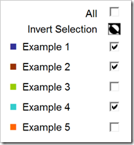
    Invert Selection V01

    The VBA code triggered when clicking on the symbol is straight forward:

    Sub InvertFilters()
    Dim rng_cell As Range
        For Each rng_cell In Range("myActualFilter")
            rng_cell.Value = Not rng_cell.Value
        Next rng_cell
        Range("myCheckBoxAll").Value = _
                 Application.WorksheetFunction.And(Range("myActualFilter").Value)
    End Sub

    The code simply inverts all target values of the check boxes from TRUE to FALSE and vice versa.

    Here is the workbook for free download:

    Download Multiple Value Filter Control with Invert Selection v01 (Microsoft Excel 2003, 91K)

    If the additional row bothers you, you may want to look at Leonid’s alternative option: use a hyperlink on the symbol to provide a tooltip (”Invert Selection”):
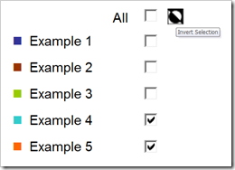
    Invert Selection V02

    There is an additional cell and some more code necessary (on the dashboard worksheet), but the implementation is still pretty straight forward. Here is the workbook:

    Download Multiple Value Filter Control with Invert Selection v02 (Microsoft Excel 2003, 96K)

    Leonid, many thanks for sharing your ideas here and for your workbooks. Your contributions are highly appreciated.
  • Excel Dashboard Controls – Multiple Value Filters

    How to create a multiple value filter control including a “select all / none” option with Microsoft Excel

    Multiple Value Filter Control

    If you ever built interactive Microsoft Excel dashboards, I am betting the ranch that there was at least one with some kind of interactive filtering features. For selecting one out of several categories you probably used a drop down list (i.e. a combo box). If you need a multi filter control (i.e. selecting several categories) a multi select list box or several check boxes are the way to go. We had that before: In one of the first articles on this blog I already showed different techniques of how to implement a multi-select control feature on Microsoft Excel dashboards (Approach with Caution).

    So far, so good. However, what I didn’t discuss in that article is one obvious requirement you may have for a multiple value filter control on a dashboard: an option to let the user easily select all or none categories with one single mouse click. Especially helpful if you are having a lot of categories.

    Today’s post tries to fill this gap: this article shows several options of how to implement a multiple value filter control based on check boxes, including an additional check box to easily select and deselect all categories. As always, the post provides all Excel workbooks for free download. 

    (more…)

  • Microsoft Excel Site Catchment Analysis (Part 2)

    Techniques to implement the Site Catchment Analysis of Germany in Microsoft Excel

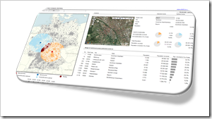
    Site Catchment Dashboard IntroI am sure you are already fed up with articles on Site Catchment Analysis here. I swear it was not my intention to have such an avalanche on this topic here. But it turned out to be a very good example to demonstrate different interesting ideas in Tableau and Excel. After using this example for a how-to tutorial on Calculated Fields in Tableau, I wrote an update for Tableau 6 (Site Catchment Analysis with Tableau 6) and Richard Leeke was kind enough to provide a fabulous guest post series (part 1, part 2, part 3) with excellent insights on how table calculations work in Tableau, also based on the Site Catchment showcase. I finally couldn’t resist to use the example again and showed how this would look like in Microsoft Excel: Microsoft Excel Site Catchment Analysis (Part 1). Since the Excel model is quite a complex workbook, I decided to split this up again into a 2-post series.

    So, please bear with me, I have to bring this to an end now. Today’s post provides some more details on the Site Catchment Analysis of Germany with Microsoft Excel.

    (more…)

  • Microsoft Excel Site Catchment Analysis (Part 1)

    The Microsoft Excel version of the Site Catchment Analysis of Germany including the calculation of the optimal center

    Site Catchment Analysis DashboardIn October 2010 I used a show case of a site catchment analysis of Germany to demonstrate the power of Calculated Fields in Tableau. During the weeks that followed we had quite an avalanche of follow-up posts on this article: Site Catchment Analysis with Tableau 6 described an upgrade of the original workbook to the new version 6 of Tableau, including the roadblocks I hit during the upgrade. In a fantastic guest post series called “Another Look at Site Catchment Analysis with Tableau 6” (part 1, part 2, part 3), Richard Leeke showed how to overcome most of the disadvantages in my implementation.

    I suspect you may already be fed up with this example. Despite the risk of boring you, I decided to stay a little longer with this topic, mainly for the following 3 reasons:

    • The use case turned out to be a very interesting and yielding example for the discussion of features, techniques, workarounds and performance facets of Tableau Software. I guess everything has been said (especially by Richard) with regards to Tableau. But what about Microsoft Excel?
    • Furthermore, finding data points within a certain radius from a given center has many more use cases than just a site catchment analysis. You may analyze sales performance KPIs, customer behavior or logistical statistics within a certain area. I am convinced, a Microsoft Excel version of the site catchment analysis can be very useful for some of your analyses of geographical data.
    • Last, but not least, the Tableau implementation allowed to display the results of any user selected postcode, but it lacked a feature to calculate the optimal center of any given radius. A task tailored for Microsoft Excel.

    Thus, today’s article will provide a Microsoft Excel workbook to conduct a site catchment analysis and to compare the results of the optimum with any given center, including some nice interactive features on the dashboard. As always the Excel workbook is provided for free download.

    (more…)

  • Better Chart Tooltips with Microsoft Excel 2010

    Create Tableau lookalike Chart Tooltips on your Microsoft Excel 2007/2010 Charts

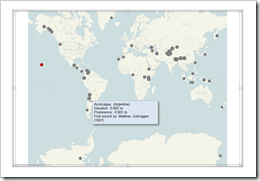
    Better Chart Tooltips with Microsoft Excel 2010Let’s call a spade a spade: Microsoft Excel’s chart tooltips are lame.

    When talking about tooltips I refer to textboxes that appear when hovering over a data point of a chart with the mouse.

    Excel’s chart tooltips show by default the name of the data series, the point (e.g. the category) and the values. There is no built-in feature to change anything about them except for turning the tooltips off in Excel’s options.

    However, chart tooltips are a great interactive feature. They give the user the opportunity to easily explore the data and get additional information about selected data points on the chart.

    Have a look at Tableau as a benchmark. Tableau allows you to display any information in the tooltips (i.e. any given dimension or measure), to format them and to replace the field names by whatever you choose. There is even much more. For instance: my highly esteemed Tableau blogging colleague Andy Cotgreave showed on the outstanding blog of the data studio how to add conditional formatting to tooltips and even how to implement pseudo bar charts inside of a tooltip. Fantastic work, Andy.

    Back to Microsoft Excel. Can we do at least something similar in Excel? Let’s stay humble. I am not dreaming of great formatting features or even the fabulous things Andy did with Tableau. I am talking about just some nice and meaningful tooltips displaying more information than the Excel default does. Is this possible?

    Yes, it is.

    Today’s post shows how to improve Microsoft Excel’s chart tooltips using a textbox and some VBA. As always, providing the Excel 2007/2010 workbook for free download. 

    (more…)