Category: Microsoft Excel

  • Selecting and Highlighting Areas on Excel Charts

    Interactive Selecting and Highlighting Areas on an Map or an XY Scatter Chart in Microsoft Excel
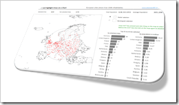
    Selecting and Highlighting on Excel ChartsThe previous post demonstrated an alternative technique to implement a direct interaction with an Excel chart using an ActiveX label control sitting on top of the chart. The example used in that post (a geography quiz) allowed a click on a map and evaluated the coordinates of the position the user clicked on.

    The technique, however, can also be used in many more cases. If you are working with an XY scatter chart and especially if you are working with a map, interactive selecting and highlighting a user-defined area of the chart can be a very helpful feature for exploring and analyzing the data.

    Tableau Software, for one, allows for different ways of selecting and highlighting areas. Microsoft Excel has no such features built in. With the technique described in the previous post and some additional VBA code, however, you can bluff almost the same functionality in Excel.

    Today’s article describes how to implement selecting and highlighting features on Excel charts. As always the example workbook and the VBA code is provided for free download.
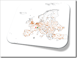
    (more…)

  • Another Technique for Interactive Excel Charts

    Another technique to create interactive charts in Microsoft Excel using an ActiveX Label Control on top of the chart

    Where is it?Interactive features add a lot of analytical power to dashboards. If you want to create a professional analysis dashboard, interactivity is almost a must-have.
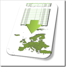
    Unfortunately, Excel does not provide built-in interactive features for charts. However, this doesn’t mean you can’t have interactivity on Excel dashboards.

    As always, VBA is the way to overcome Excel’s shortcomings.

    We already had a couple of articles providing workbooks with interactive features, like Bluffing Tableau Actions with Microsoft Excel, The Next Level of Interactive Microsoft Excel Dashboards, Microsoft Excel Site Catchment Analysis, Better Chart Tooltips with Microsoft Excel 2010.

    All of them were taking advantage of the chart object’s mouse event procedures. More precisely, they were based on the great code provided by Jon Peltier here: Get XY on any Chart.

    I recently discovered another technique to implement interactivity on Excel charts. Andy Pope uses an ActiveX label control on top of a chart to track and evaluate mouse positions. Unlike the chart object mouse events, Andy’s approach doesn’t require to activate the chart first.

    I “stole” Andy’s idea and used his technique to create a little interactive geography quiz in Excel: find European cities on a map. Today’s article describes the implementation of the workbook and the code and – as always – provides the Excel file for free download.

    (more…)

  • Create Excel Freeform Shapes from Polygons

    How to transfer polygon data into freeform shapes in Microsoft Excel

    Create Excel Freeform Shapes from PolygonsIf you are a regular reader or even subscribed to this blog, you will not be surprised to hear that I am working on a new challenge regarding maps in Microsoft Excel.
    We had a lot of articles already on how to create Choropleth Maps in Microsoft Excel. The new project is about using maps in Excel again, but with a different type of visualization.

    Since I am just starting out on this challenge, I can’t provide more details yet.

    Having said that, for the preparation of the new project, I had to work with geographical polygon data. Now, what’s this?

    A polygon is […] a plane figure that is bounded by a finite chain of straight line segments closing in a loop to form a closed chain or circuit.” (source: Wikipedia).

    In the context of geographical visualization, a polygon represents a region (e.g. country) on a map. Such a polygon consists of a series of geographical points: pairs of latitude and longitude in a defined order (path). If you draw an outline through these points in the given order, you get a shape forming the boundary of this region.

    And this was my challenge: transfer geographical polygon data into freeform shapes in Microsoft Excel. I am not sure, but I thought maybe some of you might be interested, so I decided to share my solution.

    Today’s post first shows how to plot polygon data on standard Excel XY Scatter charts and then describes my solution to transfer the data into freeform shapes. As always, the article provides a link to download the Excel workbook for free.

    (more…)

  • Excel Oddity: Camera Objects bloat File Size

    Camera objects (aka linked pictures to cell ranges) can considerably increase the size of an Excel workbook. Why?

    Vintage Camera - Photographer: Peter Miller (flickr.com)Camera Objects (aka linked pictures) are an easy-to-use, powerful and flexible technique in Excel, especially for making dynamic and interactive charts and dashboards.

    I learned this technique years ago from Charley Kyd’s fantastic e-book Dashboard Reporting With Excel.

    My good friend and Excel MVP Chandoo also wrote several articles about the Camera Object (all articles with ‘camera tool’ tag on chandoo.org).

    The feature may still not be as known among Excel users as it should be, but there are so many very good tutorials available that I do not need to write another one.

    As great as they are, Camera Objects always had a few issues (printing, merged cells, distorting captured charts, etc.) as Charley points out here: A New Excel 2010 Camera Tool Bug, and a Workaround.

    Today’s article will describe not a real bug, more an Excel oddity or annoyance regarding Camera Objects: the extensive use of Camera Objects can let the file size of your workbook explode, especially if they are linked to cells with inserted images sitting on top. I took a closer look into this and today’s post describes what I found out.

    (more…)

  • Highlighting on Excel Dashboards

    Highlight one selected item across all charts and views of an Excel Dashboard: an example and the how-to

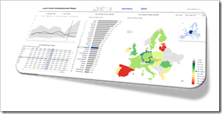
    Dashboard EU Unemployment RatesVery often, a dimension is displayed on more than one view of a dashboard.

    Let’s say you want to analyze data of the European Union. Chances are that you will have the dimension “member state” on more than one of your charts.

    If you pull these charts together into one dashboard, highlighting a selected member state across all charts is very helpful to explore and analyze the data. It supports the user to easily focus on the selected state and to identify its position in the context of all members at a glance.

    Highlighting is the very simple act of selecting one item out of many (by e.g. clicking) and automatically seeing this item emphasized in all views across the entire dashboard. This is a very effective and user-friendly visualization technique and should be available on every interactive dashboard.

    Today’s post shows how to implement highlighting on an Excel dashboard. As always, including the Excel workbook for free download.

    (more…)