Category: Dashboards

  • Software Project Dashboards – Episode 3

    How to create a Microsoft Excel dashboard to monitor the progress of a software development project (part 3 of 3)
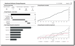
    Dashboard Software Change Requests - click to enlarge This article is the last part of a 3 posts series on software development project dashboards with Microsoft Excel. Episode 1 of the series discussed a software defect statistic dashboard, Episode 2 talked about a test progress and test success dashboard. Today’s post focuses on monitoring change requests, one of the biggest threats to complex software projects.

    Change requests (CR) raised already during the development of the software lead to additional time and cost needed, threaten the project plan and the budget, bear the risk of additional defects and lead to an instable baseline of the software to be tested by Quality Assurance. That’s why you should definitely keep an eye on the development of change requests throughout the development phase of your software project.

    Today’s post provides a minimalist dashboard for monitoring and reporting the actual status of change requests and their development over time. As always including the Microsoft Excel workbook for free download.
    (more…)

  • Software Project Dashboards – Episode 2

    How to create a Microsoft Excel dashboard to monitor the progress of a software development project (part 2 of 3)

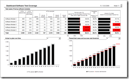
    Dashboard Software Test Progress - click to enlarge This is the second part of a 3 post series on software development project dashboards with Microsoft Excel. Episode 1 of the series discussed a dashboard to monitor the software defect statistics. Today’s article addresses to another very relevant facet in a software development project: The progress and success of testing.

    Testing as the process of validating and verifying quality and suitability of the developed system is at least as important as the number of defects detected. Actually, it goes without saying that testing is the prerequisite of finding software defects. Having said this, it probably would have been better to start the series with this part, but I recognized this too late. My bad.

    Anyway: Today’s post provides a minimalist dashboard to monitor test progress and test success within a software development project. As always including the Microsoft Excel workbook for free download.
    (more…)

  • Software Project Dashboards – Episode 1

    How to create Microsoft Excel dashboards to monitor the progress of a software development project (part 1 of 3)

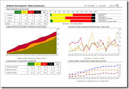
    Software Development Defect Dashboard - click to enlarge When it comes to manage software development projects, you have to monitor a lot of different quantitative and qualitative metrics in order to  answer the main question:

    “Where are we?”

    As in any other project you have to take care of the usual suspects in project controlling like the completion rate of tasks, the milestones and quality gates, the budget adherence, etc. In software development projects, however, there are a couple of very important specific additional facets to be monitored closely:

    1. The actual status and the trend of software defects
    2. The test progress, test coverage and test success
    3. The actual status and the development of change requests

    Today’s article is the first of a 3 post series on how to create minimalist, dynamic software project dashboards with Microsoft Excel; this time a software defect monitor dashboard including the Microsoft Excel workbook for free download.
    (more…)

  • You can’t start a fire without a spark (2)

    A Price Benchmarking Tool for Mobile Phones – A Sparklines for XL Showcase

    In my recent review of Sparklines for XL, I announced a second post, providing a real life example of a model and a dashboard using Sparklines for XL. Here it is.

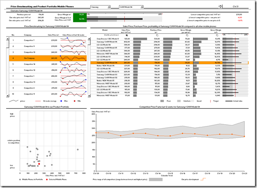
    This showcase is a price benchmarking tool I implemented for a mobile phone retailer. Limited in size (number of products and competitors), but regarding the functionality pretty close to the original implementation.

    This is a screenshot of the dashboard:

    Price Benchmarking Dashboard - click to enlarge

    Since it is a real life example, not all charts and visualizations are sparklines. The showcase uses a combination of different techniques and visualizations to create a professional price benchmarking dashboard. It is not exclusively dedicated to sparklines, but from my point of view this model provides a good impression of how to use sparklines in real life dashboards.

    Interested in getting on fire for a dashboard with Sparklines for XL?

    Here you go.

    (more…)

  • Visiting a friend

    Chandoo's KPI Dashboards revisited – the Box Plots

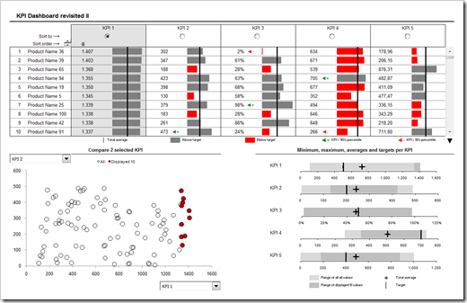
    In summer 2008 my friend and Microsoft Excel MVP Chandoo was kind enough to give me the opportunity of contributing guest posts to his excellent blog Chandoo.org. Actually Chandoo even featured a whole 6 post series on how to create interactive KPI dashboards with Microsoft Excel. Here is a screenshot of the final dashboard:

    PHD KPI Dashboard - click to enlarge


    The last part of the series was about box plots to visualize the distribution of the data (Box Plots Excel Dashboards Tutorial), including average and target values. At that time Chandoo and I decided to apply Occam’s razor and we restricted the tutorial to a simplified version of box plots, working only for data sets with positive values.

    This follow-up post on my own blog is about how to create these box plots for all kind of data distribution, i.e. positive and negative values.

    (more…)