A Data Analysis and Dashboard Showcase with Microsoft Excel
 This post is about a showcase. Don’t expect too much. I will not provide a detailed how-to tutorial. All you can learn from this post is that you should not toss Excel as a matter of principle, when you have to create Business Intelligence tools and dashboards. Agreed, Excel has its limitations especially with regards to the access to larger external databases. And Excel’s chart engine has some limitations as well. Nevertheless Excel provides the flexibility to create compelling and professional dashboards.
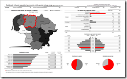
Recently a Lithuanian company invited me to conduct a training to their marketing department. The focus of this training shall be on how to create Excel models including dashboards and visualizations made to stick. I haven’t done trainings for quite a while, but I do remember that the perfect start for a training is a demonstration of what it will be about and what the participants will be able to do afterwards. Therefore I created a showcase based on the Lithuanian Census 2001.
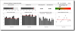
 Using Key Performance Indicators (KPIs) in Customer Care management is a prime example of Performance Dashboards. Call Center Managers usually monitor the performance of their Customer Care with an extensive list of different metrics and KPIs visualized on one or several real-time dashboards. On a higher level and in a more condensed form the numbers are also reported to the Top Management on regular intervals, usually at least weekly.