Category: Choropleth Maps

  • US Choropleth Map by County per State

    How to display a Choropleth Map of the United States by County for one user-selected state
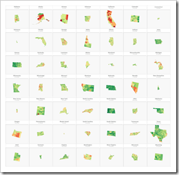
    Choropleth US Map by County per State (Intro)If you are a regular reader of this blog, you certainly know that I am into geographical data visualization. Just click on “Choropleth Maps” in the Categories roll on the right side of the blog and you will see that we already had 18 (!) posts in this category. Some of them discussing maps in Tableau, but most of them dealing with the question how to implement Choropleth Maps or Cartograms in Microsoft Excel.

    I thought I would be through with this topic. I really did. However, I recently noticed that there is one common use case for Choropleth Maps in Excel I never wrote about: visualizing one user-selected region of a bigger map. Imagine you have geographical data with a hierarchy, e.g. USA by state and county (to state the obvious for the majority of my readers). It may well be that one of your dashboards is focused on displaying views for one selected state only.

    Now, what if one of your views shall be a Choropleth Map? How can you show only the selected part of a map on your dashboard?

    Today’s post describes three different options how to do this. As always, the example Excel workbooks are provided for free download without any password protection.
    (more…)

  • Cartograms in Microsoft Excel

    How to create Cartograms in Microsoft Excel

    Cartograms in ExcelThe article Cartograms in Tableau described the limitations of Choropleth Maps under certain circumstances and why Cartograms can sometimes be a viable alternative to color coded maps.

    Building upon that, the previous post (Create your own Cartograms in Tableau) provided a Microsoft Excel tool to create the polygons for Cartograms based on your own data. The Excel tool (called Cartogram Data Generator) is based on my VBA implementation of “an algorithm to construct continuous area cartograms” by J. Dougenik, N. Chrisman and D. Niemeyer, published in “Professional Geographer” back in 1985.

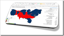
    With this VBA algorithm and two other techniques previously published here (Faster Choropleth Maps with Microsoft Excel and Create Excel Freeform Shapes from Polygons), we have all modules available to calculate and plot Cartograms directly in a stand-alone Microsoft Excel workbook.

    Today’s post describes how to create Cartograms in Microsoft Excel and provides two versions of the Cartogram workbook for free download.

    (more…)

  • Create your own Cartograms in Tableau

    The Cartogram Data Generator: a free Excel Tool to create your own polygon data for plotting Cartograms in Tableau

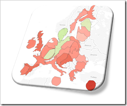
    Cartogram EUOne of the recent posts showed how Cartograms can be a viable alternative when Choropleth or Filled Maps are stretched to their limits and tell the wrong overall story:

    Cartograms in Tableau

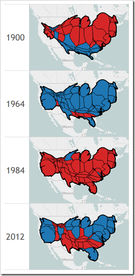
    The article included a Tableau Public dashboard comparing Filled Maps with Cartograms for the results of the US Presidential Elections since 1900.

    Since Tableau does not provide Cartograms as a built-in chart type, the distorted polygons have to be calculated outside of Tableau and then used as a data source to plot the maps using Tableau’s polygon map approach.

    Today’s article is the follow-up post. It provides a free and open Microsoft Excel workbook to create Cartogram data with a few mouse clicks: copy in the data and the original polygon points of all regions and let the tool create a ready-to-use data set to plot Cartograms in Tableau.

    (more…)

  • Cartograms in Tableau

    Plotting preprocessed polygon data as Cartograms in Tableau: the results of the US Presidential Elections since 1900

    Cartograms of the US Presidential Elections plotted in TableauChoropleth Maps or Filled Maps (as they are called in Tableau) are a great technique for analyzing geographical data, especially for maps with a high level of detail (e.g. US by counties or ZIP codes). They make it very easy to identify geographical hot spots first and then drill down into these regions using other visualization types.
    Having said that, they also have their limitations and disadvantages. Even worse, under certain circumstances Choropleth Maps can be misleading and visualize the data incorrectly.

    A classic example of misleading Choropleth Maps are the well known US Presidential Election Maps. We all have seen them, right? A map of the USA with color coded states: a red fill color if the Republican candidate won the state and a blue fill color if the Democratic candidate won (and in some years other colors for independent candidates).

    Although these maps correctly depict the geographical distribution of “who won where”, they are usually telling the wrong overall story.

    How come?

    Traditionally Republicans very often win some of the larger states with a small population density like Alaska, Montana and Wyoming (and thereby only a small number of electoral votes). As a consequence red often dominates the color coding of the map, even if the Democratic candidate won the entire election.

    Cartograms are a geographical visualization on a map avoiding this problem. Cartograms are distorting the map by resizing its regions according to e.g. the population, the popular votes or the electoral votes, At the same time the Cartogram algorithm tries to retain the topology of the map as far as possible.

    Today’s article presents a dashboard on Tableau Public comparing a Filled Map with a Cartogram for every US Presidential Election since 1900.

    (more…)

  • Drill Up and Down on Choropleth Maps in Excel

    Interactive drill up and down geographical hierarchies on a Choropleth Map in Microsoft Excel

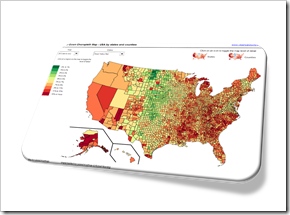
    Drill Down Choropleth Map USA

    The post Faster Choropleth Maps with Microsoft Excel provided a faster version to update a Choropleth Map in Microsoft Excel. The approach made it possible to use Choropleth Maps with several thousand regions on an interactive Microsoft Excel dashboard in production.

    This also opened up new possibilities to enhance the maps with additional features. Leonid Koyfman contributed a couple of great enhancements in the follow-up article Fast Choropleth Map with Enhanced Features like filtering the data by value bin, showing tooltips and letting the user decide whether the map shall be colored by state or by county.

    Very soon after this follow-up article was published, Leonid came up with another great idea. He suggested to take the user selection of how to color the map to the next level: let the user easily drill up and down the geographical hierarchy by simply clicking on the map. One click toggles from coloring the entire state to the counties in that state and vice versa. I have to admit, I am sitting on this nugget for one and half years already and never found (well, more precisely never took) the time to publish it. But finally the time has come. Here it is.

    Today’s article explains Leonid’s idea and implementation how to drill up and down geographical hierarchies on a Microsoft Excel Choropleth Map.

    The article includes two example workbooks for free download: the USA by states and counties and Germany by the two common ZIP-code levels PLZ2 and PLZ5 (first two digits of the ZIP-code and the entire five digits ZIP-code).

    (more…)