Category: Charts

  • An Underrated Chart Type: The Band Chart

    Why band charts should be used more often and how to create them with Microsoft Excel and Tableau Software
    Band Chart IntroBand chart, range chart, high-low line chart, corridor chart. I don’t know whether there is a standard term for this type of charts, so let me call it a band chart hereafter.

    What is a band chart?

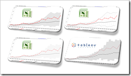
    Basically a band chart is a standard line chart enhanced with a shaded area displaying the upper and lower boundaries of groups of data (e.g. the range between the minimum and the maximum of all members of the category). Band charts are very often supplemented by another line showing the arithmetic mean (the average).

    What is the big whoop?

    Band charts provide by far more context to your visualization and more insight into your data. Especially if you have to explore unknown data sets. They are easy to implement, very intuitive, very effective and do not require one pixel more of your dashboard real estate than a standard single line chart.

    This being said, I have always been wondering why I do not see these charts more often in my professional environment. Are people underrating the benefits of band charts or am I overrating them?

    Today’s article discusses the benefits and the use cases of band charts and provides tutorials of how-to implement this type of chart with Microsoft Excel and Tableau Software. As ever, including the Excel workbooks for free download and the Tableau visualization for direct access via Tableau Public.
    (more…)

  • Better Chart Tooltips with Microsoft Excel 2010

    Create Tableau lookalike Chart Tooltips on your Microsoft Excel 2007/2010 Charts

    Better Chart Tooltips with Microsoft Excel 2010Let’s call a spade a spade: Microsoft Excel’s chart tooltips are lame.

    When talking about tooltips I refer to textboxes that appear when hovering over a data point of a chart with the mouse.

    Excel’s chart tooltips show by default the name of the data series, the point (e.g. the category) and the values. There is no built-in feature to change anything about them except for turning the tooltips off in Excel’s options.

    However, chart tooltips are a great interactive feature. They give the user the opportunity to easily explore the data and get additional information about selected data points on the chart.

    Have a look at Tableau as a benchmark. Tableau allows you to display any information in the tooltips (i.e. any given dimension or measure), to format them and to replace the field names by whatever you choose. There is even much more. For instance: my highly esteemed Tableau blogging colleague Andy Cotgreave showed on the outstanding blog of the data studio how to add conditional formatting to tooltips and even how to implement pseudo bar charts inside of a tooltip. Fantastic work, Andy.

    Back to Microsoft Excel. Can we do at least something similar in Excel? Let’s stay humble. I am not dreaming of great formatting features or even the fabulous things Andy did with Tableau. I am talking about just some nice and meaningful tooltips displaying more information than the Excel default does. Is this possible?

    Yes, it is.

    Today’s post shows how to improve Microsoft Excel’s chart tooltips using a textbox and some VBA. As always, providing the Excel 2007/2010 workbook for free download. 

    (more…)

  • Animate Cumulative Data with Tableau 6

    Create a motion chart and animate cumulative data using the new functionality “Show History” of Tableau 6

    © Pixel King / pixelio.deThe article Animate cumulative data with Tableau described a workaround to visualize the history of data on the page shelf of Tableau’s version 5. The example provided in that post showed the growth of Walmart since 1962 on a map of the United States.

    The workaround included a custom SQL statement in the data connection to create a second date field to be used on the page shelf.

    The workaround did the job, but it came with a couple of serious disadvantages:

    • SQL knowledge needed to create the Custom SQL statement
    • Additional time needed to set up the data connection
    • Extremely slow performance: executing the SQL query after opening the workbook took between one and three minutes
    • Impacts on other data analysis and visualizations due to the artificially bloated data source

    As I already said at the end of the original article: A workaround. No more, no less.

    All that belongs to the past. With Tableau 6 you can easily animate cumulative data on the page shelf using the new feature “Show History”. Today’s post includes a how-to tutorial and the Tableau workbook for direct access here and for free download.

    (more…)

  • Combine Tables and Charts on Excel Dashboards

    Visualize Football League statistics on an Excel Dashboard integrating charts directly into a table

    Allianz Arena - Home of FC Bayern Munich - click to enlarge Combining tables and charts is a very powerful technique for creating Microsoft Excel dashboards. It allows you to integrate texts, values and visualizations into one table. This ensures to have the maximum of information at a glance, including a direct comparability row by row.

    I already used this technique in several posts before, like the Sparklines for XL showcase or the Software Project Dashboard examples. Today’s article provides another showcase for a dashboard combining tables and charts.

    Football rules the world, especially these days. We are all impatiently waiting for the FIFA World Cup in South Africa, aren’t we? My friend Chandoo recently had a very nice post on visualizing the different footballs used in the World Championships since 1930. That’s remarkable, because Chandoo lives in India and I suppose he is more interested in cricket than football. But as I said, football rules the world these days.

    That’s why it somehow suggests itself to use a football-related visualization for today’s post. But I will not go for the FIFA World Cups. Not yet. Today’s article shows how to visualize national football league statistics using a dashboard that combines tables and charts. As always including the Microsoft Excel workbook for free download.

    (more…)

  • Animate cumulative data with Tableau

    Use a custom SQL data connection to animate cumulative data on the page shelf in Tableau

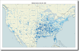
    The Growth of Walmart - click to enlargeInspired by Nathan's Walmart growth movie, Daniel Ferry recently had a very interesting post at his outstanding blog Excel Hero. Daniel presented a beautiful Excel implementation of animating the growth of Walmart, plotting dynamic named ranges on an XY scatter chart against a background image map of the US.

    There is nothing to add to Daniel’s great post and implementation with regards to the use of Microsoft Excel. But how about Tableau? Can you create animations like this with Tableau Software?

    At first sight this should be a piece of cake: If you think of animating data with Tableau, of course the page shelf is the first thing that comes to your mind, isn’t it? Dragging a field (the year of the opening date of the stores in our example) to the page shelf allows you to either manually navigate through all the years or to use the playback controls for a slide show. 

    However, the page shelf creates a view on the currently selected page. Thus, dragging the opening date on the page shelf would show an animation only displaying the location of the new Walmart stores in the current year. At the end of the animation, for instance, the visualization would include solely all stores opened in 2006 instead of all stores opened since 1962.

    Therefore the page shelf and Tableau’s built-in mapping functionality are only half the battle won. We need a little tweak to visualize and animate the cumulative data, i.e. all Walmart stores from the very beginning.

    Today’s post presents a way of emulating Daniel’s Excel implementation with Tableau. As always including the Tableau packaged workbook for free download.

    (more…)