Category: Charts

  • Gapminder Replica in Microsoft Excel

    A Gapminder-lookalike animated chart in Microsoft Excel, based on the generic Motion Chart Excel Template
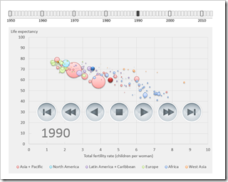
    Gapminder Replica in Microsoft Excel

    The recent article Motion Chart Excel Template provided a generic template for a motion or animation chart in Microsoft Excel. The examples in that post visualized episodes of the Italian cartoon series La Linea (La Linea article on Wikipedia).

    Today’s article will put the motion chart template to a more serious, business like use: a Gapminder replica in Microsoft Excel.

    For those of you who do not know Gapminder: Gapminder is a data visualization software to animate statistics. It was originally developed by Prof. Hans Rosling and his team and Prof. Rosling presented it in this famous TED talk:

    Hans Rosling shows the best stats you have ever seen

    Today’s article rebuilds this data visualization and animation in Microsoft Excel using exactly the same metrics. As always, the Microsoft Excel workbook is provided for free download.

    (more…)

  • Motion Chart Excel Template

    A generic template to create Motion Charts in Microsoft Excel and 2 examples to animate La Linea episodes in Excel

    La Linea #7 - Photographer: Jimmy Fllnk (flickr.com)A preliminary note

    In the previous article I published my three entries for Tableau’s current “Viz as Art” contest.

    With pride and humility I announce that one of my entries (my replica of Curtis Steiner’s 1,000 blocks) made the cut and is among the 10 finalists:

    Destination Data—Viz as Art contest finalists & voting

    The voting is open now through Friday, August 29, 2014, 5pm (PST) and takes place on Twitter. So, if you have a Twitter account, please have a look and vote with a tweet.

    To be crystal clear: I am not asking you to necessarily vote for my entry. Have a look, see for yourself and decide which entry you like most. It goes without saying that it is your decision who to vote for, but please do vote. Thank you!

    So much for the preliminary note, now on to today’s content:

    As mentioned above, I submitted three entries, but truth be told, I had a favorite child: the La Linea workbook. Maybe because it was the only one I haven’t published before, maybe because it reminds me of my childhood, I don’t know.

    Anyway. As soon as you have your data, it is very easy to create this animation in Tableau. However, this kind of motion chart is possible in Microsoft Excel, too. So I thought it might be interesting to publish an Excel replica of my La Linea Tableau workbook.

    Today’s post provides an Excel version of my La Linea Tableau workbook, a generic template to create motion charts in Excel and also an Excel workbook to animate a whole episode of La Linea. Of course, all workbooks are provided for free download.

    (more…)

  • Pivot-like Marimekko Charts in Excel

    How to create an interactive “Pivot-like” Marimekko Chart in Excel allowing the user to select the visualized dimensions and measure on the fly

    Rubik's Cube - Photographer: Clemens Koppensteiner (flickr.com)The previous post Marimekko Charts in Microsoft Excel described and provided a VBA-based template to create a Marimekko chart in Excel made up of freeform textboxes. In the article I claimed, the used approach would offer some flexibility. Action speaks louder than words, so let’s turn this rhetoric into action.

    A Marimekko chart visualizes one measure (numerical) by two dimensions (categorical). The original template provided in the previous post was based on a data source arranged in a crosstab.

    Now let’s say you have a data source with several dimensions and measures organized in a flat table. That’s the norm, isn’t it? If you want to quickly analyze this data in Excel, you will probably use a Pivot Table and maybe a Pivot Chart allowing you to easily select which dimensions shall go to rows and columns and which measure shall be summarized in the values area. Now this is exactly the feature we want to bring to our Marimekko chart template.

    Today’s post describes how to enhance the existing template with interactive features to enable the user to easily define what shall be displayed in the Marimekko chart. As always, the article includes the Microsoft Excel workbook for free download.

    (more…)

  • Marimekko Charts in Microsoft Excel

    A VBA based Microsoft Excel Template to create a Marimekko Chart aka Matrix Chart aka Mosaic Chart for free download

    marimekko #2 - Photographer: 4WheelsofLux (flickr.com)A Marimekko or Matrix or Mosaic Chart (called Marimekko hereafter) is a combination of a 100% stacked column chart and a 100% stacked bar chart combined in one view. It works like a 100% stacked column chart, but additionally the width of a column is proportional to the total value of this column.

    Microsoft Excel does not provide a built-in chart type for Marimekko charts, but there are several workarounds available to accomplish this. For instance, Jon Peltier shows in his article Marimekko Charts how to turn a combination of a stacked area and a line chart into a Marimekko chart. My friend Chandoo, Conditional Formatting aficionado he is, uses the cell grid, formulas and cell value based formatting rules to create a pseudo Marimekko chart in his post Market Segmentation Charts using Conditional Formatting. Of course there are also a couple of other blog posts on this topic and also commercial Add-ins available.

    Although Jon’s and Chandoo’s solutions work well and are available for a long time already, I decided to add my 2 cents with another approach: a VBA based solution creating a Marimekko chart made up of freeform text boxes. The main advantage: reduced set-up time and more flexibility, if the number of rows and columns of the Marimekko chart changes.

    Today’s article provides a VBA based solution to create a Marimekko chart in Microsoft Excel and explains how to use and customize the template to suit your requirements. As always, the workbook is available for free download and the VBA code is without password protection.

    (more…)

  • Interactive Drop Lines on Microsoft Excel Charts

    Display drop lines to both axis of an Excel chart after clicking on a data point

    Ruler - Photographer Auntie P (flickr.com)The previous post (Tableau Quick Tip #4 – Drop Lines) discussed a great interactive feature for exploring large data sets on charts: the Drop Line.

    In fact I like this feature so much that I am not only using in Tableau. If the data is appropriate, I am also providing a similar feature on my Excel dashboards.

    You may ask:

    “Interactive Drop Lines in Excel Charts? Does Excel provide such a feature?”

    Not built-in, but with a few tweaks and a small piece of VBA code, you can easily get to interactive drop or reference lines in Microsoft Excel, too.

    Today’s post shows how to create interactive drop lines on Microsoft Excel charts for different chart types. As always, the article provides the Excel workbooks for free download.

    (more…)