Display drop lines to both axis of an Excel chart after clicking on a data point
 The previous post (Tableau Quick Tip #4 – Drop Lines) discussed a great interactive feature for exploring large data sets on charts: the Drop Line.
In fact I like this feature so much that I am not only using in Tableau. If the data is appropriate, I am also providing a similar feature on my Excel dashboards.
You may ask:
“Interactive Drop Lines in Excel Charts? Does Excel provide such a feature?”
Not built-in, but with a few tweaks and a small piece of VBA code, you can easily get to interactive drop or reference lines in Microsoft Excel, too.
Today’s post shows how to create interactive drop lines on Microsoft Excel charts for different chart types. As always, the article provides the Excel workbooks for free download.
The Idea
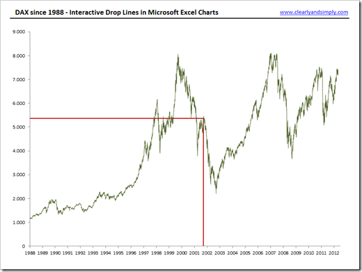
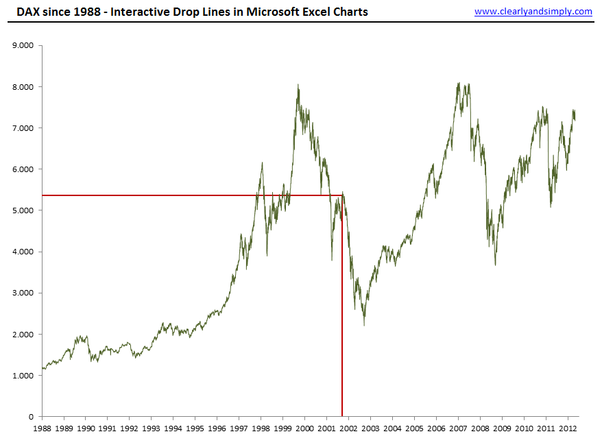
The idea is simple: include an interactive feature to your Excel dashboard or chart which displays drop lines to both axes after user clicked on any given data point of the chart:
 The Implementation
The implementation of interactive drop lines in Microsoft Excel consists of three main parts:
Part 1 – Named Ranges / Named Formulas
We define a couple of names (named ranges and named formulas):
- myX, myY and myIndex are names referring to the source data
- myDataPoint is the index of the currently selected data point, i.e. it does not refer to a range but simply contains a number. The VBA code (see below) will update the value of this name
- myEB_X_Neg, myEB_X_Pos, myEB_Y_Neg, myEB_Y_Pos are named formulas calculating the error amount of the error bars (see below) based on the source data and the currently selected data point
For the details, have a look at the definition of those names in the Name Manager:

Part 2 – Error Bars
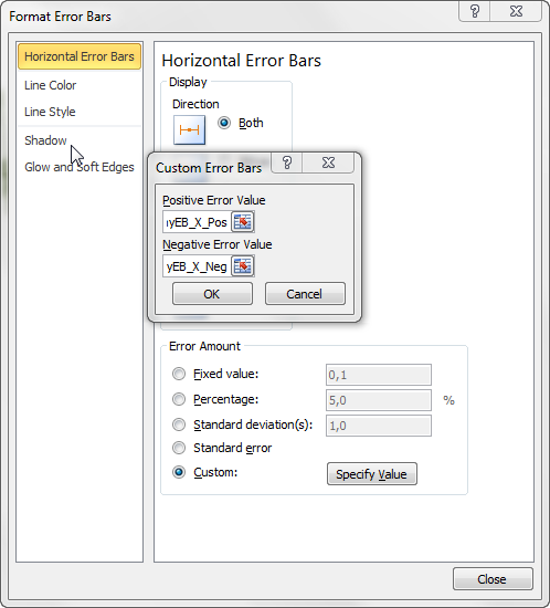
Now we add horizontal and vertical error bars to the data series of the chart using the standard Excel functionality (ribbon Chart Tools | Tab Chart and Layout | Error Bars. In the Format Error Bars dialogue, we select Error Amount “Custom” and specify the values using the error bar amount named formulas (myEB_X_Pos, etc. see Part 1):
Part 3 – The VBA Code
Unsurprisingly the heart of the solution is the VBA code.
The technique is again based on a small, but extremely powerful code snippet Jon Peltier provides on his PTS Blog: Get XY on any Chart. This excellent piece of code tracks the mouse events on charts and returns all necessary information about the user’s actions.
I have used Jon’s technique for several other articles and workbooks published on Clearly and Simply:
Bluffing Tableau Actions with Microsoft Excel
There are only minor changes necessary for using the code to provide interactive drop lines (see module modDropLines and class clsChartEvent). Hence, I won’t go into the details of the VBA code again. Have a look at Bluffing Tableau Actions with Microsoft Excel or download the workbooks (download link see below) and dissect the VBA code on your own. If you have any question, please leave me a comment.
That’s it. A few names, error bars and 74 lines of VBA code and you are good to go.
Other Chart Types
An XY line chart as shown above is the primer for using interactive drop lines. However, you can also take advantage of them on other chart types:
XY Scatter Charts
Since we already took care of positive and negative error bar amounts in the definition of the named formulas, we can easily use the same technique for XY scatter charts, even if there are positive and negative values on both axes: 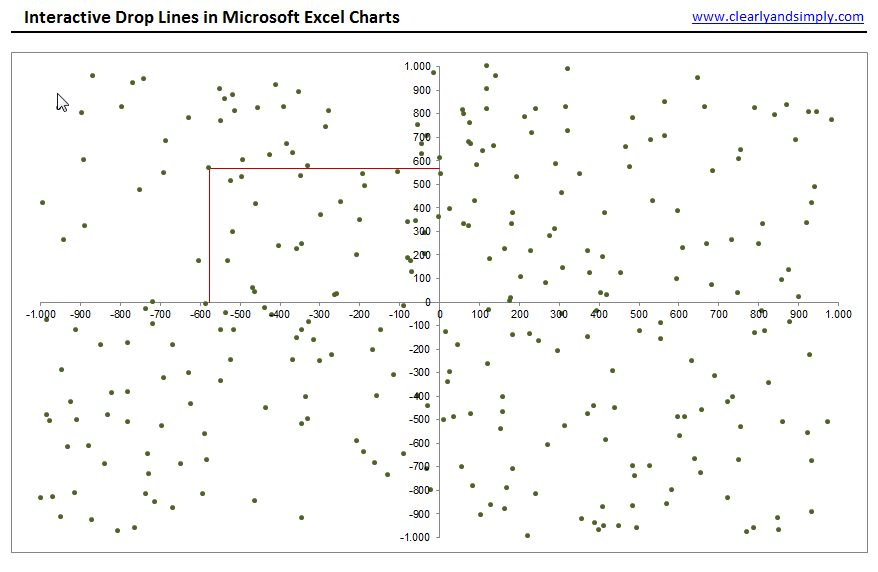
Bar Charts
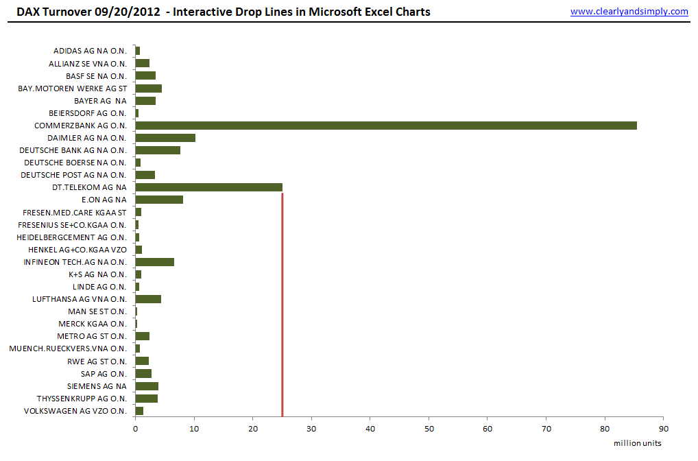
This is a drop line in the strict sense of the word, but from my point of view an interactive reference line covering all categories of the vertical axis is even better:
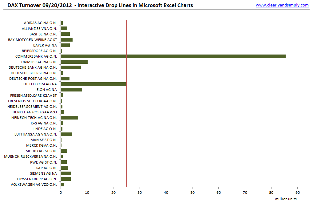
The implementation is even easier than with XY line or XY scatter charts. The drop line (or reference line) isn’t an error bar in this case, but a second data series (chart type: XY line chart).
Column Charts
Drop lines on column charts are also possible with the same technique we used for bar charts:
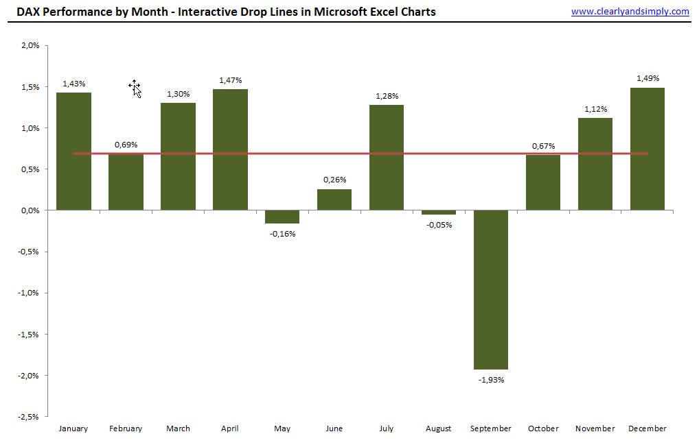
Improvement – Add Labels to the Drop Lines
Drop lines as shown above are a helpful interactive feature for exploring data on a chart. But wait. There is still room for improvement. Especially on charts with a large amount of data points (like the DAX development per day since 1988), the exact X and Y values of the selected data points can be very helpful:
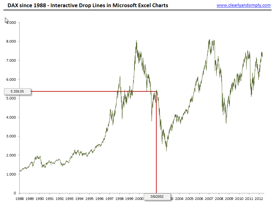
The technique is simple. It a nutshell, 2 textboxes are added to the worksheet and the VBA code makes them visible after the user clicked on a data point, positions them at the end of the drop lines and updates their texts (values). This is pretty much along the lines of what I have done in this post: Better Chart Tooltips with Microsoft Excel 2010.
The Download Link
Here is a zipped folder with all Microsoft Excel 2007/2010 workbooks shown in the screenshots above for for free download:
Acknowledgement
Many thanks go to Jon Peltier for providing the heart of the solution by sharing this fantastic piece of code. I have used it for various purposes and made a ton of hay with it, so I can’t thank him enough. Thank you, Jon!
What’s next?
The next posts will provide another Excel emulation of one of my Tableau dashboards, one or two articles on VBA techniques and a Tableau article on date functions in Calculated Fields.
More things to come soon. Stay tuned.
Comments
8 responses to “Interactive Drop Lines on Microsoft Excel Charts”
Robert,
I am trying to insert error bars but it will not accept what you have typed (myEB_X_Pos) etc. Any ideas why? I realize I am not providing much information..
Thanks,
Dillon
Dillon,
when you are using named formulas / named ranges to define data series or error bars of charts, you have to add the filename and an exclamation before the name, like this:
=interactive_drop_lines_xy_line_labels.xlsm!myEB_X_Pos
Don’t ask me why. One of Excel’s hidden mysteries I guess.
Thank you very much. I appreciate your help/speedy response.
You are awesome!!!
Hi Robert,
Fantastic technique. FYI I’ve suggested this approach on Superuser, and pointed anybody reading it back to your blog.
http://superuser.com/q/728406/151054
Nice work!
Cheers
Andi
Very creative technique. I tried to apply this on a scatter chart with 2 series and found it doesnt work. Is there a limitation that we can only have one series for this to work?
Anil,
actually the interactive drop lines in the workbook posted for download above work only on charts with only one data series. Having said that, you can enhance the tem-plate by duplicating and adjusting all named formulas and with a few small changes in the VBA code.
Have a look at this example with an XY scatter chart and 2 data series:
Download Interactive Drop Lines XY Scatter with 2 Series (36K)
mate, I know I have overlooked so much from your blog. This post is proved it. Amazing! potential candidate for the presentation, as there’s so much to choose. I need to take seat.