An alternative solution to the controversial animated Bar Chart Races in Microsoft Excel
1,276 words, ~ 6.5 minutes read
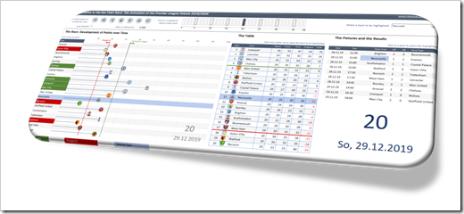
The other day, I watched an as interesting as entertaining dispute between Andy Kirk and Andy Cotgreave about the popular Bar Chart Races: Data Viz Debate: Is the bar chart race more than just a gimmick?
Although I truly admire Andy Kirk’s work, I am with Andy Cotgreave, here. I wouldn’t go so far to call them the “fidget spinners of data visualization”, but I find them hard to follow, especially when the speed of the animation is too fast.
Last week, Philip Treacy of MyOnlineTrainingHub published a post and a workbook, how to do a Bar Chart Race in Microsoft Excel. Philip visualized the 2019/2020 Premier League results in an animated Bar Chart. I am a big fan of Mynda and Philip’s MyOnlineTrainingHub, which is definitely one of the best Excel websites worldwide.
This made me think. Although I love Philip’s work, I am not a fan of the Bar Chart Race. So, how would I approach this? Today’s post provides my solution of an alternative for animated Bar Charts. As always, the post comes with the Excel workbook for free download.
The Original: Philip Treacy’s Bar Chart Race in Microsoft Excel
Here is the initial spark for today’s article: Philip Treacy’s classic example of a Bar Chart Race in Microsoft Excel:
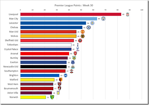 Philip’s approach is very smart: a Pivot Table to aggregate the data of the current week, Excel 365’s SORT function to sort the table, re-colouring the bars, assigning the team logos to the data labels and managing the animation by VBA.
Great work. Kudos, Philip.
That being said, it is a Bar Chart Race and, as mentioned in the introduction, I am not the biggest fan of Bar Chart Races. So, here is my suggestion, how to visualize this data with an animation.
My Alterative Approach
Have a look at the result first:
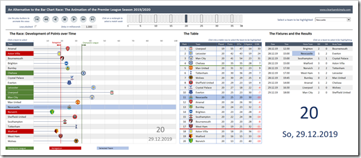 More views and probably not as easy to understand and digest as Philip’s straight forward solution.
Let me explain the changes and enhancements I made and why I made them.
A Different Chart for the Animation
Unlike Philip, I am not using a bar chart, but an XY Scatter Chart to animate the race. The main difference, however, is the fact that the teams are not sorted descending by points. Instead, they are shown in alphabetical order. This avoids the “jumping up and down” of the teams during the animation and – in my humble opinion – makes the chart less busy and the race itself easier to follow:
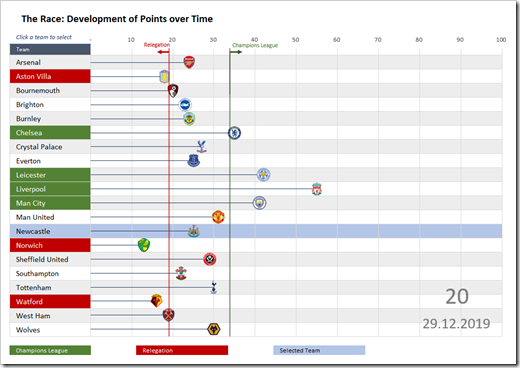 It is actually not a new idea. I have used this already in Tableau visualizations of football (for my readers in the US: soccer) data:
More Context
Putting data into context is extremely important. It helps the audience to better understand the data and to gain more insights.
Firstly, I added the information about which teams would be qualified for the UEFA Champions League (the top four) and which would be relegated (the bottom three). In the race chart, this is done in two ways: the background color of the axis labels (the team names) and two vertical lines in the plot area. Red highlights the teams currently in relegation, green shows the ones qualified for the Champions League (see the screenshot above).
Next, additional views are added right to the race chart. Nothing to write home about, just the usual suspects: the table and the fixtures with the results.
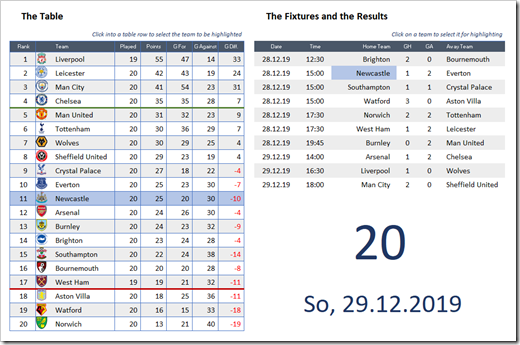 During the animation, you will probably not gain much insights from the table and definitely nothing from the fixtures and results.
That being said, these views are extremely helpful when you stop/pause the animation (and you can do this whenever you want). After stopping the animation, these views provide all the details you may be interested in for the currently selected match week. Also, with the table, you do not need the descending sort which makes the Bar Chart Race so busy.
Selection and Highlighting
If you are looking at sports results, it is kind of likely that you are interested in one team (your favourite team). My approach takes this idea into account. You can select one team and it will be highlighted across all views with a light blue background color.
Selecting a team is possible in different ways: you can use the drop down at top right, click into the axis labels of the race chart, click on any given row of the table or on either a home or an away team in the results section.
Please be advised that you can even do this while the animation is running.
Interactivity of the Animation
Using the play buttons at top left of the dashboard, you can start and stop the animation, go forward and backwards (delayed or fast) or jump to the start or the end of the season.
With the loop checkbox, you can decide whether the animation shall restart at week 1 after reaching the last match week and with “Delay in milliseconds” you have control how fast (or slow) the animation shall be.
Finally, you can select any given match week by clicking on one of the rectangles above the race chart. This will stop the animation, but you can restart it from there in both directions using the play buttons.
The Implementation / the Techniques
I have to admit: nothing really new under the sun. Just a new combination of existing tricks and techniques. I won’t got into the details of the implementation, because everything has already been used and explained in previous posts here.
If you want to understand how this is done, please download the workbook and have a look for yourself. If you have any questions, please drop me a line in the comment section.
The Weaknesses
I see two main weaknesses of this solution:
- The workbook uses a lot of different techniques and tricks and some VBA code. Quite some manual work is necessary to set it up, e.g. the assignment of the team logos to the data points, the rectangles to select a match week, the linked images in the table, etc. Agreed, it is a lot of work, but I think the result is worth the effort
- Excel needs some time to update a linked image and the screen. You would usually not notice this, but if you do the animation in fast forward or fast backward, the VBA code is faster than Excel. Thus, there is a delay in the updates of the team logos in the table, i.e. during the animation some team logos seem to be wrong. This is not a bug, it is just due to the delayed update of the linked images. Not perfect, but I think it is a minor issue. If you don’t agree, you can easily delete the team logos in the table, since they are only a nifty little extra feature which is not really necessary
Download
If you are interested in having a look, here is the Excel workbook for free download:
Download Animated Premier League 2019/2020 (zipped Excel workbook, 2.8MB)
Please note that this post is published on July 7, 2020, i.e. the data contains only the results up to the 33rd match week. The remaining fixtures are already included, but the results are missing. If you want to bring this home for the entire season, you would have to update the results of the upcoming next weeks.
Please let me know what you think of this alternative to a Bar Chart Race.
And also, please stay tuned.
Leave a Reply