Customizable Tooltips on Excel Charts

How to create customizable, meaningful tooltips on XY Scatter Charts in Microsoft Excel
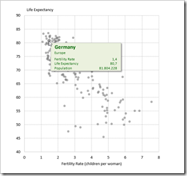
Customizable Chart Tooltips on Excel XY Scatter ChartBack in December 2010, I published an article about Better Chart Tooltips with Microsoft Excel. The post described the weaknesses of Microsoft Excel’s standard chart tooltips and provided a VBA-based technique how to get to customizable, meaningful and more useful tooltips in Excel.

Today, I would like to revisit this topic for several reasons:

Firstly, Microsoft hasn’t done anything about this shortcoming in the versions 2013 and 2016. The problem of insufficient chart tooltips in Excel remains.

Secondly, the workbook provided in 2010 implemented the better chart tooltips on another dashboard with additional features, which was published here: Bluffing Tableau Actions with Microsoft Excel. Many people have asked for a simplified, generic template only providing the tooltips on a standard XY Scatter chart.

Next, reader Will Clark came up with the great idea of using a camera object instead of a simple textbox, in order to have more formatting options.

Last, but not least, I discovered another approach for creating interactive charts in Excel. I already used and published this in several posts (Another Technique for Interactive Excel Charts, Selecting and Highlighting Areas on Excel Charts, Select Areas on a USA Map in Microsoft Excel and Zooming in and out of Excel Charts), but this technique is also viable for implementing chart tooltips.

Today’s post will discuss again Excel’s shortcomings in terms of chart tooltips, briefly describe 4 different techniques how to overcome this issue and – as always – provide the Microsoft Excel workbooks for free download.

The Requirement and Excel’s Shortcoming

Tooltips are a very helpful feature for exploring and analyzing data. This is especially the case on XY Scatter or Bubble charts with a lot of data points.

An XY Scatter Chart is the perfect choice to display the relationship between two variables X and Y and the distribution of the data regarding these two measures. However, without further chart elements (like data labels) or interactive features (like tooltips), there is no way to easily explore and analyze the data in detail, e.g. examine the maximums and minimums or the outliers.

Let’s have a look at an example. Here is an XY Scatter chart comparing fertility rate (children per woman) and life expectancy in years of more than 200 countries in the year 2013 (data source: Gapminder):
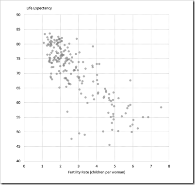
Gapminder XY Scatter Chart

You now easily see the distribution of the data and the relationship between the two variables. But what if you want to analyze the data in more detail and get some information about e.g. the country at bottom left with a relatively low fertility rate of ~2.5 and a life expectancy of only ~47 years?
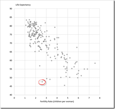
Gapminder XY Scatter Chart Outlier

Knowing the exact values of the two measures is certainly one thing you are interested in. More important, however, is the very simple question: which country is this?

Adding data labels is usually not an option, because with this amount of data points, labels will clutter the entire chart and make the view useless. Thus, tooltips are the best way to display additional information on user request, i.e. when hovering the mouse over a data point.

Shouldn’t be a problem, right? Excel does provide tooltips on charts, doesn’t it?

Yes, it does and here is how this looks like in our example:
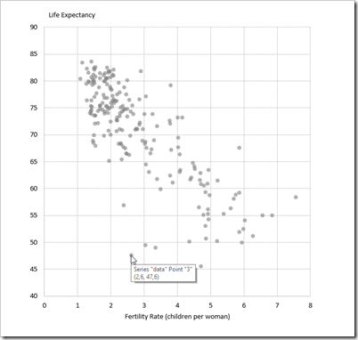
Standard Excel Tooltip

Excel’s tooltip gives us the name of the data series (which can be helpful, if you have more than one), information about the point (Point “3”) and the exact values of the measures (2.6, 47.6).

You may assume, Point “3” means that this country is the third row in the data source, but it isn’t. Point “3” means that this point belongs to the third category of the X-axis. All data points with an X-value between 2.6 and 3.5. belong to category 3, all points with an X-value between 3.6 and 4.5 belong to category 4, and so forth.

So, you can’t even use the point-information to look up the country in the data table.

The only way to get to the name of the country is to

  • remember the values of the measures
  • switch to the data table
  • sort the data table by fertility rate and life expectancy (this is optional, but definitely helpful for the next step)
  • and finally scroll through the data table to find the row with the values of fertility rate and life expectancy and get the name of the country
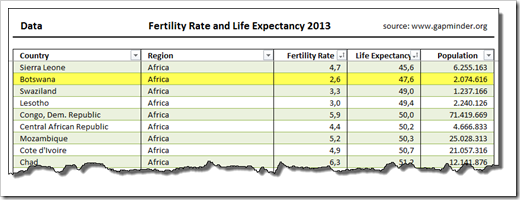
Find data point in data table

Now we see it. It’s Botswana. It works, but I am sure you will agree that this procedure is everything else than convenient, effective and user-friendly.

Let’s have a look at other data analysis and data visualization applications. Based on the same data, it took me less than 3 (!) minutes to create the following view with Tableau Software (including the formatting of the tooltip):
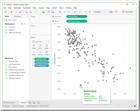
Tableau Tooltips Example

Hovering over any given data point, the tooltip displays the values of a selection or (like in this example) even all dimensions and measures in the data.

Although it definitely should, Microsoft Excel does not provide a standard option to customize the chart tooltips. All you can do is turning them on or off in the advanced Excel options.

As always, VBA can help to overcome this shortcoming: a few extra formulas in a formatted cell range, a camera object and a few lines of VBA code and you can provide your user with a tooltip functionality comparable to Tableau:
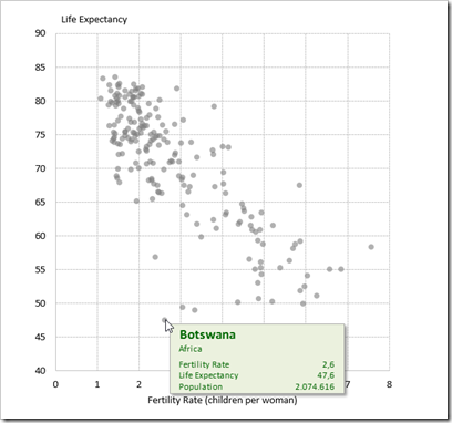
Customizable Chart Tooltips on Excel XY Scatter Chart

The following sections will describe four techniques of how to create meaningful and easy-to-use tooltips on an XY Scatter chart.

Technique 1 – Chart Mouse Move Event and a Textbox

This is exactly the technique used in the article Better Chart Tooltips with Microsoft Excel. For a more detailed description of the steps, please refer to that post.

Here is just an overview of the required elements and code:

  • An additional column in the data table with the tooltip texts (created by a string concatenation formula)
  • A formatted and named freeform textbox (“myshpTooltip”) on the worksheet with the embedded chart
  • Jon Peltier’s chart event code provided here: Get XY on any Chart
  • The points per pixel function from the great book “Professional Excel Development” by Stephen Bullen, Rob Bovey and John Green
  • Adjustments of the sub myEmbeddedChart_MouseMove to detect the position of the mouse and – if the mouse hovers over a data point on the chart – assign the defined tooltip text to the textbox and make the tooltip visible. Otherwise the textbox is set back to invisible. If you are interested in the details, have a look at the VBA code of the template (download link see below)

That’s it. A text formula, a textbox and 117 lines of VBA code.

The disadvantage: the tooltips are only visible if the chart is selected, i.e. the user has to click on the chart first before the tooltips appear.

Technique 2 – Chart Mouse Move Event and a Camera Object

The second technique is a slight variation of the first one: instead of using a simple textbox and changing the text via VBA, a camera object is used as the tooltip:

  • The additional column in the data table is not needed, because the code does not assign a text to the shape anymore.
  • Instead, it writes the index of the current data point (i.e. the one the mouse hovers over) to a cell called [myPointIndex]
  • Based on the value of [myPointIndex], the relevant information is fetched from the data table by simple INDEX formulas in a cell range called [myTooltip]
  • The cell range [myTooltip] can now be formatted as desired (font type, sizes and color, number formats, alignment, etc.)
  • Finally a camera object is inserted on the worksheet with the embedded chart, named “myshpTooltip” and linked to the cell range [myTooltip]

The major advantage of technique 2 is the option to format the text of the tooltip as you like.

Technique 3 – Label Mouse Move Event and a Textbox

Last year, I discovered another technique to implement interactivity on Excel charts. Excel MVP Andy Pope uses an ActiveX label control on top of a chart to track and manage mouse positions. The main advantage compared to techniques 1 and 2: Andy’s approach doesn’t require to activate the chart first.

  • Like in technique 1, we need an additional column in the data table with the tooltip texts
  • The heart of the solution is an ActiveX label control (insert one via the DEVELOPER tab and Insert):
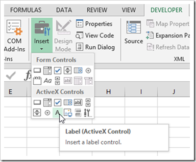
Insert ActiveX Label Control

  • Position and resize the label control to sit exactly on top of the plot area of the chart
  • Format the label control to be invisible (white back color and transparent back style)
  • On the additional worksheet Control, define three named ranges ([myCurrentX], [myCurrentY] and [myDisplayTooltip]) and a data entry cell to let the user define a tolerance deviation
  • Add the MouseMove event sub of the label control on the worksheet object of the sheet with the XY scatter chart
  • The code inside this sub calculates the values (not the coordinates) of the current mouse position and writes them to the cell ranges [myCurrentX] and [myCurrentY]
  • On the worksheet Control, an array formula using MATCH, SQRT and MIN detects the nearest neighbor in the data to the current position (cell C9 on worksheet Control)
  • The named cell [myDisplayTooltip] contains a formula checking if the nearest neighbor is within the user-defined tolerance to the current mouse position. If it is, the formula returns TRUE, otherwise FALSE
  • The code checks the value of [myDisplayTooltip] and if it is TRUE, the text will be added to the textbox, it will be positioned on the worksheet and made visible. If [myDisplayTooltip] is FALSE, the code hides the tooltip

That’s it. Agreed, compared to technique 1, you need an additional worksheet and more complex formulas. On the other hand, the code is even slimmer (only 52 lines).

Technique 4 – Label Mouse Move Event and a Camera Object

This is a variation of technique 3 and – similar to technique 2 – uses a camera object instead of a textbox.

Not so much to explain here, I guess.

The Disadvantages

All four techniques are workarounds and – like most workarounds – they all have their disadvantages:

  • Techniques 1 and 2 are not working seamlessly. You have to activate the chart first (i.e. click on the chart area) to make the tooltips working. This is not intuitive and the user has to know this
  • Techniques 3 and 4 are providing a more seamless user experience, but they only work at a zoom level of 100% and if the entire chart is visible in the application window. The code forces the zoom level to 100% and this usually solves the issue, but it is still a drawback
  • Techniques 1 and 3 are very limited in terms of formatting options
  • Techniques 2 and 4 provide more formatting options, but the camera object is known to be a bit buggy sometimes and may lead to problems under certain circumstances
  • All techniques require VBA
  • All techniques require a considerable time for setting up the workbook, the chart and the code

Agreed, a lot of disadvantages, but the techniques are working and provide much better chart tooltips than Excel’s standard.

Download Link

Here is a zipped folder containing one template for each of the four techniques described above for free download:

Download tooltips on XY scatter charts (4 zipped Excel 2007-2016 workbooks, 215.9K)

Acknowledgements

Many thanks go again to Microsoft Excel MVP Jon Peltier for providing the chart mouse event code and to Microsoft Excel MVP Andy Pope for sharing the idea of using a label control for chart interactivity (see here: Clocks). Thank you, gentlemen.

More new posts to come soon.

Stay tuned.

Comments

75 responses to “Customizable Tooltips on Excel Charts”

  1. Anton Roodhuijzen Avatar
    Anton Roodhuijzen

    Thanks for the excellent post and workbooks.

  2. Andrew Avatar
    Andrew

    Excellent site Robert.
    Is it possible to combine this technique or similar with your world map excel http://www.clearlyandsimply.com/files/2009/06/choropleth_map_world_color_scales.xls?

  3. Robert Avatar

    Andrew,
    unfortunately no, at least not directly. The technique used above takes advantage of the chart method .GetChartElement to identify the data point the mouse cursor is currently hovered over. The Choropleth Maps consist of freeform shapes and there is no built-in VBA method to directly identify the shape under the mouse. I.e. you would have to develop your own VBA code to implement such a method. I never tried, but I assume this may be way more complicated than it sounds.
    Another option is displaying a customized tooltip after clicking on a shape of the map (e.g. using Application.Caller), but this wouldn’t be a real tooltip anymore…
    Finally, you can show tooltips on a Choropleth Map using a hyperlink as shown in the article

    Fast Choropleth Map with Enhanced Features

    but there are no options to customize the tooltip.

  4. Ben Avatar
    Ben

    How can I plot a multiple datasets (i.e. different colored points) and still have the tool tips function correctly?

  5. Robert Avatar

    Ben,
    you have to adjust the VBA code: the argument Arg1 of the method .GetChartElement specifies the data series.
    I am referring to the textbox option now: first you need another data column concatenating the text for the tooltip of the second data series. Next, you have to adjust the VBA code e.g. like this:
    If lng_Argument1 = 1 Then
    .TextFrame.Characters.Text = Worksheets(“Data”).ListObjects(“tab_data”).ListColumns(“Tooltip”).DataBodyRange(lng_Argument2, 1)
    ElseIf lng_Argument1 = 2 Then
    .TextFrame.Characters.Text = Worksheets(“Data”).ListObjects(“tab_data”).ListColumns(“Tooltip2”).DataBodyRange(lng_Argument2, 1)
    End If
    For more than 2 data series, you would certainly use a Select Case statement instead of the IF clause.
    Doing this for the camera object option would require some other adjustments, but those would be along the same lines.

  6. Ben Avatar
    Ben

    Robert,
    Thanks for the response.
    How do I set up the second data series though? In your example code, it looks like you have have the second data series still on “Data” worksheet and a part of the “tab_data” table, with just an additional column for Tooltip2.
    Do you not need a new table? Everything I include in tab_data still plots as one data series.
    Sorry if these are very silly questions. I am brand spanking new to VBA/macros/anything above middle school level of Excel usage. I have a general understanding of what the code is doing, but I don’t really get much of the syntax or commands. Like how Arg1 is specifying the data series (i.e. I see it called out in the code, but I don’t see where you assign it to any data)
    Thanks

  7. Robert Avatar

    Ben,
    have a look at this generic example with 3 data series:
    Download tooltips on xy scatter charts more data series (42K)
    Maybe this makes things clearer than lengthy explanations in a comment.

  8. James Avatar
    James

    Hello Robert, would you be interested in doing me a step-by-step guide/do this for me?
    I would be willing to pay for these services

  9. Robert Avatar

    James,
    sure, send me an email (email-link at the top of the blog) and we will figure out how I can help you.

  10. James Avatar
    James

    Have emailed you Robert – thanks.

  11. emanuele Avatar

    Robert, you are the man! thanks to your post I am now able to create the labels for my Scatter chart.

  12. Anne Shirley Avatar
    Anne Shirley

    This is brilliant. Thank you. Can you tell me how I can discriminate between two or more instances where the data being plotted is the same. The tooltip only highlights the first instance when it occurs and not the other instances.

  13. Robert Avatar

    Anne,
    have a look at this workbook with a small variation of the technique:
    tooltips_on_xy_scatter_charts_multiple_data_points (60.5K)
    The tooltip shows up to maximum 5 data points with the same X and X values. A few extra formulas on the [data] and [tooltip] sheet, but no changes of the VBA code.
    I hope this will be helpful.

  14. Juan Jose Baena Arenas Avatar

    In my case, the scale of the x-axis is logarithmic. How would I have to modify the VBA code in that case?

  15. Robert Avatar

    Juan,
    I would recommend to use one of the approaches taking advantage of the chart mouse move event (techniques 1 and 2 described above). They work with logarithmic scaled axes as they are. No changes of the VBA necessary.

  16. Jason Avatar
    Jason

    Great technique!
    Is it possible to make this work across multiple charts on the same (or different) sheets? I experimented a bit but couldn’t get them to show on a second, duplicated chart.

  17. Robert Avatar

    Jason,
    this is possible, of course, with a few changes in the workbook and an additional line of code. Have a look at this example:
    Download customizable tooltips on more excel charts (71.8K)

  18. JC Robledo Avatar
    JC Robledo

    o
    Hi Robert, first of all, thank you very much for sharing your work. Then, i used your examples to implement custom tooltips to a line chart where i need to show related info for each specyfic point of every series. Its works great but i have randoms crashes related to another chart in the same sheet. The charts are in a secondary sheet, so i change the initial run from the workbook_open event o the worksheet_activate, which i think could be causing the hang, i never worked with class modules, how do you change the chart events to only one chart instead all the charts? (there are 4 more charts preceding the one who needs the tooltips).

  19. Robert Avatar

    JC,
    if you have more than one chart on a worksheet, but want to display the tooltips only on the first chart, the Set_All_Charts sub would look like this:
    Sub Set_All_Charts()
    If ActiveSheet.ChartObjects.Count > 0 Then
    ReDim myCharts(ActiveSheet.ChartObjects.Count)
    Set myCharts(1).myEmbeddedChart = ActiveSheet.ChartObjects(1).Chart
    End If
    End Sub
    Change the “1” to the index of the chart in your sheet which shall disply the tooltips.

  20. Xavier D. Avatar
    Xavier D.

    Hi,
    A huge thanks indeed for sharing this worksheets, this is most helpful!
    We ran into a problem though:
    – When filtering on the data, it updates the chart accordingly,
    – However, this cause an issue in the “Point Index” variable => it shows the right index (ex: 15), but then when running the search in the date based on the index, the result is wrong (eg, 10 rows were “hidden” with the filter => we should read the line 25 instead of line 15). And as a consequence the tooltips shows the wrong data.
    I tried to fix that but could not find in the code where the Point Index variable was set (I am a total beginner in VBA…).
    Thanks in advance for your advice.
    Best Regards,
    Xavier

  21. Xavier D. Avatar
    Xavier D.

    Hi Robert,
    thank you so much!
    We now have a really really great tool!
    Best Regards,
    Xavier

  22. JeffK627 Avatar
    JeffK627

    Hi Robert,
    I see that JC Robledo managed to implement this in a line chart, but when I tried it I got an error, “Method ‘MaximumScale’ of object ‘Axis’ failed”, on the line “dblXScale = (.Axes(xlCategory).MaximumScale – .Axes(xlCategory).MinimumScale) / LArea.Width”. It appears that line charts don’t have the MaximumScale or MinimumScale methods on the Category Axis from what I’ve found via Google. Can you clarify?
    This is for a Blood Pressure tracker. The Category axis has 3 data points, Date, Time, and Arm (L/R), and I’m trying to get the values from a Comments column in the tab_data table to be the tooltips.

  23. JeffK627 Avatar
    JeffK627

    I should probably have mentioned that I’m using Technique 3 and that my Value axis also has 3 data points: Systolic, Diastolic, and Heart Rate.

  24. Robert Avatar

    Jeff,
    line charts have minimum and maximum scales on the category axis, too, but only if the data on the X-axis is numerical or a date/time and this seems to be not the case in your set-up.
    It won’t work if you have a categorical dimension on the X-axis.
    If you are trying to visualize the development of blood pressure, date/time should be on the x-axis and blood pressure on the y-axis. The chart would then show the development of blood pressure over time and the information about the arm should be shown in the tooltip. This would work with the technique I have shown above.

  25. JeffK627 Avatar
    JeffK627

    Thanks Robert, I did figure out that it was the non-numeric data that was causing issues. I do want to keep the arm data on the X-axis though.
    I managed to use a method similar to the first technique above to get a custom tooltip to appear when clicking on a data point. I think I can make it work with a mouseover by using the count of data points on the X-axis instead of maximum scale. I’ll let you know if it works!

  26. Ryan Avatar
    Ryan

    Hi Robert,
    How do I get the tooltips to work on a chart in another sheet? The Set_All_Charts sub does not seem to work for another active sheet with a chart on it.
    I have successfully assigned another data table to the tooltips, but these tooltips are now appearing on your scatter chart.

  27. Nina Avatar
    Nina

    Hi!
    Is there a way to do somewhat the reverse of this? I have a large data set plotted in a dynamic scatter plot and I’m trying to figure out a way to highlight the data point on the chart from a specific cell in the linked table. ie. when I highlight cell B3 I’d like to see that point on the chart change color for instance. Is there a way to do this?

  28. Robert Avatar

    Nina,
    Have a look at this article:

    Highlight Actions in Microsoft Excel

    I assume this is the technique you are looking for.

  29. Nina Avatar
    Nina

    Perfect thanks! Took a bit of jiggering to adapt it to my set up and now my chart is showing a 0 point for (I’m assuming) all the #NA values in my highlighted series although I have it set to show empty cells as gaps not zeros…but other than that everything is working now!

  30. VBAnewb Avatar
    VBAnewb

    Hi Robert,
    I’m trying to apply custom tooltips to a dynamic scatterplot powered by a pivottable which has slicers and timelines as well. I’m mostly trying to wrap my head around using Technique 2, and am very lost with implementing the VBA code. Is there a more detailed, step-by-step tutorial available for setting up my data, formatting it, then going into developer and writing (copy/pasting/adjusting) the VBA code?

  31. Robert Avatar

    Hi,
    I am sorry, I do not have a more detailed description, but the entire VBA project has only 117 lines of code and the most important class (clsChartEvent) is commented. It should be possible to understand the implementation by reading the code and the comments.
    Having said that, if I understand you correctly, you want to implement customizable tooltips on a Pivot Chart. I never tried to do that, but I assume this will require considerable extra coding.
    The technique used above detects the index of the current data series point (the one beneath the mouse cursor) with the GetChartElement method of the Chart object. Since the data is not filtered, this index is equal to the row number in the source data of the current data point. The rest is a piece of cake. Simple INDEX formulas can then be used to display the data in the tooltip.
    If you are having a PivotChart, this would not work anymore, because you can’t directly refer to the underlying data source. The chart displays aggregated and maybe even filtered data and you need extra (new) code to find the data which belongs to the data point hovered over in the chart.

  32. VBAnewb Avatar
    VBAnewb

    more specifically, when I copy over the code from your template workbook to my workbook, I don’t know where to find the code that creates the PointIndex from the mouse hover, or the code that inserts the camera object on the cell range for myTooltip and displays it when I hover my mouse over a point..

  33. VBAnewb Avatar
    VBAnewb

    Robert,
    Thanks for your quick response! So to clarify, the chart I’m working with is technically not a PivotChart (apparently scatterplots are not feasible in PivotCharts). I actually created the scatterplot by selecting a blank cell out of the PivotTable, then selected the data for my series’ by selecting the range of the cells where the PivotChart is located (a workaround).
    I do see how the filtered data could pose a problem with displaying the correct point’s tooltip however, which is why I mentioned the part about my chart including slicers/timelines. Similar to my above workaround though, could I have the code refer instead to the cell range where the PivotChart data is located so that everytime a filter is applied, it would rearrange the indexpoint/row numbers by the new data?

  34. Robert Avatar

    Hi,
    the camera object isn’t inserted by the code. I inserted it manually. The code only relocates the object and hides / unhides it.
    The code which updates the value in the cell named myPointIndex is in the sub myEmbeddedChart_MouseMove of the class module clsChartEvent. This line of code updates the cell:
    [myPointIndex] = lng_Argument2

  35. VBAnewb Avatar
    VBAnewb

    Hi Robert,
    Just an update: got your code to work with my chart! thanks for the help.. only issue is that the custom tooltip shows as well as the default excel chart tooltip, any way to disable? or is the code supposed to be doing that?
    Thanks!

  36. Robert Avatar

    Hi,
    the code is doing this in the Workbook_Open and Workbook_BeforeClose subs (see ThisWorkbook object of the VBA Project).

  37. VBAnewb Avatar
    VBAnewb

    Robert,
    yea this was a simple fix of saving, closing the workbook then reopening.
    I did notice another issue that I’m troubleshooting now. Basically the data that I’m plotting is contracts that have a start year, an end year, and a dollar value. My scatterplot has 3 series, one to plot the start and $, one for end and $, and the last which is a second pivottable formatted so that all the contracts are paired together (e.g., 1990 $200, 2000 $200) and a blank row between each contract. I then format that 3rd series to remove the marker from the scatter and instead use a line which then connects the start and end year. The blank rows are required so that each contract isn’t connected to each other with a diagonal line.
    The problem I’m having with the mousehover code is that when my mouse is hovering over the line series, it recognizes the data from the 2nd pivottable I have, but because that pivottable isn’t identical to the pivottable that the tooltip is indexing from (in terms of the pointindex/rownumber), I’m getting the tooltip showing the wrong contract ID when hovering over the line.
    any way for me to alter the code so that when I hover over the line series, I can instead display the tooltip of say the marker that corresponds to the start year and $ for that contract?
    sorry for the lengthy post! and thanks for being so responsive to my questions! You’re code has been amazing so far!!

  38. Robert Avatar

    Hi,
    actually, it is hard to answer your question without seeing your workbook and how you set it up. You can send it by email if you want to (email-link at the top of the blog) and I will have a look. No promise, though, that this could be within the next days, but I will try to provide my 2 cents as soon as I have the chance to.

  39. VBAnewb Avatar
    VBAnewb

    Hi Robert,
    I appreciate the offer to look at my workbook, but unfortunately the data I’m working with is secure and can’t be sent out. I did find a workaround that instead disables the tooltip for when my house hovers over the scatterplot series for the line connecting the start year and end year. If lng_Argument1 = 3 Then “myshpTooltip”.visible = false. That is a good enough fix for now but I may do some more troubleshooting to get the tooltip to display the correct information. Thanks!

  40. Steven H Avatar
    Steven H

    This is amazing! Thanks for putting your stuff out there like this, it’s a huge help!
    I implemented technique 2 moving from an embedded object to a chart sheet and with multiple series with very little difficulty.
    One issue I can’t seem to debug though is that while my chart is a scatter plot, I need to present it with both lines and markers. As it is, the code seems to pick up the line between pt1 and pt2 for example and show the tooltip for pt2 anywhere along the line.
    Is there an easy way I am missing that it will only pic up on marker data and ignore lines?
    I’ve considered duplicating the series as a work around, one plotting only markers and one plotting only lines, and then wrapping the tooltip show command within a check of the series ID as I do for different series anyway, but for large data sets this would be clumsy and inefficient…

  41. Robert Avatar

    Steven,
    if you are using an XY scatter plot with lines, the lines belong to the data series of the chart just as the markers do. As you said, by definition the entire line between point 1 and point 2 belongs to point 2.
    The method .GetChartElement does not deliver any detailed information about whether you are above a marker or a line of the data series. You only get the information that it is the data series (ElementID) and the point index (Arg2).
    So, I am sorry to say, but I do not see another solution than the “clumsy and inefficient” workaround you already described in your comment.

  42. Steven H Avatar
    Steven H

    That’s what I feared, oh well, clumsy and inefficient it is, but still WAY better than it was previously.
    Thanks again 🙂

  43. Jack Avatar
    Jack

    Hi Robert, this is awesome! I’ve got the code to work on my project but since implementing it, it has skyrocketed the computing times for the other macros in my workbook. I’m using it in a report that updates weekly and my runtime has increased 100-fold. Is there a way to disable the tooltip functionality while my other code runs and then enable it after the new table is generated? Or do you have any thoughts on why it dramatically increases the time it takes to index through my sheets? I’m a beginner and have been googling a solution for hours but can’t find anything, any insight would be greatly appreciated!

  44. Robert Avatar

    Jack,
    the tooltip code is only running when the chart is activated, so as long as the chart is not active while your other code is executed, I do not see why my code should slow down your macros.
    What you can try to do is to call the sub AppEventsOff at the beginning and the sub AppEventsOn at the end of your code. This should disable the tooltip functionality during the execution of your macro.
    If this doesn’t help, you can send me a sanitized version of your workbook by mail and I will have a look.

  45. Angela Moss Avatar

    Hi I have been using the chart events text box version successfully on Excel 2010 and windows 2007. We have now moved to Windows 10 and Excel 2016 and although I do not get any VBA errors the tooltip box appears only for some of the xy points and the tooltip which shows does not contain the correct tooltip content for the xy point hovered on. I would appreciate any thoughts/solutions you may have to resolve this.
    Many thanks

  46. Robert Avatar

    Angela,
    I used the technique with
    Excel 2010 / Windows 7,
    Excel 2013 / Windows 7,
    Excel 2016 / Windows 10 and nowadays with
    Excel 365 / Windows 10
    and never had the problem you described. You can send me your workbook by email and I will check if I can reproduce the error on my machine, if you want.

  47. Juan Avatar
    Juan

    Hello,
    Thanks for the tutorial, using the tooltips_on_xy_scatter_charts_label_events_camera.xlm example, if I resize the graph, the system doesn’t work fine in the new extended area, column I, J….

  48. Robert Avatar

    Juan,
    did you also resize the ActiveX label control?

  49. Juan Avatar
    Juan

    Thanks!!! It was that!!

  50. Jon Peltier Avatar

    Hi Robert –
    Somehow I never encountered this post in the past, nor Andy Pope’s approach using mouse events of an ActiveX label.
    I have a project where I am using chart mouse clicks for various purposes, and the fact that I cannot protect the chart was causing me problems. But Andy’s approach, with an ActiveX label, is just what I needed. All I have to do is convert the mouse coordinates over the label from points to pixels, and I can use GetChartElement for the underlying chart.
    So thank you for posting all of this. I notice that since the Covid situation has started that you’re posting more than you have been. I’ve been posting very little, not because of lack of ideas, but because posting requires a certain motivation that I’ve been lacking.

  51. Robert Avatar

    Jon,
    many thanks for your comment. I am glad you liked the post and I am happy to hear that this may help you in one of your projects.
    Regarding your statement “no lack of ideas, but a lack of motivation”:
    I hear you. I lost my motivation back in 2017 and I didn’t post anything for more than 2.5 years. When the lock down started, I needed something to keep me busy, though. Hence, I decided to revive the blog…

  52. Arun Avatar
    Arun

    Thank you Robert, for your excellent posts and tools. I used this particular tool (tool tips) in one of the projects that I’m working on. It was very easy to integrate into my code.
    Also thanks to Jon Peltier (https://peltiertech.com/) for developing and sharing portions of the code.
    Appreciate it very much.

  53. Dove Avatar
    Dove

    I am very happy I came across this post, amazing help! Thank you very much, it was really helpful in making my data more explorable!
    However, I have one issue I was not able to solve (sorry – very, very new to VBA): my scatterplot has 3 series, but I only need to have the code working for one of them (the others are there just to highlight portions of the data with different symbology when prompted by a drop-down list, and are connected to other tables).
    Unfortunately, as it stands, the textbox reports an incorrect text on the points that also belong to series 2 and 3: I need the box to only fish out the text for series 1 and ignore the other 2. Is that feasible?
    Many thanks again!
    P.s.: I am using technique 1

  54. Robert Avatar

    Dove,
    please have a look at my reply to Ben on March 23, 2017 regarding a chart with more than one data series. My reply also provides a workbook for download.

  55. Dove Avatar
    Dove

    Dear Robert,
    many thanks for the hint. I had already tried that solution, but unfortunately my second and third series are plotted from a data range that contains multi-cell arrays, so I can’t not turn it into a table and reference it in the code (or anyway, Excel tells me so…). I think the best solution would be to have the code only working with the first data series and ignore the subsequent ones, but I’m not sure how to do it

  56. Dove Avatar
    Dove

    Many thanks, your solution works perfectly!

  57. Andy Avatar
    Andy

    hello Robert.. thank you for this, this is really helpful in my project.
    for method 4.. is there a way to apply Method 4 tooltips on 2 or more charts in a sheet? TIA..

  58. Robert Avatar

    Andy,
    please have a look at my reply to Jason’s comment on December 18, 2017 above. I also posted an example workbook to download in my comment.

  59. Jesse Avatar
    Jesse

    Hi Robert,
    Fantastic workbook and really helps with my project. I am having the same challenge with filtering the data. I did apply slicers to the data and the graph is updating accordingly. However, the tooltips are wrong now. Could you please share the solution you shared with Xavier? I can’t download the Excel anymore.
    Many thanks,
    Jesse

  60. Robert Avatar

    Jesse,
    I just tried, the download link in my reply above is still working fine. If it doesn’t work for you, try to right click on the link and select Save Target As.

  61. Jesse Hansler Avatar
    Jesse Hansler

    Many thanks Robert, that indeed worked. Would the same filtering solution be available for the Excel where the tooltip is not based on camera position but on textbox (tooltip is the concatenate)?

  62. Robert Avatar

    Jesse,
    this is possible, too, of course, but it is a little bit more work. Just like in the camera approach, you first need 2 additional columns in the data table to detect, whether the row is visible (i.e. not filtered out) and a running index of the visible rows. Furthermore, you need some changes in the VBA code to first write the value of lng_Argument2 to a cell on a worksheet and another (named) cell to calculate the position of the row in the filtered data. Finally, you have to change the VBA code to first store lng_Argument2 in the cell mentioned above and to fill the text of the tooltip with the value in column [Tooltip] of the row calculated in the named cell (also see above).
    Some work to do, but no rocket science.

  63. Chris Papanicolas Avatar
    Chris Papanicolas

    Hi all,
    This is a great post. I am running into an issue with getting the data to show on the tool tip. Is this something that needs adjusting in the VBA or somewhere else? Not sure ho to get the data into the tooltip.
    Thanks,
    Chris

  64. Chris Avatar
    Chris

    Just to clarify I am using Technique 3

  65. Robert Avatar

    Chris,
    there is a defined named range called “myTooltipText” referring to cell C11 on worksheet [Control]. The VBA code assigns the text defined in this named range / cell to the textbox (the tooltip). Adjust the formula in this cell to define what shall be shown in the tooltip.

  66. Chis Avatar
    Chis

    Thanks Robert. I realized it was technique 2 that I was using. Thanks for your help.

  67. Chris Avatar
    Chris

    Hi Robert, I managed to get this workking. The only issue I am running into is that the tooltip is not returning for me the correct data. I am wondering if it has something to do with the function that chooses the nearest point?

  68. Robert Avatar

    Chris,
    hard to tell without seeing what you have done. Can you send me a sanitized version (i.e. with dummy data instead of your real data) of the workbook? I will then have a look. You can find the E-Mail link at the top of the blog.

  69. Ruben Rubilar Avatar

    Hello
    I just tried the first method !
    And it works !
    Thanks for this valuable post (even if a little old, really useful,

  70. Gary Avatar

    Hi JC, any chance you can share your workbook showing custom tooltips on a line graph?

  71. Astrid Avatar
    Astrid

    Hi Robert, thanks for your great blog posts, this is the second time I found what I was looking for on your website, even though it is quite a few years later. I’m wondering if you have any thoughts on following issue when using 2 monitors with different zoom settings. In that setup, the getchartelement method only returns the correct ElementID on my laptop screen (zoom set to 150%) and not on my secondary monitor (zoom at 100%). I can change the Display Settings to “Optimize for compatibility” and then the tooltips do start working on the second monitor, but the rest of the Excel workbook does not look great at all (blurred text, etc). If I set zoom to 100% on my laptop, it works too, but this is not really workable when wanting to use both screens… It seems this is a known issue for a long time, and I haven’t found anywhere where someone has a work-around/solution. Thanks in advance for any insights you may have!

  72. Astrid Avatar
    Astrid

    As is often the case, once you ask for help, you figure something out (with the help of my software developer partner…). Scaling the X and Y of the MouseMove event by the ratio of the zoom settings between the 2 screens (1.5 in my case) does the job. Now to figure out how to have Excel do this scaling automatically based on the monitor it is open on. Anyhow, no need to respond to this, I think I got it now. Thanks again for the awesome blog, Robert!

Leave a Reply

Your email address will not be published. Required fields are marked *