Another technique to create interactive charts in Microsoft Excel using an ActiveX Label Control on top of the chart
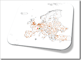 Interactive features add a lot of analytical power to dashboards. If you want to create a professional analysis dashboard, interactivity is almost a must-have.
Unfortunately, Excel does not provide built-in interactive features for charts. However, this doesn’t mean you can’t have interactivity on Excel dashboards.
As always, VBA is the way to overcome Excel’s shortcomings.
We already had a couple of articles providing workbooks with interactive features, like Bluffing Tableau Actions with Microsoft Excel, The Next Level of Interactive Microsoft Excel Dashboards, Microsoft Excel Site Catchment Analysis, Better Chart Tooltips with Microsoft Excel 2010.
All of them were taking advantage of the chart object’s mouse event procedures. More precisely, they were based on the great code provided by Jon Peltier here: Get XY on any Chart.
I recently discovered another technique to implement interactivity on Excel charts. Andy Pope uses an ActiveX label control on top of a chart to track and evaluate mouse positions. Unlike the chart object mouse events, Andy’s approach doesn’t require to activate the chart first.
I “stole” Andy’s idea and used his technique to create a little interactive geography quiz in Excel: find European cities on a map. Today’s article describes the implementation of the workbook and the code and – as always – provides the Excel file for free download.
The Challenge and the well-known Solution
The challenge is to provide an option for a direct interaction with an Excel chart: the user can click anywhere on the chart and a piece of VBA code detects the position he clicked. The result can then be used to select and highlight one or several data points on a chart, exclude outliers, show tooltips, highlight or filter data on other views of a dashboard, etc. Or – as in the example described below – it may simply visualize where the user clicked.
The commonly used approach for this is taking advantage of the mouse move and mouse down events of the chart object. Microsoft Excel MVP Jon Peltier provides a fantastic piece of VBA code for free (Get XY on any Chart) and it is very easy to build any kind of interactive feature based on this great code snippet.
I used Jon’s code in several workbooks and articles for different purposes:
- Select a data point on a chart and highlight the selection across the dashboard: Bluffing Tableau Actions with Microsoft Excel and
The Next Level of Interactive Microsoft Excel Dashboards - Select a data point on a chart and highlight other points within in a certain radius of the selection: Microsoft Excel Site Catchment Analysis
- Show better tooltips on Excel charts: Better Chart Tooltips with Microsoft Excel 2010
Jon’s code works well and is very fast. The only disadvantage of this technique is the fact that it doesn’t provide a totally seamless user experience. The user has to activate (i.e. click on) the chart first before the mouse events are fired. This is not really intuitive and the user has to know this.
The alternative Approach
Recently I learned another technique for realizing interactive Excel Charts: Microsoft Excel MVP Andy Pope inserts an ActiveX label control on top of a chart in his Clocks workbook and uses the mouse events of the label control instead of the mouse events of the chart itself.
Andy’s approach has one major advantage compared to the mouse events of the chart object: the user does not have to activate the chart. As soon as the mouse hovers over the label, the cursor changes to a hair cross and the mouse event procedures are fired.
I have never seen this technique before and I only serendipitously discovered it. It definitely is a very interesting approach and I wanted to see how this works in one of my own workbooks.
The Example – “Where is it?”
I was looking for an appropriate example to test and demonstrate Andy’s technique. You know that I am loving to work with maps in Excel and it is no surprise that I selected a map based example: a geography quiz.
Where is it? Find European cities on a map.
After you opened the workbook (download link see below), you see a map of Europe on the right side of the worksheet and a few parameters and a command button on the left:
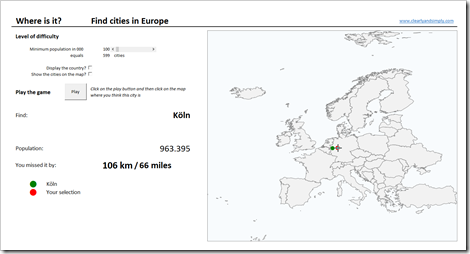
The game is simple: clicking on the play button starts the quiz. The code randomly selects one European city (out of 600 with more than 100k inhabitants) and you are asked to find this city by clicking on the map. After you clicked, your selection (red dot) and the searched city (green dot) are shown on the map. The distance between the searched city and your selection is displayed left to the map.
The parameters at top left let you change the level of difficulty. You can select
- the size of the cities (minimum inhabitants) using the slider
- define whether or not the name of the country shall be displayed
- define whether or not the cities shall be shown on the map
Give it a try. It is fun. And don’t be too strict with yourself. With the given size of the map, every distance smaller than 50 kilometers is a shot in the bull’s eye.
The Implementation
The workbook is rather simple:
- 3 worksheets
- One XY scatter chart, one ActiveX label control, a few freeform shapes
- Less than 10 formulas (without counting those which were simply copied across or down and without the simple links to other cell ranges)
- 3 named ranges / named formulas
- Less than 50 lines of VBA code (without the comments)
Here is a step by step of the implementation:
Step 1: The Data
First, we have to collect the data. I downloaded a list of all cities in Europe with more than 100,000 inhabitants from Geo Names and eliminated some redundancies. The list includes the name of the city, the country, the population, the latitude and the longitude.
I did some spot checks and the data looks reasonable, but please be advised that I did not check every city included in the data. Therefore I do not guarantee for correctness and completeness of this list, especially with regards to the population.
Step 2: The Map
Next step is copying the freeform shapes of the map of Europe from the example workbook provided at the end of this article: Create Excel Freeform Shapes from Polygons.
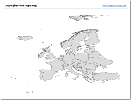
Draw a freeform rectangle around the entire map, color it pastel blue, send it to the back, group all shapes and rename the group to “Land and Sea”.
Step 3: The Workbook
Set up the workbook with 3 worksheets: [map], [data] and [control]:
- Insert the data from Geo Names on worksheet [data] and sort the list descending by population (the sort order is important, see step 5)
- Insert the grouped shapes (see step 2) on the worksheet [map]
- Insert the form controls (slider and check boxes) on [map] and define their target cells on [control]
- Define ranges on [control] to store the coordinates of the searched city and the selected location and assign names to these ranges: “mySearchedCity” and “mySelectedLocation”
Step 4: The XY Scatter chart
Insert an XY Scatter chart with 2 data series: one for the coordinates of the searched city and one for the location the user clicked on. Format the data series as you like (marker and colors) and remove everything else from the chart (title, legend, borders, fill colors of chart and plot area, etc.).
Since the user shall be able to select whether the cities shall be shown on the map or not, we need a third data series. Before adding the series, we need two more columns on [data] as the data source for the cities (columns H and I). The formulas in these columns check if the city shall be displayed or not. If yes, the formulas simply fetch latitude and longitude of this city. If not, the value is set to #N/A, i.e. the city will not be plotted.
Step 5: Additional calculations
Some more calculations are necessary on the worksheet [control], like the number of cities, the position of the currently searched city, the population and the country of the selected city. COUNTIF, MATCH, INDEX, IF, IFNA. Nothing really complicated.
The only complex formula is the one calculating the distance between the searched city and the selected location. The formula calculates the distance using the spherical law of cosines. I won’t go into the details. If you are interested, have a look here: Spherical law of cosines.
Finally a named formula called “myCities” uses OFFSET to define the list of cities to be included in the quiz based on the minimum number of inhabitants selected by the user. This named formula will be used in the VBA code.
Step 6: The ActiveX Label Control
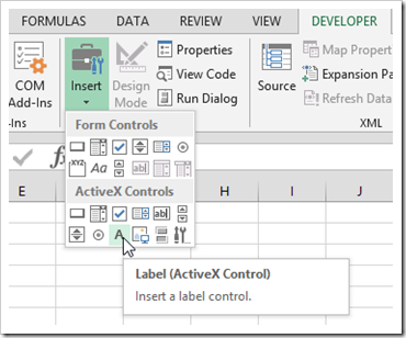
The heart of the solution is inserting an ActiveX label control (DEVELOPER tab, Insert):
The crucial part is resizing and aligning the freeform shapes group (step 2), the plot area of the XY Scatter chart (step 4) and the label control. All three need to have exactly the same size (width and height) and to be aligned top left. Furthermore their order on the sheet is important. The freeform shapes in the back, then the chart and the label (“LArea”) on top:
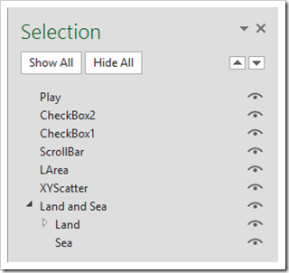
Step 7: VBA Code 1 – The Mouse Event Procedures
The VBA worksheet object [map] contains the mouse event subs LArea_MouseMove and LArea_MouseDown. There isn’t much code. Basically they are just assigning values to globally defined variables (see step 8). Finally the worksheet object contains the sub Play_Click, the procedure which will be fired if the user clicks on the command button “Play”.
Step 8: VBA Code 2 – The Module modPlay
The module modPlay defines 3 global variables and one sub called PlayGame. The sub has only 27 lines of code and each section is commented. Hence, I won’t go into the details here. If you are interested, please have a look to see what the code is doing. If you have any questions, please leave me a comment at the end of the article.
That’s it. It takes some time to set up the workbook, but I think the resulting interactivity is well worth the time.
The Disadvantage
Besides the time you need to set up the workbook and code, the ActiveX label approach for interactive charts comes with one major disadvantage: It works only at a zoom level of 100% and if the entire label is visible in the active Excel window.
Zooming and panning would be very helpful, especially for the geography quiz, but – truth be told – I just couldn’t make it work. Thus, the VBA code in my example workbook forces the zoom level to 100% and the active window to be maximized.
You could overcome the zooming problem with a sub called PointsPerPixel, provided in the fabulous book “Professional Excel Development” by Stephen Bullen, Rob Bovey and John Green. However, this solves only the zooming problem. It is still necessary that the entire ActiveX label is visible in the active Excel window.
It may be possible to allow for zooming and panning, but this is above my head.
The Download Link
Here is the example workbook with the geography quiz for free download:
Download “Where is it?” (Excel 2010-2013 workbook, 627KB)
Acknowledgements
Many thanks go to Andy Pope for sharing this technique and also (again) to Jon Peltier for providing the chart mouse event code. Thank you, gentlemen!
What’s Next?
I will stay with this technique for one more post. The next article will build upon this workbook and demonstrate how you can use Andy’s technique to let the user make a rectangular and radial selection of an area of the chart.
Stay tuned.
Leave a Reply to sophie snder Cancel reply