Bluffing Tableau Actions with Microsoft Excel

Selected techniques to emulate a Tableau lookalike dashboard using Microsoft Excel, including some interactive features similar to Tableau Actions

Actions - Clapperboard ExcelThe recent post described the power of Tableau Actions. Tableau actions allow you to add context and user-defined interactivity features across your workbook. If the user clicks on one of your visualizations, Actions give you full control over what should happen on other worksheets or visualizations. Setting up a Tableau dashboard with various actions like filtering, highlighting and linking to web pages is a piece of cake.

How about Microsoft Excel? Is it possible to implement a similar interactivity on a Microsoft Excel dashboard? Yes it is.

Today’s post describes a set of techniques and tricks to build a replica of the Tableau 50 most prominent summits on earth dashboard using Microsoft Excel. As always, including the workbook for free download.

The Reference and the Challenge

Here is the reference from the recent post: a Tableau dashboard visualizing the 50 most prominent summits on earth, including great interactive features like updating the Google Map view after clicking on a summit on the map or in the data table:
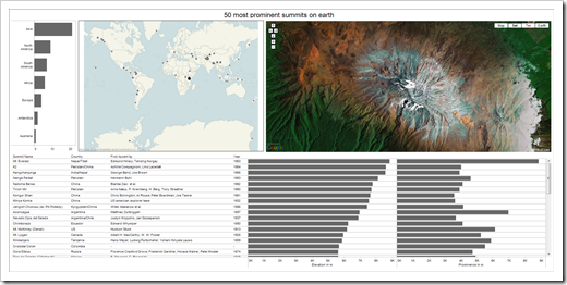
Tableau Public: 50 most prominent summits on earth The challenge is easy to describe: implement something as close a possible in Microsoft Excel.

To make it a bit easier, we allow one restriction: we will not rebuild the filter action zooming into the map after clicking on a continent in the top left bar chart. Other than that, we will create a Microsoft Excel workbook bluffing all other Tableau action functionality.

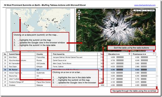
A picture is worth a thousand words, so here is a screenshot explaining the interactive features to be implemented in our Excel workbook:

Actions to be implemented - click to enlargeThe Implementation

Unlike in the previous post, I will not provide a detailed step-by-step tutorial here, because all used techniques are already described elsewhere. Thus, I restrict myself to a quick overview of the implementation including some links to other sources.

Part 1 – The Structure of the Workbook

Nothing new under the sun. If you have already downloaded one of my other Excel workbooks, you might be familiar with the way I am structuring my models. The workbook consists of three worksheets: the dashboard, the data worksheet and a calculation worksheet containing the control parameters and the formulas needed to implement the functionality and the charts on the dashboard.

Part 2 – Controlling User Inputs

For controlling all user inputs and actions, we need 4 parameters, defined on the worksheet Calculations:

  • Actual sort criterion: the target cell of the radio buttons
  • Actual snapshot start: the target cell of the scroll bar
  • Actual selection in table: the position of the actual selected summit in the snapshot table on the dashboard (1 to 10)
  • Actual selection in raw data: the position of the actual selected summit in the source data (1 to 50)
These 4 parameters are the switch board of our interactive features. The values in these cells will be changed after a user input, either by the form controls or the VBA code (see below). All other calculations in the workbook are based on these parameters.

Part 3 – The Visualizations on the Dashboard

The World Map Bubble Chart

Basically it is a simple standard bubble chart with 2 data series. One data series contains all summits, the other data series will be used to highlight the selected mountain. Jon Peltier provides a great tutorial on how to do this in his post Custom Format for Chart Minimum and Maximum.

A bit more tricky is the World Map. Here are the main steps in a nutshell:

  • Export the map visualization from the Tableau workbook including the circles
  • Insert the map as the background of the chart area (chart area|fill effects|picture)
  • Relocate the bubbles by using the technique described in my article Background Image Maps with Tableau until all bubbles are exactly on top of the circles on the map.
  • Go back to Tableau and export the map again without the bubbles (set color to minimum)
  • Insert the map again as the chart area background in Excel

That’s it. A bit of laborious work, but afterwards we have a Tableau lookalike map in Excel.

The Data Table including the Bar Charts

  • Creating a snapshot of a longer list of data on a dashboard and letting the user scroll up and down is a technique I once described on Chandoo’s blog
  • Combine Tables and Charts on Excel Dashboards was a post here on my own blog that showed the power of integrating charts into tables
  • Simple standard conditional formatting highlights the row of the selected summit
  • The functionality to sort the table using the radio buttons has nothing to do with the actions, but sorting is always a helpful feature. You can find a detailed description on how to do this in my second guest post over at Chandoo’s blog
  • The technique to highlight a selected bar is the same we already used for the Bubble chart
  • Finally, an additional dummy series with the maximum of the values ensures that the scale of the horizontal axis stays the same if the user scrolls up or down in the data table

The Web Browser Control

This one is a piece of cake. All necessary information on how to use a Web Browser Control in VBA can be found at the MSDN library. The Web Browser object provides our dashboard with the full Google map view functionality. The user can zoom in and out, go to a different view like map or earth, etc.

 Part 4 – The VBA Code

The sophisticated part of the VBA code are the two modules and two class modules implementing the mouse events and clicks. I haven’t written one single line of this code. Guess where I got the code from? Of course from Jon Peltier, whom else? Here is the link to Jon’s implementation:  Get XY on any Chart. I simply took out the parts I didn’t need in my workbook and called my update procedures from there.

The best thing about Jon’s code is the fact that the mouse events work seamlessly. You do not have to activate a chart first. You can directly click on a data point on the map or a bar and the dashboard will be updated.

The rest of the code isn’t too complicated:

  • The Workbook_Open sub and the Workbook_Close sub turn the application events on and off and navigate the Web Browser to the right URL respectively to an empty page (this reduces the file size before closing).
  • The Worksheet_SelectionChange sub of the worksheet Dashboard checks whether the user clicked into the data table and – if he did – calls the according update sub
  • The module modActionsBluff contains 4 update procedures which change the parameters (see above) to the desired values and navigates the Web Browser to the correct URL. Pretty simple VBA code.

The Final Result and the Download Link

That’s it. There is nothing new or innovative to this way of bluffing Tableau actions with Excel. All techniques are well-known and documented somewhere on the net. My only part in this little project was gathering the information and techniques and stirring them it into my workbook.

Here is a screenshot of the Excel dashboard. It is not exactly the same as the Tableau dashboard (see above), but you have to admit that it is quite a lookalike:
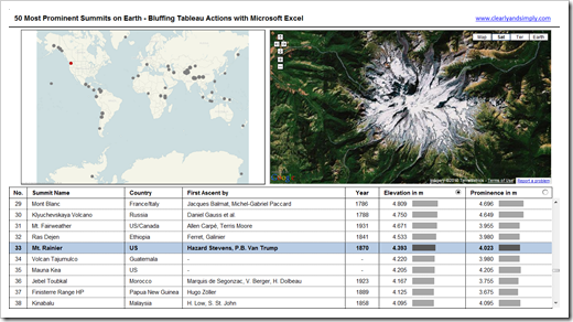
Bluffing Tableau Actions Dashboard - click to enlargeAnd here is the download link:

Download Bluffing Tableau Actions with Excel (Microsoft Excel 2003, 576K)

Why bluffing Tableau with Excel?

Don’t get me wrong. I will not start a Tableau versus Excel discussion here. In my humble opinion, these two products are not competitive, they are complementary. I use both a lot and I would never dismiss one of them.

But then: why bluffing Tableau charts and functionality using Microsoft Excel? From my point of view, there are 3 main reasons:

  1. You will learn a lot. Believe me, if you try to emulate Tableau using Excel, you will learn a lot about data visualization from Tableau and a lot about Excel’s capabilities and flexibility during the implementation of the replicas. Know-how that will definitely be helpful somewhere else.
  2. Of course, there are a lot of people out there who have only Excel available. Bluffing Tableau’s best-of-breed visualizations and features with Microsoft Excel enables those people to considerably improve their Excel workbooks.
  3. Even if you have Tableau and Excel available, you will have projects where Tableau is not the right tool: a business case, a simulation, an optimization algorithm, a what-if-scenario-analysis, a forecasting model, whatever. Challenges, Tableau is simply not built for. Excel is the right tool for this type of projects. Looking at Tableau’s best practices of visualizing data and knowing how to bluff them with Excel will considerably increase the quality and user experience of your Excel models.

You may be asking:

"Come on, there has to be something where the Excel implementation of the 50 summits dashboard outperforms the Tableau workbook?”

Yes, there is something: After selecting a summit on the map that is currently not one of the 10 displayed mountains in the data table, the Excel dashboard navigates to this summit in the data table. In other words, Excel (respectively the implemented VBA code) automatically scrolls up or down until the selected summit is visible. Tableau doesn’t. A small advantage brought to you by Excel’s and VBA’s flexibility.

However, don’t forget about the time needed to set up the workbooks. As soon as you have your ducks in a row (i.e. the source data ready), the implementation of the Tableau workbook takes less than 30 minutes. Try to build this model in Excel from scratch and stop the time. You will see the difference.

Acknowledgements

Many thanks go to Matt Grams, not only for inventing the “Bluffing Tableau with Excel Category” here on Clearly and Simply with his wonderful guest post Bluffing a Visual Cross-tab with Excel, but also for taking the time to review the workbook for this article and for his enduring encouragement. Thanks, Matt!

I would also like to thank Daniel Ferry who was kind enough to spend some of his precious time looking at my workbook, although he was very busy with preparing his amazing Smith Chart implementation at the same time. Daniel found a bug in my workbook using Excel 2007 that I haven’t noticed. Thanks, Daniel!

Last, but not least, special thanks to Jon Peltier for providing the core piece of the VBA code used in the workbook. Thanks, Jon!

What’s next?

As already mentioned in the introduction, the recent post was a how-to tutorial on standard functionality of Tableau Software. I received a couple of comments and emails encouraging me to write more step-by-step Tableau tutorials. Thus, I am tempted to do so. Maybe on Custom Shapes, maybe on Calculated Fields. Or maybe on something else? What do you think? Which feature of Tableau would you like to be covered in a future post here? If you have a minute, please leave me a comment and let me know what you think.

On top of that, I still owe you a follow-up post to Export Microsoft Project Tasks to Outlook. I promised this one a long time ago, but I never wrote it. I guess this one should be next.

Stay tuned.
Comments

32 responses to “Bluffing Tableau Actions with Microsoft Excel”

  1. Jon Peltier Avatar

    Robert –
    You’re welcome. I like what you’ve done with my code.

  2. Daniel Ferry Avatar

    Robert –
    I’m glad I was able to help in a very small way. Your project is a very fine Excel dashboard.
    To be honest I think you helped me much more with that pesky decimal/comma/European/VBA thing that plagued my Smith Chart.
    Thanks again!
    Regards,
    Daniel Ferry
    excelhero.com

  3. Acotgreave Avatar

    Excellent post – I love this kind of emulation. As you say, it may not always be a practical application but the learning process is a great way to push the boundaries of the products, and your knowledge.
    Well done!
    Andy

  4. Daniel Cedeño Avatar

    Excellent post! Amazing work! The book really looks and work like Tableau! I love the geocoding features in this dashboard! Thanks a lot!

  5. Met_Apps Avatar
    Met_Apps

    This is a SUPER JOB! I learned so much by reading this post!
    Do you know of a way to get the GE Map printed from actual excel file without using PrtScrn button?

  6. Robert Avatar

    Met_Apps,
    Thanks! Your feedback is greatly appreciated.
    Copy the following sub to the VBA code (worksheet Dashboard) and assign it to a new command button on the dashboard:
    Sub ButtonPrintPreview_Click()
    Dim eQuery As SHDocVw.OLECMDF
    On Error Resume Next
    eQuery = Worksheets(1).WebBrowser1._
    QueryStatusWB(SHDocVw.OLECMDID.OLECMDID_PRINT)
    If Err.Number = 0 Then
    If eQuery And _
    SHDocVw.OLECMDF.OLECMDF_ENABLED Then
    WebBrowser1.ExecWB OLECMDID_PRINTPREVIEW,_
    OLECMDEXECOPT_PROMPTUSER, 0, 0
    End If
    End If
    End Sub
    Executing this sub will call the print preview of the Web Browser Object. You can either print from the print preview or change the code accordingly (replace _PRINTPREVIEW by _PRINT) to directly print the view.
    However, please be advised that this prints only the view in the Web Browser, not the whole dashboard.
    I hope this will be helpful.

  7. Met_Apps Avatar
    Met_Apps

    Thanks Robert! The print function is definitely a nice utility. It’s a nice work-around until it’s fully supported in the print command 🙂

  8. dan l Avatar
    dan l

    Hawt.
    But how did you highlight the data in the table when it’s clicked on? Is that VBA? Or something else?
    Thing is, I can do most everything in excel that’s not VBA. Because…I am VBA stupid.

  9. dan l Avatar
    dan l

    know what, n/m it looks like it’s all covered on chandoos.
    I’ll rtfm.

  10. Robert Avatar

    Dan,
    the highlighting of the rows in the table is done by simple conditional formatting, depending on the actual position of the selected summit.
    The check whether the user clicked on a row within the table is done by VBA in the Sub Worksheet_SelectionChange. This sub is event driven. It is called every time the user changes the selected cell on the worksheet “dashboard”, i.e. clicks somewhere else or uses the up or down keys.
    I hope this answers your question.

  11. dan l Avatar
    dan l

    Ok. So I took some inspiration from this. So what I have is a bunch of baseball statistics. I’ve layed them into the scrollable/sortable table from your chandoo tutorial.
    So here’s what I want to do:
    When somebody clicks on a row I want to update a couple of charts to show that team. (so, instead of the maps, I get some charts).
    This is a babysteps thing. I’m impressed that I’ve even made it this far.

  12. Robert Avatar

    Dan,
    You won’t get what you want without VBA. Here are the main steps in a nutshell:
    1. Define a cell range name for your scrollable table (“myOutputTable” in the example above)
    2. Define a target cell to store the row number that has been clicked on and assign a cell name (“myActualSelection”)
    3. Add the Sub Worksheet_SelectionChange to your worksheet with the following if-clause:
    If Not (Application.Intersect(ActiveCell, Range(“myOutputTable”).Cells) Is Nothing) Then
    ‘Call your update procedure here
    End If
    See also my previous comment.
    4. Within the if-clause you have to update the cell range “myActualSelection”. Here is the example from the workbook above:
    Range(“myActualSelection”).Value = _
    Range(“myOutputTable”).Cells_
    (ActiveCell.Row – Range(“myOutputTable”).Cells(1, 1).Row + 1, 1).Value
    Assumed you have the serial number in the first column of the data table (like in the example posted above), this statement brings back the serial number of the actual row.
    You have the serial number of the selected team now in cell “myActualSelection” and can change your charts accordingly using INDEX or OFFSET formulas.
    I hope this answers your question.

  13. dan l Avatar
    dan l

    Yes. Thank you. I think I can make this work. I’m really pairing this down to stupid, but—ya gotta start somewhere:
    1. Pop the whole lot of data into a pivot chart.
    2. Set up the charts using getpivot
    3. the ‘myactualselection’ thing will also tie to a offset (which, thanks to your tutorials, I now know way more about) getting the team name.
    4. Feed the team name into the chart sets from get pivot.
    5. Pray.

  14. dan l Avatar
    dan l

    Robert! It worked!
    Well. by ‘worked’ I mean, I was able to cut and paste exactly what you had done with the summit thing and it does what I want it to do. I didn’t even change the names to protect the innocent…it was a direct rip.
    Now, I’m going to drop that vba into NP++ and stare at it until I understand how it works.
    I’m actually really trying to put in some effort to learn VBA. It’s kind of the final frontier for my excel skills.

  15. Robert Avatar

    Dan,
    great. Good to hear that it’s working now. If you have any further questions on the VBA code, please let me know.

  16. dan l Avatar
    dan l

    Thank you. I’m sure I will:)
    Incidentally, I’m analyzing this data using even my admittedly rudimentary dashboard is actually really helpful to learn how to make the tool better. As I play with it, I ask myself questions that I either can or can’t answer based on what’s visible.
    I think I may go through this whole thing again and try to add some elements.

  17. dan l Avatar
    dan l

    Okies, I’ve learned some things:
    Range(“myOutputTable”).Cells(ActiveCell.Row – Range(“myOutputTable”).Cells(1, 1).Row + 1, 1).Value
    the .Row+1,1).Value
    That second 1 tells it to return the left most cell in the row. So where my data is (serial, team, year, salary) I could point it to 2 which would return the team instead of the serial as it does with a 1. That’s good, amiright?
    Moving right along:
    Range(“myotherselection”).Value = ActiveCell.Value
    Is easy and returns the straight up value of the active cell. Changing .Value to .Row returns the row of the selection.
    Likewise:
    Range(“header”).Value = Range(“MyOutputTable”).Cells(1, ActiveCell.Column)
    Returns value of the top cell in the table (in this case, “team”).
    But I’m still trying to figure this out:
    .Cells(ActiveCell.Row – Range(“myOutputTable”).Cells(1, 1).Row + 1, 1).Value
    I realize it’s some slight of hand. I seem to have arrived at the ‘right’ results, but perhaps the wrong way with:
    Range(“test”).Value = Range(“myOutputTable”).Cells(ActiveCell.Row, 1)

  18. Robert Avatar

    Dan,
    let me try to dissect this line of code. Since I do not know the structure of your workbook, my examples refer to my workbook posted above.
    Here is the whole line again:
    Range(“myActualSelection”).Value = Range(“myOutputTable”).Cells(ActiveCell.Row – Range(“myOutputTable”).Cells(1, 1).Row + 1, 1).Value
    The goal of this is to detect the value in the first column of the data table and the actual selected row (i.e. the serial number of the summit) and to write this number to the cell called “myActualSelection”.
    The left side of the equation should be clear.
    Range(“myOutputTable”).Cells(1, 1).Value brings back the value in the first row and first column of the cell range “myOutputTable” (i.e. in the dashboard above the value in cell B20).
    The property .Cells has the parameters rowindex and columnindex. We want to get the serial number which is in column 1 of our table. Thus, the second parameter of the .Cells property remains a hardcoded 1.
    The only dynamic part is the selected row.
    ActiveCell.Row brings back the actual row number on the worksheet, i.e. if we click into the last row of the table, ActiveCell.Row will be 29. However, we need the row number within our defined cell range “myOutputTable”, i.e. the row number for the .Cells property has to be 10. To get there, we subtract the row number where the data table starts (Range(“myOutputTable”).Cells(1, 1).Row), i.e. 20. Finally we have to add 1.
    The result: 29 minus 20 plus 1 = 10
    Thus, the statement on the right side of the equation brings back the value in row 10 and column 1 of the data table.
    Does this answer your question?

  19. dan l Avatar
    dan l

    Aha! Ok. I get it. When I was experimenting with this, I was just using a ‘flat’ table.
    That’s why
    Range(“serial”).Value = Range(“table”).Cells(ActiveCell.Row, 1)
    Worked.
    When I tried porting it over to my bad dashboardy thing, it failed hard. I couldn’t figure out why until I started my first cup of coffee this morning. When I changed .value to .address I was getting results, but not what I had expected. And then, I read your post and determined that I am, in fact, an idiot.
    Thanks again man. This was just the kind of jump start I needed.

  20. Jeff Avatar
    Jeff

    Has anyone gotten this to work with Excel 2007 or later given the web-export-only model for these versions?

  21. Robert Avatar

    Jeff,
    thanks for your comment.
    I am sorry, but I am not sure that I understand your question. I developed the model using Microsoft Excel 2010 and I tested it using Excel 2002, 2003 and 2010. It is working like a charm on all those versions. I do not have an Excel 2007 installation available, but I can’t see why it shouldn’t work with 2007.
    What do you mean by “web-export-only model”?

  22. Dustin Avatar
    Dustin

    Quick question… I’ve been able to figure out most of this but for whatever reason I cannot get the graph to work correct. When I click in the table, everything highlights in the table as it should at the correct bubble is highlighted on the map.
    However, if I just click on the bubble in the graph, it basically selects the bubble on the graph as it normally would it you select a point on the graph. It doesn’t change to the highlighted selection and the highlighted row in the table below does not change.
    What could I be doing wrong? Thanks in advance

  23. Robert Avatar

    Dustin,
    thanks for your comment.
    I am sorry, but I can’t reproduce this. Many people have downloaded the example file and apparently had no problems with the workbook.
    Do you face this issue with the workbook I posted for download or did you use the technique in your own workbook? If it is a problem with your own workbook, you may send me the file by email and I will have a look.

  24. Dustin Avatar
    Dustin

    I’m sure theres a good chance I did something wrong somewhere. I tried to build my own dashboard using your same code. Which pieces of the code deal specifically with clicking the bubble chart and having the correct row highlight in the bottom?
    My guess is that the clsChartEvent was the main piece. Do I need to name my chart ‘myembeddedchart’ for this to work correctly?

  25. Robert Avatar

    Dustin,
    no, you do not have to rename the chart.
    I suspect you did not copy the VBA code of “ThisWorkbook” into your own workbook. AppEventsOn is called in the Workbook_open sub there and this is necessary to initialize the code correctly.
    Open my example workbook, go to the VBE, click on “ThisWorkbook” (or “DieseArbeitsmappe”, I created this with a German version of Excel…) and copy the code from there to “ThisWorkbook” of your own file.
    Let me know if this will not solve the issue.

  26. Dustin Slater Avatar
    Dustin Slater

    Didn’t fix it. I noticed i have the same issue when clicking on the bar charts in the table at the bottom as well. So whatever code allows me to click on the bubble chart or the bar chart was not copied over correctly or I am missing a step.
    If I were to send my workbook to you, where would I send it?

  27. Robert Avatar

    Dustin,
    it can also have to do with other charts on your dashboard (if you are having more than just the map and the bar charts).
    Send me the file and I will have a look. You will find an “Email Me” link at the top and on the left of the blog.

  28. Jo Avatar
    Jo

    Error on startup at this vba line
    Worksheets(1).WebBrowser1.Navigate Range(“myActualURL”).Value

  29. Robert Avatar

    The workbook posted for download is still working like a charm for me. If you are trying to use the technique in your own workbook, make sure the VBA is referring to the correct sheet, the correct webbrowser control and the correct named range.

  30. Neha Avatar

    Robert, I increasingly find that Tableau even though a good UI tool, cannot be very well used to do data manipulations at the backend. I find it lacking extensively in that area vis-a-vis Excel. Can you cover on how to do vlookup equivalent in 2 data sources in Tableau?

  31. Robert Avatar

    Neha,
    it depends on what you mean by “data manipulations at the backend”.
    True, Tableau does not allow changing / manipulating data in the underlying data sources. For very good reasons: it is a Business Intelligence Front End and so it is designed to analyze and visualize data, not to change the data.
    Having said that, if you think of “data manipulations” in terms of enhancing and enriching data for your visualizations, Tableau has various powerful features to do this, for instance
    1. Tableau’s Calculated Fields allow you to create additional dimensions and measures, which are not available in the data source, like “sales per capita” or something similar. Calculated Fields are pretty much the equivalent to an Excel formula
    2. An equivalent to Excel’s VLOOKUP can easily be created in Tableau by data blending. Have a look at this video, for one:

    Re-creating and Extending Your Favorite Excel Methods

    Or am I misunderstanding your question?

  32. Cal Avatar
    Cal

    WOW! My brain is abuzz with ideas on using this in tracking things on my property. Just need to get more attuned to using Google Earth/Maps and integrate images into Excel then maybe use with OneNote as well.

Leave a Reply

Your email address will not be published. Required fields are marked *