Background Image Maps with Tableau

Tableau discovers the world – more detailed maps by using background images and a little trick in Microsoft Excel

© Gerd Altmann / pixelio.deTableau Software offers a very easy way of overlaying data on a map, even without requiring the geographical references (latitude and longitude) in the data source. It automatically identifies field names in your data that are appropriate for visualizations on a map, like state or county and generates the according latitudes and longitudes.

If you are using data of the United States, Tableau provides a very high level of detail (state, county, zip code area) and displays the boundaries and names of the regions on the underlying map. You can even enhance the visualization with a choropleth map showing a variety of predefined US census data.

For other counties of the world, however, Tableau does not (yet?) provide this level of detail. In a data source of Germany, for one, Tableau automatically identifies the 16 states and shows the state boundaries on the map. But that’s it. Higher levels of detail like counties (Regierungsbezirke, Landkreise, etc.) or even zip code areas are not available.

Of course, the folks over at Tableau Software have been smart enough to implement a very easy workaround to overcome this: Tableau provides an option to overlay the data on any given image, e.g. on a picture of a map. Prerequisites for this workaround are a picture of the map and the latitudes and longitudes in the underlying data source. Usually both are easy to find and download somewhere on the Internet. Sometimes, however, the geographical references in your data do not exactly fit to the areas on your map image and Tableau’s visualizations will not be located exactly in the center of the according region.

Today’s post describes this problem using data based on German zip code areas and provides a how-to-tutorial, a Tableau packaged workbook and a little bonus track for my friends in Lithuania.

Tableau’s built-in maps

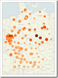
Map of Germany (Tableau's standard) - click to enlarge

Let’s assume we have a database of German data on a level of zip code areas. For your understanding: German zip codes have 5 digits, but only the first 2 digits represent continuous regions. Using the first 2 digits of the zip code divides Germany into 95 regions. That’s right, 95 not 99. The remaining 4 are unused or do not represent a geographical area. But that’s another story.

With only a couple of mouse clicks and drag and drop actions, Tableau generates the visualization shown in the screenshot on the left. It is exactly what Tableau claims to be: rapid-fire Business Intelligence.

In most cases this visualization should meet all of your requirements. However, as already mentioned in the introduction, Tableau does not provide the boundaries of the zip code areas. If you like to see the boundaries as well, you have to use a background image map.

Using background images as maps with Tableau – step-by-step tutorial:

To replace Tableau’s built-in maps by any given image of a map, conduct the following steps:

  1. Organize an image of the background map you want to use
  2. Insert the latitudes and longitudes of the regions into your data source
  3. Open a new Tableau workbook and connect to the data
  4. Drag longitude to the columns shelf, latitude to the rows shelf and the measures to color and size on the marks card
  5. Dismiss Tableau’s built-in map by clicking on Data|Background Maps|None
  6. Insert your image as the background image (Data|Background Images|Add Image|Browse
  7. Set the minimum and maximum values of the longitudes by inserting the longitudes of the left and right border of your image to the left and right field of the X field
  8. Set the minimum and maximum values of the latitudes by inserting the latitudes of the bottom and top border of your image to the bottom and top field of the Y field
  9. Choose the desired washout using the slider
  10. Click ok
  11. Set the axes to fixed scales used in steps 7. and 8. (double click on axis) and hide the axes (right click on axis)

That’s it. Here is a screenshot of the result:

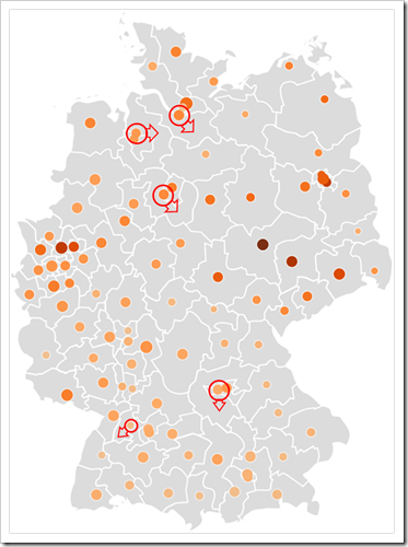
Background map of Germany original - click to enlarge

And here is our problem. The location of the circles based on latitude and longitude in our source data do not correspond to the underlying background map. I added some red circles to highlight a couple of problematic data points. The arrows indicate where the data point should be.

Root cause for this problem could be

  • wrong latitude and longitude values in the data source
  • wrong maximum and minimum values used for adding the background image and fixing the axes scales
  • a small, invisible distortion of the dimensions of the map image

And here is the challenge: find an easy and convenient way to make the locations of the data points fit to the regions of the background image.

The trick – using an undesired feature of Microsoft Excel to solve the problem

In versions 2003 and earlier, Microsoft Excel provides the possibility of changing values of data markers in an XY scatter chart by clicking on a single data point and dragging the point to another position on the chart.

“It's a feature, not a bug.”

Honestly, if you call this one a feature, I would recommend to call it an undesired feature. In my humble opinion the visualization of data should never allow the user to change the underlying data. There is a high risk that users unintentionally change the original data without even noticing. The visualization parts of Business Intelligence software should allow to display, filter, group, brush data, etc. But it should definitely prevent users from changing the original data.
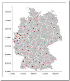
Manipulate Lat Long using Microsoft Excel 2003 - click to enlargeThat said, we will take advantage of this undesired feature for solving our problem described above. Here is the how-to tutorial:

  1. Create a new Excel workbook and copy your data (zip code, latitude and longitude) to it
  2. Insert a XY scatter chart (X = longitude, Y= latitude)
  3. Clean up your chart by removing the usual suspects like the grey fill color of the plot area, the gridlines, the legend, etc.
  4. Fix the scales of the axes to the same values we used in our Tableau workbook (see above)
  5. Select the plot area, choose format, fill effects, click on the tab picture and browse for the file with the image of your map
  6. Click on a data point that is not in the right location and change the underlying latitude and longitude coordinates by dragging the data marker to the desired position. Please be advised that you can drag the data marker only either horizontally or vertically in one step
  7. Repeat step 6. for all data points you would like to relocate
  8. Copy the manipulated data set of longitudes and latitudes to the data source of your Tableau workbook

That’s it.

I know it is somehow hypocritical blaming a feature of Microsoft Excel and exploiting it at the same time. On the other hand: it is still there and if it can be helpful somehow, why not taking advantage of it?

By the way: I assume Microsoft would nowadays call this one an undesired feature as well, since it is no longer available in Microsoft Excel 2007.

The solution

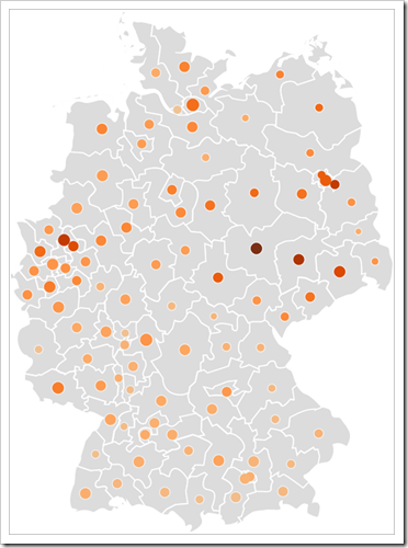
Here is a screenshot of the Tableau map using the manipulated data:

Background map of Germany optimized - click to enlarge

And here is the Tableau Packaged Workbook with a map of Germany by zip code areas for free download:

Download Germany by ZIP code areas (Tableau Packaged Workbook, 259.0K)

To open this workbook you need Tableau 5.0 (14-days free trial) or the free Tableau Reader.

The Bonus Track
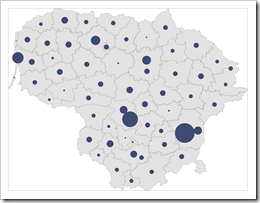
Lithuania by municipalities - click to enlargeIf you are a regular reader here on Clearly and Simply, you may have come across a previous post called Lithuania at a glance.

Thus, you might have reckoned that I spent some time in Lithuania and know Tableau aficionados there as well. If so, you are absolutely right.

So here is one for friends: a Tableau workbook including a map of Lithuania by municipalities:

Download Lithuania Map by Municipality (Tableau Packaged Workbook, 202.2K)

What’s next?

For the fast growing community of Tableau aficionados out there: I am planning to have a couple of more posts on visualization with Tableau during the upcoming months.

For our readers not yet using Tableau: I recommend to download the 14-days free trial: if you are in data analysis and visualization, I guarantee you will love Tableau.

Having said that, of course there will be further posts on Microsoft Excel, data visualization in general and project management here on Clearly and Simply as well.

Stay tuned.
 

Comments

18 responses to “Background Image Maps with Tableau”

  1. Robert Morton Avatar

    Hi Robert, thanks for the interesting post. I wanted to let you know about two options for improving your geocoding and mapping resolution.
    To be able to resolve German zip codes to lat/lon automatically in Tableau, you can use import the geocoding database you described if it’s stored in the format of a CSV file. Simple use the menu “Data >> Geocoding >> Import Custom Geocoding…”
    The other technique you will be interested in is using WMS servers for background maps instead of using background images. You can register WMS servers with Tableau using “Data >> Background Maps >> WMS Servers…”. Once a WMS server is added to the list, it can be selected from “Data >> Background Maps”

  2. Jon Peltier Avatar

    Robert –
    That “undesired” feature is intentional of course, and it is actually very useful. A major complaint by users of Excel 2007 is that this feature has been removed.
    It’s possible that data points can be moved accidentally, but it takes two clicks to select a point, then the selected point needs to be clicked on and dragged. That’s a bit difficult to do unintentionally. If the cell contains a simple value, it updates when the point is released, but if it contains a formula, Excel’s Goal Seek feature is activated, which is a clue that something has happened.
    Here is how it is useful. Suppose I have a complex model and the output is shown in a chart. Suppose further that I see an irregularity in the model, or I want to do some what-if analysis on the model. I can drag the point, and if it is linked to a formula, the Goal Seek feature appears, and I can use it to select which input variable I want to adjust to produce the new chart value.

  3. Giedre Avatar
    Giedre

    Hallo Robert,
    Thanks for another awesome post. Wasn’t aware of the “undesired feature” in Excel, which will def. help a lot when working with background maps in Tableau.
    Greetings from Vilnius!

  4. Robert Avatar

    Robert,
    many thanks for your comment. I am feeling very honored that people from Tableau Software are reading my humble contributions on this blog.
    Many thanks also for your hints. I know of the option to import the custom geocoding data, but I never used WMS servers. I will have to check this and maybe write a post on my experiences with using WMS servers in Tableau workbooks some later day.
    Do you have any recommendations or a list of links regarding WMS servers? Your input would be highly appreciated.

  5. Robert Avatar

    Jon,
    many thanks for your comment.
    I absolutely agree with you with regards to starting the goal seek by dragging data points in a chart.
    This is a very useful feature in Excel models with charts based on calculated values and I used to take advantage of this feature for my own work as well.
    Calling this an ‘undesired feature’ referred solely to the possibility of changing the original data values of the chart’s data source. I am still convinced that it is not a good idea to let the user change the values, especially without informing him what he is about to do.
    If you are aware of all this, you can easily prevent users from changing data unintentionally by using a cell range as the chart data source that simply refers to the original data by direct cell references. Thus, dragging a data point will call the goal seek and the users will be informed that they are about to change the data.

  6. Robert Avatar

    Giedre,
    many thanks for your message and the appreciation.
    I heard through the grapevine (guess who…) that you are creating some amazing visualizations and dashboards. I know it always takes a lot of time to sanitize one’s work and replace all real data by values made up (tell me about it…), but maybe you want to think about sharing some examples of your work with us?
    I would be very happy to feature a guest post from you here on Clearly and Simply.
    Let me know if you are interested.
    In any case, please stay tuned.

  7. Robert Morton Avatar

    I don’t have a comprehensive set of links to WMS servers. However one of Germany showing postal code boundaries is here: http://wms1.ccgis.de/cgi-bin/mapserv?map=/data/umn/germany/germany.map&&
    You can find much more about mapping in our Advanced Mapping Techniques (video & slides) that was originally presented at the 2009 Customer Conference: http://www.tableausoftware.com/videos/advanced-mapping-techniques

  8. Ross Avatar

    Hi,
    Rather than shiffing the data point cant you resize the image file? _ Or have I got the wrong end of the stick?
    FYI, i like shifting data points, it’s a grate feature, very useful.
    Keep up the good work
    R

  9. Robert Avatar

    Ross,
    many thanks for your comment.
    Actually, resizing and distorting the underlying map was my first approach to solve this problem. Sometimes it works, sometimes it doesn’t. Depends on the underlying map and where you want the data points to be located.
    Using the method described above is more general and allows you to individually locate each point on your map exactly to the position you want to have it.

  10. Allan Smythe Avatar
    Allan Smythe

    Just another small trick:
    1. In Tableau, you can annotate a “point” which is to say, annotate a point in the X and Y coordinate system on the view, not attached to any data marks. You can then drag the arrowhead around to change the values of X and Y.
    2. In tableau 5.0 You can leave the excel file open and then hit F5 in Tableau when the data changes.
    I find using 1 and 2 above is a very useful way to clean up X and Y data in your original excel file and I do it all the time.
    No need to create a scatter plot in excel; use un(intentional) excel features; or copy data around to different excel files.
    The key here is that while you are in “dev” mode, make sure your workbook is not packaged.

  11. Robert Avatar

    Allan,
    many thanks for your comment. Both are very good tricks.
    Especially the second one is a great alternative of manipulating the X and Y (read longitudes and latitudes) directly in the underlying data. Great idea, particularly if you need to change the coordinates of only one or a couple of data points.
    It doesn’t take all the efforts of creating a XY scatter in Excel, inserting the image as the plot area background and copying the manipulated data to your Tableau data source. Many thanks for the idea!
    One small comment: After changing the data in Excel, you have to save the Excel file first, before hitting F5 will change the visualization in Tableau.

  12. Eric Avatar

    Fantastic work around. I had MS Office ’07 and not ’03 but I was still able to add the image to a scatterplot and manually change the lat/long. Keep the great tips coming!

  13. bill Avatar
    bill

    Interesting. I must say that your description of how this works (lat/long coords) made it easy to visualize as similar process for world based Excel x-y graph by bringing in a world map as plot area picture and setting up a 100 by 100 (or 1000 by 1000) point grid and then just mapping out each country to a set of x,y points… but I had no idea it was so hard to find a public domain jpeg or png world map with current country names on it.

  14. Robert Avatar

    Bill,
    have you tried Wikimedia Commons?
    A search string like “Political World Map” takes you to a couple of png or jpg maps including the country names.

  15. Juracy Americo Avatar
    Juracy Americo

    Hi all – I’m try to replicate this technique for Brazil, but only for Espirito Santo state by municipality (78 images).
    I already have all the image for each one, but I missing something here…On step 7 and 8.
    As a new user to Tableau I’m wondering whether anyone know how I can get the minimum and maximum values of the longitudes for each one?
    Thank you in advance.
    Juracy Americo

  16. Robert Avatar

    Juracy,
    I am not sure what you need the minimum and maximum of each municipality for.
    What you need for using the described technique are the geodata of the center of each municipality and I am sure you can find a list somewhere on the internet.
    If not, you may also use one of the following tools:
    http://www.add-knowledge.com/maps/
    http://www.findlatitudeandlongitude.com/

  17. Joseph Guindi Avatar

    I know I’m writing this comment a bit late, I totally agree with Jon on this one. This “undesired” feature should have never been disabled. At a minimum, it should have been retained, with the option of enabling / disabling it just like you can lock up other aspects of Excel. I agree that, in general, users shouldn’t be able to change the underlying data in a graph, but some features, when used properly, can be used in very interesting and innovative ways.
    Here’s how I personally found it useful. I didn’t know other people also thought of the technique of map background images. I used it to create a design weather data selection tool for building designers. People don’t work with latitude and longitude, but people being visual they’ll generally know where it is on a map, so when they want to get design conditions for a new building, they just drag the point along to where the thing’s gonna be built. Then built-in functions automatically select the nearest weather station, and this selection itself can also be manually overridden, as the map also incorporates geographical features which might affect proper selection of design conditions. To my knowledge there’s no design software that does this 🙂
    Also, by allowing the user to fiddle around with the location, it serves as a useful reminder that several other weather stations might be just as close, and that the engineer must consider many other factors in selecting the design conditions, factors such as coastal exposure, topography, prevailing winds, etc.
    With this feature gone, I had to replace it with buttons to move the point up/down/left/right, which is really far from ideal especially when it worked just fine thank you. 🙂 But now, users can no longer manually input their latitude and longitude if they desire. All in all, removing this feature results in a significant loss of functionality and could’ve easily been fixed differently (such as letting the user decide?).
    I wonder if this will ever be addressed in Excel 2010 or if it’s gone for good.

  18. Robert Avatar

    Joseph,
    thanks for your comment. I agree with you. Maybe I overshoot calling it an “undesired feature”, However, I am still convinced that it is very risky if a user of a chart or dashboard is able to change the underlying data without knowing / being informed of what he is doing.
    I agree with you: Microsoft should have kept this feature with an option to intentionally turn it on.
    By the way, it is not available in Excel 2010. I don’t think they turn it on again.

Leave a Reply

Your email address will not be published. Required fields are marked *