There is more than one way to heat a map

2D Tabular Heatmaps with Microsoft Excel
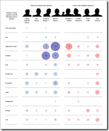
NYT Speakers XL Replica - click to enlarge Inspired by a NY Times chart, Juice Analytics recently had a post and a discussion on bubble chart heat maps: Bubble, bubble toil and trouble. Chris Gemignani wrote:

“The first tool we tried, simply on principle, was Excel 2003. As expected, making a NY Times quality bubble chart in Excel 2003 is a hard problem.”

Juice Analytics is one of my favorite blogs on visualization and I learned a lot from the blog and website. But in this case I do not agree at all. And it seems as if I am not alone.

What had to come, came. Some of us – including myself – could not let this rest.

  • I used Fabrice Rimlinger’s famous Sparklines for XL (free download here) and created a replica of the NY Times chart. Fabrice was kind enough to publish this on his blog (Yes, we can) and his own version with an improved visualization using bar charts (Stick to the classics?).
  • Two days later my friend and Excel MVP Chandoo showed Visualizing Search Terms on Travel Sites, a bubble-chart solution with plain old Excel (no VBA).
  • Last, but not least: Andreas Lipphardt of xlCubed was ahead of his times and had a post on creating heatmap tables with Excel based on bubble charts already in August 2008.

Conclusion: Yes you can. It is not a hard problem to create quality heat maps with Microsoft Excel.

But let’s take one step back. What if you don’t want to use the size of the bubbles for visualization? What if you want to create a classic heat map, i.e. the higher the value, the darker the fill color of the cell and vice versa? Following a definition like the one on Wikipedia:

“A heat map is a graphical representation of data where the values taken by a variable in a two-dimensional map are represented as colors.”

Can you create a classic 2-dimensional tabular heatmap with Microsoft Excel as well?

Yes, you can. And there is more than one way to skin the cat. This post shows the different options and includes all examples for free download.

The data

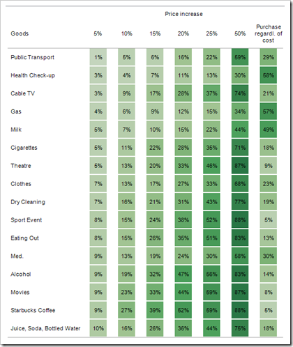
In order to avoid boredom, I decided to use different data for this post’s examples. Everybody is talking about the recession at the moment. So I searched and found an article on marketingcharts.com: Americans Deep in 'Culture of Recession'. The included heatmap visualizes the results of a survey on the question “at which price increase would you stop spending?” for 16 product categories.

Interesting question and interesting results, but I will not discuss the results of the study here. Let’s just take this data and create some tabular heatmaps with Excel.

Depending on the version of Excel you are using and depending whether or not you are willing to use VBA, you have different options for building tabular heatmaps with Microsoft Excel:

Option 1: Excel 2003 without VBA

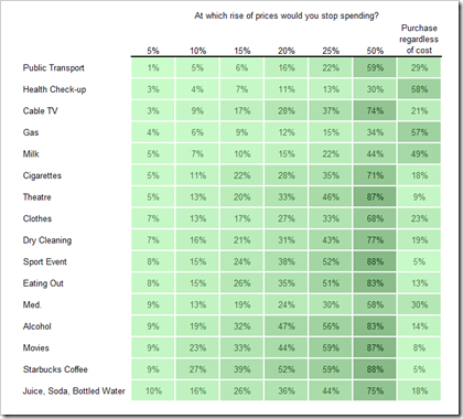
Even if you shrink back from using VBA in your workbooks, you still can create a simple tabular heatmap with Excel 2003. Use conditional formatting to change the fill color of the cells according to the cell value. It already looks like a heatmap but the result is not really compelling:

2D Heatmap XL2003 Cond Format - click to enlarge

The problem is Excel 2003’s limitation to maximum 3 conditions for conditional formatting, i.e. you have only 4 different fill colors on the heatmap. Here is the file for download:

Download 2D Tabular Heatmap XL 2003 Conditional Formatting (Excel 97 – 2003, 53.0K)

Option 2: Excel 2003 with VBA

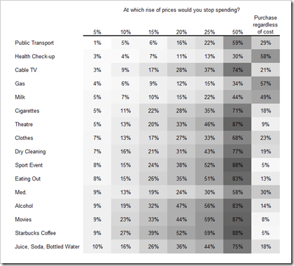
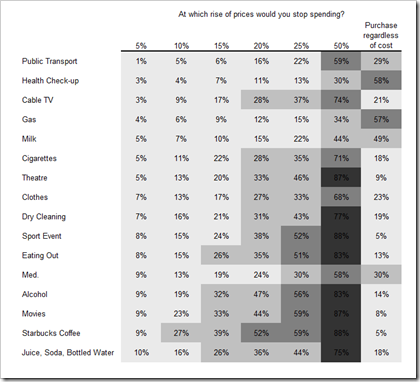
You don’t mind using VBA in your workbooks? Good. A very simple VBA routine (12 lines of code), changing the color palette of the workbook and an additional mapping table to assign RGB colors to the values produce the following result:

2D Heatmap XL2003 VBA - click to enlarge

This looks better, doesn’t it? But there is a shortfall again: Excel 2003 and earlier versions are limited to maximum 56 different colors in a workbook. You can change every color in the color palette of the workbook, but there is no way to get more than 56. In this example I changed all colors of the palette to different shades of grey. Maybe I was taking this too far and you would probably get along if you only change – let’s say – 10 or 20 colors to grey shades. In this workbook, however, you don’t have any other colors than white, grey and black available for formatting cells, charts, etc:

Download 2D Tabular Heatmap XL 2003 VBA (Excel 97 – 2003, 76.0K)

Option 3: Excel 2003 with Fabrice Rimlinger’s Sparklines for XL

As already mentioned in the introduction to this post, Fabrice’s Sparklines for XL include UDFs (user defined functions) to create 2- or 3-dimensional heatmaps. With one single formula in one single cell you can make a heatmap like this:

2D Heatmap XL2003 Sparklines - click to enlarge

Note: I added one line to Fabrice’s original code to make the shapes of the heatmap transparent. Download the workbook here:

Download 2D Tabular Heatmap XL 2003 Sparklines XL (Excel 97 – 2003, 583.5K)

Fabrice’s Sparklines for XL are an incredible piece of work and offer much more than just heatmaps. You can easily create sparklines, spark bar charts, bullet graphs and much more. I am planning to have one or two posts dedicated to the use of Sparklines for XL during the next months.

Option 4: Excel 2007 without VBA

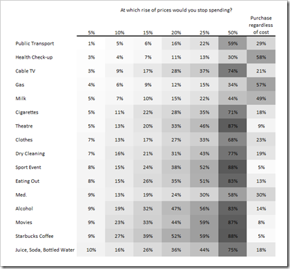
This one is a piece of cake. Since version 2007 Excel provides a color scale conditional formatting option. Select the range, choose conditional formatting and the option “format all cells based on their values”. Select a 3-color-scale and choose white, a lighter grey and a darker grey for the color scale. That’s it. And here is the result:

2D Heatmap XL2007 Cond Format - click to enlarge

Download the file here:

Download 2D Tabular Heatmap XL 2007 Conditional Formatting (Excel 2007, 18.7K)

Option 5: Excel 2007 with VBA

You may ask: If it is that easy to create a tabular heatmap in Excel 2007 using conditional formatting, what do I need VBA for?

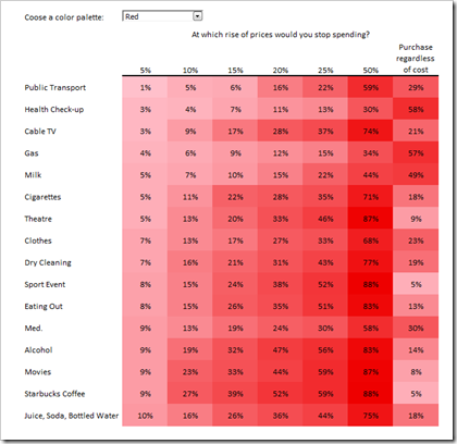
Well, the color scale is defined manually by selecting colors in the conditional formatting dialog. Sometimes you want to have the color scale of the heatmap automatically changed after a user input (another variable, another scenario, applying filters, etc.). Therefore you will need VBA. The coloring of the table is still done by conditional formatting, but the color scale is changed by a small VBA routine called in a worksheet_calculate routine or after changing a drop-down-list:

2D Heatmap XL2007 VBA - click to enlarge

Here is the file for download:

Download 2D Tabular Heatmap XL 2007 VBA (Excel 2007, 30.1K)

Somehow off topic: other options than Excel?

If you are only looking for the visualization and don’t need the heatmap in your Excel model, there are more than enough software packages providing heatmaps. With Tableau, for one, creating the following chart took exactly 3 minutes:

2D Heatmap Tableau - click to enlarge

Download the Tableau workbook:

Download 2D Tabular Heatmap Tableau 4.0 (Tableau Packaged Workbook, 39.6K)

To open this workbook you will need Tableau 4.0 (14-day free trial) or the free Tableau Reader.
Comments

26 responses to “There is more than one way to heat a map”

  1. www.google.com/accounts/o8/id?id=AItOawkC8yw-DuqDr9nGop5KV1t4gMGwobZOpBk Avatar

    Excellent Post Robert. Keep them coming !
    Regards from Bucharest

  2. Jon Peltier Avatar

    I’m glad to be introduced to your blog.
    Comment on heat maps: Having too many colors is not efficient. Color intensity is not one of the factors that human cognition is good at interpreting. The first couple pages of Stephen Few’s Practical Rules for Using Color in Charts show this very well. In light of this, the four colors available through Classic Excel’s conditional formatting may be sufficient for many purposes.

  3. Robert Avatar

    Fabrice,
    thank you very much for spreading the word on your own blog ( http://sparklines-excel.blogspot.com ), for your wonderful words and for kicking off comments!
    As mentioned in the post above, I am planning to have at least one post in the near future dedicated to the use of Sparklines XL. It will be a showcase of a competitive analysis tool, including an interactive analytical dashboard and the file for free download.
    Stay tuned!

  4. Robert Avatar

    Jon,
    thank you for your comment and welcome to ‘clearly and simply’.
    I agree: a heatmap with 4 colors will do the job in most cases. Furthermore I can’t claim that I am using heatmaps very often. From time to time, however, they are a good way of visualizing patterns and clusters. In certain circumstances, depending on the size of the table and the distribution of the data, a scale with only 4 categories / colors just ain’t enough.
    Some time ago, for instance, I was in charge of an optimization project and we had to visualize patterns in a huge data table. I tried a 4-color heatmap first, but this was not sufficient for our purposes. Increasing the number of categories and colors on the heatmap added a lot of value and delivered much more insights than the 4-color-heatmap.
    Last, but not least: I admit, I have taken the numbers of colors too far in my post above. Perhaps I thought exaggeration would help to illustrate my point.

  5. oracle@delphi Avatar
    oracle@delphi

    Hi there Robert, i saved your example on option 2, (2003 w VBA) and it worked fine.
    The thing is the script srcrewed up my color palette. and i cannot reset it (Tools->Option->Color->Reset) no matter how i tried.
    my suggestion is – to put the correctional parameter in your VBA to reset the pallette & if can, would you be kind enough to get me a VBA that will res\set my color palette to the default color palette. ;D
    regards,
    oracle@delphi

  6. Robert Avatar

    oracle@delphi,
    Thanks for your comment and question.
    This is a pretty strange effect you are describing. I am not able to replicate the error and I am sorry for the inconvenience, but I don’t have a solution for this.
    It can’t be the fault of the VBA code though. The small VBA procedure does not even change the palette of the workbook let alone the standard palette. It only changes the fill color of cells in a cell range (.Interior.Color). I defined the color palette of this workbook (all grey shades) manually using Tools|Options|Color.
    As far as I know, the standard color palette is part of the Excel installation and I don’t know a way of changing the standards, even if I wanted to.
    You can change every single color in a workbook or copy the color palette from another file to your workbook. Furthermore you can also define a color palette in the template ‘book.xlt’ in the xlstart folder and every new workbook will have this adjusted color palette.
    But in any of these cases you are always able to reset the palette to Excel’s standard.
    I understood that you can’t reset the palette. But are you able to change the colors manually or to copy the complete palette from another workbook? If this isn’t working either, it would assume that there is a problem with your Excel installation.
    Maybe you want to send me your file and which Excel version you are using (email-link on the left) and I will have a look at it.

  7. blah@blah.com Avatar
    blah@blah.com

    i have a rather basic question – how are you exporting these charts for use on webpages and powerpoint? are you taking screen shots or can excel export the table is some nice image format?
    thanks,
    -ricardo

  8. Robert Avatar

    Ricardo,
    no sweat:
    Excel 2003 and earlier:
    1. Select the range
    2. Hold the shift-key pressed and click on Edit and Copy Picture
    3. The Copy Picture dialog appears. Select “as shown when printed” and click OK
    4. Go to PowerPoint and insert the picture from the clipboard (ctrl V)
    Excel 2007:
    1. Select the range
    2. On the Home Tab of the Ribbon click on Paste, As Picture, Copy as Picture
    3. Go to PowerPoint and insert the picture from the clipboard (ctrl V)
    I hope this answers your question.

  9. Henrique Avatar
    Henrique

    Hi Robert!
    I´m sorry but i couldn´t find any workbook in the zip files for cond. formating in Excel v.2007. Inside, there is only the archives with XML and PHP.
    If you don´t mind, could you fix it?I would really want to see the changing collors with VBA.
    Thanks!

  10. Robert Avatar

    Henrique,
    thanks for your comment and question.
    The files posted for download are Excel files (XLSX and XLSM), not ZIP files. However, a 2007/2010 Excel file is nothing else than a zipped file consisting of different XML, BIN and other files. I assume you directly opened the file during download with the Windows Explorer and thereby unpacked the XLSX file. Simply download it again using “save as” instead of “open” and you will see that it is an Excel file you can directly open with Excel 2007/2010.

  11. Life is Delightful Avatar

    This is incredible. I was struggling to make heatmaps for quite some time. But with the help of these subroutines and tips, I think it will be quite easy for me to make heatmaps now. Thanks for sharing.

  12. Y Avatar
    Y

    hi,
    i recently discovered in excel2010 sparklines. Since, I have gone back to excel2003, and am trying to use the heatmap function. Could you tell me exactly where you changed the code to fix the ‘transparency’ issue?
    thanks!
    Y

  13. Robert Avatar

    Y,
    thanks for your comment.
    I am referring to the workbook provided for download in the section “Option 3” of the article above: in Class Module “HeatMapClass” go to line 197 and you will find the following statement:
    .Fill.Transparency = 0.5
    within a “With Shp” statement.
    This does the job.
    I hope this will be helpful.

  14. MarkySharky Avatar
    MarkySharky

    Sorry to ask,
    but what are the steps to use the download for Option 5 of these heatmaps?
    I’d really love to play with this & maybe incorporate into a report I’m trying to add impact to.
    Have pretty good computing skills,
    but no programming skills.

  15. Robert Avatar

    MarkySharky,
    thanks for your comment.
    Actually the workbooks provided for download above are all ready to use. However, if you want to incorporate the technique of option 5 into your own Excel 2007 workbook, here are the main steps in a nutshell:
    1. Define the range of your heat map and fill it with values
    2. Define a name for this range (“my_rng_Heatmap”)
    3. Add an input control to your dashboard (the combo box / drop-down box) and link it to a target cell (Control!C4)
    4. Define color ranges (min, median, max) for different color scales like I did on worksheet Control in cells D16:J18
    5. Use INDEX in (C16:C18) to fetch the according values from D16:J18 based on the target cell of the combo box
    6. Define names for these 3 cells (“my_color_min”, “my_color_med”, “my_color_max”)
    7. Go to the VBE and copy the VBA module HeatMap to your workbook
    8. Assign the VBA sub “UpdateHeatMap” to the combo box. This way, the code is called every time the user selects a different color using the combo box
    I hope this will be helpful.

  16. Gergito Avatar
    Gergito

    Great work Robert you gave me some good ideas!
    I just would like to know how you calculated the hues for the colors (Excel 2003) e.g. for gray 16448250 – less than 2%; 16053492 2%

  17. Gergito Avatar
    Gergito

    It seems the other half of the message didn’t go through.. Anyway I was just wondering what was the rule you applied by calculating the hues for the colors (blue, red, yellow..)
    Thanks!

  18. Robert Avatar

    Gergito,
    many thanks for your comment and question. To create the numbers for the property Interior.Color, I wrote a UDF with 3 input parameters called red, green and blue. This UDF returns the number of the color:
    Function myColorNumber(red As Single, _
    green As Single, blue As Single) As Long
    myColorNumber = RGB(red, green, blue)
    End Function
    I used this UDF to calculate all the color hues I needed and then pasted them as values into the workbook.
    Of course you can also define the RGB values somewhere on your worksheet and either use the UDF to calculate the values in your worksheet or use the VBA RGB-function directly in the VBA sub “UpdateHeatMap”.
    Does this answer your question?

  19. Gergito Avatar
    Gergito

    Hi Robert, many thanks for your kind explanation 🙂 I see that you use an UDF to calculate the colors but what I am looking for is the rule you used. I can see there is a pattern (the delta is almost the same btw hues).. Let me put it this way:
    i.) can I convert your numbers back to RGB?
    ii.) did you simply hold constant one of the basic colors and changed the the others? If yes what steps did you use? Like #1 (0,0,0) #2 (0,10,10) #3 (0,20,20) etc.
    Many thanks again 🙂

  20. Robert Avatar

    Gergito,
    to be very honest, I can’t remember which technique I used in this specific case. The article was published more than two and a half years ago. However, I can imagine, I used a color gradient online tool like this one:
    Color Gradient
    With regards to your question number 1: yes it is possible to get the RGB colors from the RGB long value. Chip Pearson provides the code snippets here:
    Color Functions in Excel
    I hope this will be helpful.

  21. Gergito Avatar
    Gergito

    Much appreciated Robert, your answer was more than helpful 🙂 Btw I came to this article from a more recent one of yours:
    “Color Coded Bar Charts with Microsoft Excel”
    Have a nice day!

  22. Hugo Avatar
    Hugo

    Robert,
    this is just what I need, thanks a lot, but a question: can it be done for shape formating (color) using cell values? if so, can you show me the VBA code?
    my specific need is to have a heatmap for 20 shapes linked to 20 cells..
    kind regards.

  23. Robert Avatar

    Hugo,
    thanks for your comment. This is possible, of course.
    I uploaded an example workbook for you:

    Download Color Shapes based on Cell Values (Microsoft Excel 2010, 20.1K)

    There are 2 VBA subs included. One sets the fill color of the shapes based on the RGB values in column A. The second sub assigns the fill colors of the cells in column B to the shapes.
    Both are very simple code snippets using a For Next loop. The code will assign the colors to the first 20 shapes on the active sheet. There is a lot of room for improvement of this code, but I think this will point you into the right direction.
    I hope this will be helpful.

  24. Michael Q Avatar

    Brilliant post, I’ve been searching the web high and low for something like this.
    I did have a couple questions that I *hope* you might be able to expand on.
    1. If the data range that is being reported on is bigger than the one that is defined in you example (I am using Download 2D Tabular Heatmap XL 2007 VBA) how can you expand the affected area? I am asking because I can click and drag the cells outside the range but it seems to default to the red color only. So if the color is changed to say green, only the original area is switching colors with anything outside remaing the default red? How do you redifne that range to fit a larger data spread?
    2. If I was looking at assigning different colors to represent different variables (age, height, weight etc.) what would be the process of adapting this table to accomodate that expanded functionality? So for example the grey drop-down could be re-written to denote age and the selection of that would refer to another set of data (of the same size/perameters). Would something like that be possible in the outlined format. I have a large set of data with multiple variables pivoting on one central metric that I am trying to consilidate and view in the most compact/consise way possible (I am currently losing this battle). I hope this query makes sense. Thanks for reading and in advance for the help.

  25. Robert Avatar

    Michael,
    thanks for your comment and your kind words. I don’t think you will lose the battle.
    Regarding your questions:
    1. The entire heat map is a named range called “my_rng_Heatmap”. The VBA code refers to this name as the range to be processed, i.e. the code sets the conditional formatting for this range. If you want to expand this area, you can either change the range definition of this name in Excel’s Name Manager (on the formulas tab of the ribbon or by pressing CTRL+F3) or you simply insert additional rows and columns somewhere within the heatmap range and the range of the name will be expanded automatically.
    2. Yes this is possible, even without changing the code:
    a. First you have to change the input range of the combo box (drop down) to point to a cell range with the names of your variables.
    b. Next step: In my example the formulas within the heat map simply link to the according cells on worksheet [data]. For your requirement you have to use a formula getting the relevant data based on the value in the target cell of the drop down (i.e. the data of the variable selected in the drop down). I do not know the structure of your data and workbook, but I would assume an INDEX formula will do the job.
    c. Finally you may have to re-arrange the RGB color values on worksheet [control]. For instance: if the first entry in your drop down (variable) is “age” and you want to color the heat map in blue for this variable, you have to copy the RGB values on worksheet [control] in E16:E18 to D16:D18, and so forth for all of your variables.
    Does this answer your questions?

Leave a Reply to Michael Q Cancel reply

Your email address will not be published. Required fields are marked *