Lithuania at a glance

A Data Analysis and Dashboard Showcase with Microsoft Excel
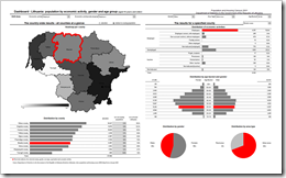
Lithuanian Census Dashboard - click to enlarge This post is about a showcase. Don’t expect too much. I will not provide a detailed how-to tutorial. All you can learn from this post is that you should not toss Excel as a matter of principle, when you have to create Business Intelligence tools and dashboards. Agreed, Excel has its limitations especially with regards to the access to larger external databases. And Excel’s chart engine has some limitations as well. Nevertheless Excel provides the flexibility to create compelling and professional dashboards.

Recently a Lithuanian company invited me to conduct a training to their marketing department. The focus of this training shall be on how to create Excel models including dashboards and visualizations made to stick. I haven’t done trainings for quite a while, but I do remember that the perfect start for a training is a demonstration of what it will be about and what the participants will be able to do afterwards. Therefore I created a showcase based on the Lithuanian Census 2001.

“The Lithuanian Census of 2001? Really? Isn’t that data by far outdated?”

Sure, but this doesn’t matter. This post is not about the data, it is about the possibilities of Microsoft Excel. I am convinced you can easily imagine how much value a dashboard like this could add to your daily business, if you would use this model for analyzing your customer base, sales figures, revenues and so forth.

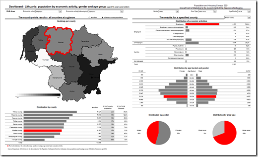
Here is a screenshot of the dashboard:

Lithuanian Census Dashboard - click to enlarge

Looks interesting? Download the file:

Download Lithuania Census Dashboard (Excel 97 – 2003, 505.5 K)

The dashboard is divided into 3 main sections:

  1. Drill-down section – the user input interface
    (top of the dashboard)
    • Slicing and dicing of the displayed data by selecting dimensions from drop-down-lists
    • Context-sensitive drop-downs for the economic activities. The list of subcategories always corresponds with the selected main category.
  2. Visualization part I – the country-wide results – all counties at a glance
    (left part of the dashboard)
    • A heatmap of Lithuania by county visualizes the geographical distribution of the data by flood-filling: the higher the value the darker the fill color and vice versa.
    • The corresponding sorted bar chart below the heatmap shows the results for all counties and allows a direct comparison.
    • The red border color on the map and the red bar highlight the selected county (if any, see below).
    • The radio buttons on top let the user toggle between the absolute numbers and the numbers relative to the total population of the counties.
  3. Visualization part II – the results for a selected county or Lithuania in total
    (right part of the dashboard)
    • The drop-down-list on top of this part of the dashboard can be used for selecting one county or Lithuania in total.
    • A structured table and bar chart visualizes the distribution of all economic activities by category and subcategory.
    • The tornado chart shows the population pyramid by gender.
    • The pie charts provide a quick overview about the distribution of gender and area type.
    • The dimensions selected for drill-down (if any) are highlighted in red on all 4 charts. Thereby the user is able to immediately identify the values selected for drill-down.

This model has been realized with nothing else than Microsoft Excel. No add-in or other additional software needed. Just plain old Excel with a couple of lines of VBA-code and some advanced Excel features and tricks:

  • Combo boxes and option buttons to handle the user inputs and drill-downs and create a convenient user-experience
  • A simple one line VBA procedure in combination with a named range and a CHOOSE function to provide the context sensitivity regarding the drop-down-lists for category and subcategory of the economic activity
  • Array formulas to consolidate the data according to the user inputs (slicing and dicing)
  • A small VBA routine and a color assignment table to flood-fill the heatmap according to the displayed data
  • Combination of tables and charts to save real estate on the dashboard and to maximize the amount of information displayed
  • A simple, but effective way of sorting with formulas to provide the sorted bar chart (distribution by county)
  • Charts with dummy series to highlight the selected county and the selected dimensions in red
  • A simple chart hack to create the tornado chart for visualizing the population pyramid by age bucket

I agree, all this requires advanced Excel skills. As mentioned above, I will not provide a detailed tutorial for all these techniques. But every single one of them has already been described somewhere on the internet. This proves that generally everybody is able to build a dashboard like this with Microsoft Excel.
Comments

18 responses to “Lithuania at a glance”

  1. www.google.com/accounts/o8/id?id=AItOawkC8yw-DuqDr9nGop5KV1t4gMGwobZOpBk Avatar

    This is really really nice. I specially loved the color code… clear and simple. A great template.

  2. Drew Avatar
    Drew

    It is a nice dashboard. But, if you are trying to contribute to the community by sharing knowledge, locking it down with a password is kind of unhelpful.

  3. Josh Avatar
    Josh

    I’m very interested in how you handled the irregular shapes on the map… as Drew mentioned the workbook is locked, some follow-up would be great!

  4. Robert Avatar

    Drew,
    I understand that you are interested in downloading a fully accessible workbook. Usually I do provide the free downloads without any passwords or restrictions (see all other posts).
    In this case however I am not allowed to. I purchased the editable map of Lithuania from a commercial vendor and their terms do not allow me to distribute the map in an editable format.

  5. Robert Avatar

    Josh,
    as mentioned in my reply to Drew, I am not allowed to provide the unlocked workbook.
    As I wrote at the end of the post, all used techniques are already described in tutorials somewhere on the internet. I took the idea and the VBA code to color the map directly from Tushar Mehta’s website:
    http://www.tushar-mehta.com/excel/charts/0301-dashboard-conditional%20shape%20colors.htm
    Tushar provides a detailed tutorial and an unprotected file for download (a map of the United States).

  6. Andrew Avatar
    Andrew

    Where did you buy the map? I need something similar.

  7. Robert Avatar

    Josh,
    I forgot to mention: Chandoo over at Pointy Haired Dilbert published 2 examples of a world heat map (with unprotected workbooks for free download) using exactly the same technique some time ago:
    http://chandoo.org/wp/2008/10/16/the-new-poor-internet-penetration-rates-by-country/
    http://chandoo.org/wp/2008/08/12/olympic-medals-excel-chart-improved/
    I hope this will be helpful.

  8. Robert Avatar

    Andrew,
    There are a couple of websites offering a selection of editable maps for free download (PowerPoint files).
    http://www.presentationhelper.co.uk for instance provides maps of the World, of North America and of Europe for free:
    http://www.presentationhelper.co.uk/world-maps-vector-editable-507.htm
    http://www.presentationhelper.co.uk/free-editable-powerpoint-maps-of-north-america-404.htm
    http://www.presentationhelper.co.uk/free-powerpoint-maps-12.htm
    If you are looking for something more specific (like I did in the case of Lithuania), there are several vendors offering maps, partially for very reasonable prices, partially pretty expensive.
    Here is a selection of some commercial websites:
    http://www.data2map-shop.de/lshop,shopstart,25488,e,1235199167-25488,,,,,.htm
    http://www.presentationload.com/oxid.php/
    http://www.presentationmaps.com/
    I am sure Google will help you to find more.

  9. Pointy Haired Dilbert - Chandoo.org Avatar

    What is Your Opinion on Pie Charts?

    Pie charts are one of the most used charts in the world. And for obvious reasons: they are simple to create and easy to understand. When it comes to pie chart, I have no clear opinion. Part of me says use them, the other says avoid them.
    What is your …

  10. Josh Avatar
    Josh

    Robert,
    Thanks for the follow-up. I like the looks of your blog and will definitely keep reading…

  11. Howard Goodell, Sc.D. Avatar

    Hi —
    The color-coding of region table to map is very effective. I presume this reflects linked brushing/selection, a powerful interaction technique. Unfortunately, using the same highlight color (red) for other attributes in other charts (e.g. male vs female in the pie charts at the lower right) creates a spurious connection that is a significant confusion factor. Just choose a highlight color that you don’t use for anything else. (Red is also an accessibility problem for a few percent of males who can’t perceive it.)
    Cheers!
    Howie

  12. Robert Avatar

    Howard,
    thanks for your comment and welcome to clearly and simply.
    I agree with you: it might be confusing for some readers that red highlights the selected county on the left side and the selected attribute on the right side of the dashboard.
    Using different highlight colors for the left and right part of the dashboard is a viable alternative.
    On the other hand: you would need one more color, one more legend entry and you are losing the simple mental translation (red = selected).
    I must admit that I haven’t thought of the color-blind, but – to be honest – I do not know which color with a high visual impact can be recognized by everyone. Any ideas?

  13. Giedre Avatar
    Giedre

    It does not really matter which colors you select as long as you use a highly contrasting scheme. Color-blind people can then use the different levels of lightness to tell the colors apart.
    (Source – former boss had a color vision deficiency)
    Also – some programs (e.g. Tableau) have a built-in palette intended specially for the color-blind audience.

  14. Robert Avatar

    Giedre,
    I agree with regards to the bar and tornado chart since all bars have the same color (except for the highlighted one).
    The pie charts however already use different colors (grey shades) for the data points and additionally the red color for a selected attribute. I think Howard made a good point with regards to the pie charts: it will be hard to identify whether or not an attribute is highlighted if you can’t perceive the red color.
    A possible solution would be using fill patterns instead of colors.
    But fill patterns are not available in Excel 2007 anymore. Well, more precisely they are not accessible via the Ribbon anymore. Andy Pope provides a free add-in to access the fill patterns in Excel 2007 here:
    http://www.andypope.info/charts/patternfills.htm

  15. Rick Avatar
    Rick

    A couple of ideas come to mind.
    1. Make the highlight color flash.
    or
    2. If possible make the highlight color a thinner line then make a couple of highlight lines in different colors, IE.. highlight 1 red, highlight 2 blue, highlight 3 yellow and display them in the same line size as the old highlight color. So the highlight line would appear is a line of multiple colors.
    or
    3. Make the highlight color change colors.
    While may people dont like things that flash a person who is color blind can usually detect the flash even if its not in a color range normally seen because the change in color during flash is still recognized even though the color may not be visible to them.

  16. Robert Avatar

    Rick,
    thanks for your comment and suggestions.
    I agree: making the highlight color flash is a possible solution. In my opinion, however, flashing colors come with a couple of drawbacks:
    1. flashing colors are not visible on printed versions of the dashboard
    2. you would need additional VBA code to make the charts flash
    3. as you pointed in your comment, some people do not like flashing colors. I am one of them: From my point of view, flashing colors on a dashboard are distracting and – after a while – even annoying.
    Wrt the bar charts: Next time, I would use a lighter grey for the data series and a dark grey or black for the highlighted data. As Giedre pointed out, this should be o.k. for the color blind readers as well, as long as the contrast is strong enough.
    Wrt the pie charts: I think using fill patterns could be a good alternative (see my reply to Giedre below).

  17. Apple Avatar
    Apple

    Hi,
    I’m trying to learn how to do the outlining of the map when you select a particular country? Is there any tutorial on this? Thanks! =)

  18. Giedre Avatar

    Hi Apple,
    Yes! The answer is right here on Clearly and Simply.
    Go ahead and download Robert’s interactive map from this post.
    Insert the 4 additional lines (marked in bold) into the VBA code in order to modify the border color & thickness:
    If Range(myValue).Value = 1 Then
    Range(myValue).Value = 0
    aShape.Fill.ForeColor.RGB = RGB(240, 240, 240)
    //don’t need an outline
    aShape.Line.ForeColor.RGB = RGB(0, 0, 0)
    aShape.Line.Weight = 1

    Else
    Range(myValue).Value = 1
    aShape.Fill.ForeColor.RGB = RGB(75, 75, 75)
    //need to outline shape
    aShape.Line.ForeColor.RGB = RGB(42, 179, 75)
    aShape.Line.Weight = 3

    End If
    Now when you click on the map, the highlighted regions will have a green border.

Leave a Reply to Andrew Cancel reply

Your email address will not be published. Required fields are marked *