Tag: tableau

  • Web Page Objects on Tableau Dashboards

    Spice up your Tableau dashboard with a web page object showing additional web-based or other external information at your user’s fingertips

    A window too high / Photographer: ephotography (flickr.com)

    Tableau dashboards and all their built–in interactive features are a piece of art on their own.

    However, in certain circumstances (i.e. if your data and visualization is suitable), you can even top this by embedding a web page object into your dashboard and a URL action to hyperlink to additional web–based information outside of your data source, depending on your data and on the user’s selection.

    Google Map views of your geographical data, additional product information from the Internet, websites of other companies, content from your company’s Intranet or even folders and files stored on a file server.

    Today’s post is a step-by-step tutorial how to embed web pages into your Tableau dashboard and update the views depending on user inputs. Furthermore the article includes a couple of real life examples and a discussion of the pros and cons of using this technique.

    (more…)

  • Embed and Open Tableau Workbooks in PowerPoint

    A follow up post: how to embed a Tableau Packaged Workbook in PowerPoint and open it directly within the Slide Show

    Woman Aircraft Worker / Photographer: David Bransby (flickr.com)Yesterday’s post Embed Tableau Visualizations in PowerPoint described three stand-alone alternatives (i.e. without the use of an add-in) to Andy Kriebel’s great post on how to embed a Tableau dashboard in PowerPoint.

    Both Andy and I used the word “embed” in the titles of our posts. Truth be told, this is a little exaggeration. Using a web browser control object navigating to a Tableau workbook stored on a server like Tableau Public is not really embedding the workbook. The main disadvantage of those approaches is the fact that you can interact with the Tableau dashboards, but you are not able to edit the workbook. Let’s assume you are receiving a question during your presentation which cannot be answered with your existing views and dashboards: You are not able to add another sheet and do some extra data analysis and new visualizations on the fly. In other words, you are losing one of Tableau’s greatest advantages: rapid fire data analysis and Business Intelligence.

    Of course you can physically embed the Tableau workbook in your PowerPoint presentation as an object like you can do with any other file of any other application. However, there is one main pitfall: PowerPoint does not allow you to open an embedded object during the slide show. You always have to interrupt the presentation, go back to the normal view in PowerPoint and open the file from there. Honestly, this is not much better than simply opening the file from the Windows explorer and it is far from being a seamless experience for the audience of your presentation.

    So, here is today’s challenge: embed a full packaged workbook into PowerPoint and provide a way to open it directly during the slide show.

    (more…)

  • Embed Tableau Visualizations in PowerPoint

    How to embed Tableau Visualizations in PowerPoint Presentations – an alternative without using an add-in

    Men and a woman reading headlines / Photographer: Jack Delano (flickr.com)The way stories and insights are presented to the management is fundamentally changing. For a very long time management presentation were based on PowerPoint decks with embedded static images of the data visualizations.

    Nowadays, requirements have gone up. Static data visualizations are not sufficient anymore. Especially during presentations based on data analysis, it is expected that the presenter is able to answer questions on the data live during the meeting.

    Tableau Software meets exactly this requirement. The highly interactive dashboard features and the ability to build new views on the fly by dragging and dropping enables you to answer almost every possible question on the data live.

    However, in most cases your dashboard or data visualization will not cover all topics of your presentation. So what to do? Switching back and forth between PowerPoint and Tableau during the presentation? Well, this is an option, but it is inconvenient for the presenter and not a seamless experience for the audience.

    So, what we need is a way to embed the Tableau visualization directly into the PowerPoint presentation. This will not only guarantee a seamless interactive presentation but also provide the option to distribute the PowerPoint file to the audience including an interactive Tableau dashboard.

    Earlier this week my Tableau blogging colleague Andy Kriebel published a great article on his blog VizWiz how to embed a Tableau dashboard into a PowerPoint presentation using the free LiveWeb Add-In:

    Tableau Tip: Embedding a Dashboard in PowerPoint in 8 simple steps

    Today’s post is a follow-up to Andy’s article, showing an alternative how to do the same thing using some simple VBA code instead of the add-in.

    (more…)

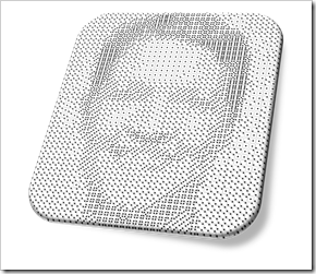
  • Dice Portraits of the Tableau Management

    Mosaic Dice Portraits of Tableau Software’s Leadership Team

    Dice Portrait of Christian ChabotFirst things first: this is a fun post. Don’t expect to learn much from today’s article, neither about Data Visualization in general nor about special tips and tricks in Tableau.Today’s post is in line with 2 fun articles about (re-)creating art with Tableau Software:

    Tableau Replica of Curtis Steiner’s 1,000 Blocks

    and

    6 Famous Paintings in Tableau

    The article is adopting an idea of creating images using different faces of a dice: mosaic dice pictures or portraits. The post includes the beautiful article and video I stole this idea from and my Tableau workbook showing the portraits of the members of the Tableau Management Team using dice face custom shapes.

    (more…)

  • Taking up the SAP BO Dashboards Challenge

    Tableau vs. SAP BO Dashboards (powered by Graphomate) – a Tableau version of Lars Schubert’s Facebook Dashboard

    Sumo / Photographer: davidgsteadman (flickr.com)A couple of weeks back, my Tableau blogging colleague Ben Jones had two excellent posts over at Data Remixed on how to create a waterfall chart with Tableau: A Facebook Waterfall and How to Create a Tableau Waterfall Chart.

    Ben used the Facebook financials to demonstrate the technique.

    Lars Schubert, an outstanding SAP and data visualization expert (no, this is not an oxymoron, at least not in all cases), stumbled across Ben’s visualization and developed a couple of excellent ideas how to improve it. He completely revamped the dashboard using SAP Business Objects Dashboards (formerly known as Xcelsius) empowered by his own add–on called Graphomate. Earlier this week Lars published his version on the Graphomate company blog (the blog is in German).

    So far, so good. However, Lars decided to use a pretty provoking title for his article: Xcelsius vs. Tableau. Being the Tableau aficionado I am and – to my knowledge – the only German native speaker blogging about Tableau so far, I felt the ball being in my court.

    With today’s post I am taking up the challenge: the article discusses Lars’ great ideas for improvement (including his dashboard) and my answer to it using Tableau Software.

    (more…)