Tag: tableau software

  • Tableau Quick Tip #3 – Keyboard Shortcuts

    Increase your productivity with a comprehensive list of all Tableau keyboard shortcuts

    © Rainer Sturm / pixelio.deDragging and dropping fields to the different shelves is the heart of user interaction in Tableau Software. In general, Tableau is predominantly designed for using the mouse.

    However, like with any other software application, using keyboard shortcuts can be a big boost for your productivity in Tableau as well. Especially for functions you are using very often, knowing and taking advantage of the keyboard shortcuts can save you a lot of time.

    But which keyboard shortcuts are available in Tableau?

    Well, the Tableau Manual has 5 pages with the most important shortcuts. Aside from the fact that there are some more, flipping through 5 pages during your work with Tableau is inconvenient. The better option would be a small print-out, only displaying those shortcuts you like most and/or you want to learn by heart.

    Today’s short article provides an Excel workbook, including a comprehensive list of all Tableau shortcuts and a feature to design and create such a small display of your favorite shortcuts. You could easily print this and position it somewhere you can have half an eye on while working with Tableau. Of course, today’s quick tip includes the Excel workbook for free download.
    (more…)

  • Tableau Quick Tip #2 – Custom Number Formats

    How to use Tableau Software’s Custom Number Formats

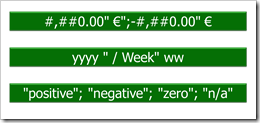
    Intro Custom Number FormatsTableau provides a variety of built-in number and date formats. There are the standard formats “numbers”, “currency”, “scientific” and “percentage”. For scientific and percentage you can only change the decimal places, but for numbers and currencies you can also define the way negative values are displayed, the displayed units, the thousand separator and you can add a prefix and/or suffix to the number. For date fields, Tableau offers 17 different standard formats.
    Tableau’s built-in number and date formats will meet most of your requirements. From time to time, however, you need something different. E.g. you want to see “Quarter” instead of “Q” on your date axis, you want to display numbers in hundreds or you need to add some text to the numbers displayed. This is where Tableau’s Custom Number Formats come into play. Today’s post provides some links to learn the principles and the syntax, includes some examples and discusses Tableau’s limitations compared to Microsoft Excel.

    (more…)

  • An Underrated Chart Type: The Band Chart

    Why band charts should be used more often and how to create them with Microsoft Excel and Tableau Software

    Band Chart IntroBand chart, range chart, high-low line chart, corridor chart. I don’t know whether there is a standard term for this type of charts, so let me call it a band chart hereafter.

    What is a band chart?

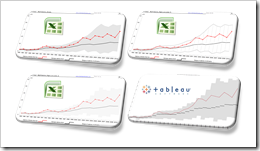
    Basically a band chart is a standard line chart enhanced with a shaded area displaying the upper and lower boundaries of groups of data (e.g. the range between the minimum and the maximum of all members of the category). Band charts are very often supplemented by another line showing the arithmetic mean (the average).

    What is the big whoop?

    Band charts provide by far more context to your visualization and more insight into your data. Especially if you have to explore unknown data sets. They are easy to implement, very intuitive, very effective and do not require one pixel more of your dashboard real estate than a standard single line chart.

    This being said, I have always been wondering why I do not see these charts more often in my professional environment. Are people underrating the benefits of band charts or am I overrating them?

    Today’s article discusses the benefits and the use cases of band charts and provides tutorials of how-to implement this type of chart with Microsoft Excel and Tableau Software. As ever, including the Excel workbooks for free download and the Tableau visualization for direct access via Tableau Public.

    (more…)

  • Nuclear Power Reactors in your Neighborhood

    How many nuclear power reactors are within a certain radius around your hometown? A Tableau Software Visualization

    Radioactivity - © Thommy Weiss / pixelio.deIn the light of recent events: Do you know how many nuclear power reactors are within a certain radius around your hometown?

    No? Today’s short post provides a Tableau visualization allowing you to explore the nuclear power plants around your hometown. All you need to know is the latitude and longitude of your city. Everything else is a piece of cake. Simply type in the geographical data, select the radius in kilometers and the visualization will provide an overview of all nuclear power plants within this radius and additional information using external links.

    Surrounded by Nuclear Power Reactors?

    How to use this visualization

    • Organize the latitude and longitude of your hometown. Here is one tool that helps you getting the data: Lat / Long Detection
    • Type in the latitude and longitude into the 2 input fields at top left of the visualization
    • Select a radius in kilometers at top right of the visualization
    • Click on a data point of the map to get additional information on the selected reactor from The World Nuclear Association in your Internet browser
    • Click on a bar of the bar chart to filter the data by the current status

    What you should be aware of

    • The geographical data is jittered. Many power plants have several reactors close to each other. In order to make them visible on the map, I slightly jittered the data.
    • The data is taken from The World Nuclear Association. The reactors of Fukushima and other reactors in the world that have been shut down in the meantime still have the  current status “operating” in the database.

    Many thanks again to Giedre Aleknonyte for taking the time to review the workbook.

    Stay tuned.

  • Tableau Quick Tip #1 – The Summary Card

    Support your ad-hoc analysis and exploration of new data with Tableau's Summary Card

    Intro Tableau Summary CardI decided to start a new little category of posts here on Clearly and Simply: Tableau Quick Tips. Today’s post could be the first one in a series of very short articles describing some of the little nuggets in Tableau’s functionality.

    Let’s give it a try with a quick hint on Tableau’s Summary Card.

    (more…)