Tag: tableau

  • All Peaks of the Alps visualized with Tableau

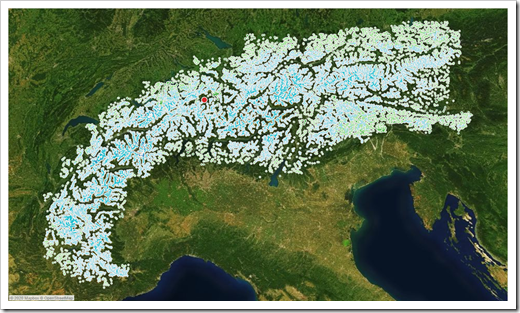
    A Tableau visualization of all peaks of the alps including the option to find and highlight one peak or to select one by clicking on the map

    The FrankensTeam runs one of the most interesting and resourceful websites about advanced charting techniques in Microsoft Excel (E90E50fx). In March 2015 the team met in person for the very first time in Milan. To celebrate this, they published an Excel workbook with a visualization of all peaks of the Alps: Meeting in Milano, trip to the Alps and an Excel chart

    All Peaks of the Alps in Tableau PublicHaving been a mountaineer in my younger days, I was intrigued with this idea. I asked them for permission to use the idea and data for a replica of their visualization in Tableau. They kindly agreed.

    I am deeply ashamed to admit that I am sitting on the Tableau replica for a couple of years already, but never published it. Until today.

    This post provides and explains a Tableau Public workbook showing all peaks of the alps with all the amazing interactive features of Tableau.

    (more…)

  • Alternative Bullet Graph Design in Tableau

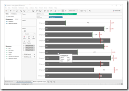
    How to realize an alternative Design of Bullet Graphs in Tableau

    Alternative Bullet Graph TableauThe recent posts suggested an Alternative Design of Bullet Graphs and an interactive version of a Bullet Graph. Both articles provided example workbooks in Microsoft Excel.

    These posts included three variations of the well known standard design of Bullet Graphs described in Stephen Few’s design specifications: no qualitative background areas (e.g. poor, satisfactory, good), data labels for actual and target as well as the visualization of the gap (target minus actual) with a data label and a span line to put the gap label into context, i.e. a thin line between actual bar and target line with arrows at the beginning and the end.

    How would this alternative design of a Bullet Graph look like in Tableau?

    Well, truth be told, I never managed to create an exact replica of my Excel implementation in Tableau. The Excel version is using error bars to display the span line of the gap. A comparable feature is not available in Tableau, but you can still realize the alternative design of Bullet Graphs in Tableau coming close to the Excel implementation.

    Today’s post presents a short description of how to realize my alternative design of Bullet Graphs on Tableau Public including the option to download the Tableau workbooks.

    (more…)

  • Writing and Reading Tableau Views to and from Databases and Text Files – Part 2

    How to use R, a Tableau connection to R and Calculated Fields to store and load the underlying data of a defined Tableau View in a Database or Text File (part 2 of 2)

    R - Photographer: Karyn Christner (flickr.com)This is the second part of Michael Martin’s guest post on how to use Tableau and R to read and write the underlying data of a Tableau view from / to an ODBC database.

    Michael is the Managing Partner at Business Information Arts, Inc, Tableau Partner, Tableau Certified Consultant, Tableau Instructor and leader of the Toronto Tableau User Group.  Last, but not least, Michael is the only person I know who is using Tableau Software since version 1.0.  

    NOTE: You may need to zoom into some of the screen shots below for legibility reasons. Also, the text below contains references to the “Level of Detail Shelf“.  This is synonymous with the Detail Pill in the Tableau Marks Card within the Tableau 9.x and 10.x user interface.  As mentioned in the introduction to part one of this post, including a ‘$’ character as part of an RODBC object name (for example crs$odbc, crs$odbc.tablescrs$dataset) could cause an error on your system, and the affected calculation will fail.  If this happens, replace instances of $ within an RODBC object name with another character within the affected calculation, such as an underscore – i.e. _.

    Supporting files and a README file are available for download at the end of this part of the post. Please look at the README file first.

    The author would like to thank Leonid Koyfman for his suggestions.

    The first part of this post walked you through the process of

    • downloading and installing R and RStudio
    • installing the required R packages,
    • setting up the ODBC database connection
    • writing the Calculated Fields in Tableau to read the underlying data of a Tableau view from a database

    In the first part, we have only run SELECT queries, but we could also run INSERT, DELETE, UPDATE or INSERT INTO (Append data) queries – all we need to be is pass a valid SQL statement to a Calculated Field that establishes an ODBC connection to the Database and run the SQL statement.

    Today’s second part of the post will

    • show how to insert data of a Tableau view into a database
    • demonstrate the necessity of aligning the orientation of the view and the Table Calculation
    • show how to perform data definition queries
    • provide the general caveats of the technique
    • demonstrate an analysis technique that leverages multiple exports of a Tableau View based on the Superstore Dataset to SQL Server
    • give some insights on performance and upper limits
    • provide some useful links regarding the integration of Tableau and R

    (more…)

  • Writing and Reading Tableau Views to and from Databases and Text Files – Part 1

    How to use R, a Tableau connection to R and Calculated Fields to store and load the underlying data of a defined Tableau View in a Database or Text File (part 1 of 2)

    R - Photographer: Karyn Christner (flickr.com)My good friend Michael Martin is kind enough to contribute another guest post to Clearly and Simply.

    Michael is the Managing Partner at Business Information Arts, Inc, Tableau Partner, Tableau Certified Consultant, Tableau Instructor, leader of the Toronto Tableau User Group and – as Interworks calls him for very good reason – a Tableau Maestro.

    In his article, Michael will show us how to store the underlying data of Tableau Views in a database or a text file using R and Tableau Calculated Fields. Michael's post will come in 2 installments.

    NOTE: It may be necessary to zoom in on some of the graphics within the body of the text below for better legibility.  If you are running 32 bit Microsoft Access under 64 bit Windows, and wish to output the data in a Tableau view to 32 bit Microsoft Access, please read the Appendix to this post before proceeding. Supporting files and a README file are available for download at the end of the second part of the post. Please look at the README file first.

    The author would like to thank Leonid Koyfman for his suggestions.

    Here is part one:

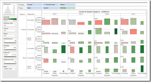
    In the Bar Graph View below (based on the Superstore dataset that comes with Tableau), yearly sales are summed and colored by profit and sized by discount:

    Superstore View

    Reference lines show average sales within each region and customer segment by year for all categories.

    How can we “capture” the data in this view and save it in a database for further analysis and re-use?

    Tableau does let you view underlying data and copy it to the clipboard, export it to a text file, or even a Microsoft Access database, but these are manual operations. What if you could write a Tableau Calculated Field to export the underlying data in a Tableau View to any Database Server that supports the ODBC protocol?

    You can, using R, and an R language library called RODBC.

    Tableau opened the door to using R language libraries within Calculated Fields in version 8.1. This article walks you through downloading and installing R on a desktop computer, configuring Tableau to use your R installation, and writing the Calculated Fields required to export data from a Tableau view to a database such as SQL Server or Microsoft Access.

    (more…)

  • La Gazzetta dello Sport gives Tableau a try

    La Gazzetta dello Sport, the famous Italian sports newspaper uses Tableau Software to visualize 20 years of Italy’s Serie A
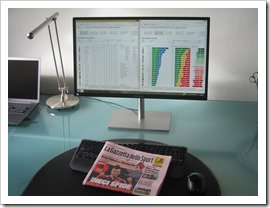
    La Gazzetta dello Sport and Tableau SoftwareIn spring this year, I received an email from Marco Nicolucci. Marco stumbled across my Tableau workbook visualizing the history of the English Premier League:

    England Premier Football League – Historical Statistics

    This workbook already got some exposure from Tableau: it is part of the Tableau Public Gallery, it was mentioned in the wrap-up to the first Tableau Sports Viz Contests (Other Winners from the Sports Viz Contest) and it even made the cut for the 25 of the best Tableau Public Vizzes.

    Marco apparently liked my dashboards, too. He asked me, if I could support him to rebuild the Tableau workbook for Italy’s Serie A. So far nothing unusual. From time to time readers contact me with some questions and requests. However, this email was something special and really exciting, because Marco is a sports journalist at La Gazzetta dello Sport, Italy’s famous and prestigious daily sports newspaper.

    La Gazzetta dello SportFor those of you who do not know La Gazzetta: La Gazzetta dello Sport is not only the Italian sports newspaper with the widest circulation (ca. 450,000 per day on average with a readership in excess of 3 million), but also one of the eldest sports newspapers in the world, first published in 1896. La Gazzetta online according to Alexa is ranked 843 worldwide and 21 in Italy. They have 1.13 million followers on Twitter and 1.5 million likes on Facebook. In Italy, La Gazzetta is more than a newspaper. It’s an institution.

    It goes without saying that I was thrilled and honored being asked to become part of this project. In the next few weeks, Marco and I used my Premier League Workbook as a basis and built a comprehensive Tableau workbook to analyze and visualize the last 20 years of Serie A:

    • 2 storyboards, 9 dashboards, 32 views
    • the classical visualizations like tables, fixtures, goal differences, win-draw-loss chart, etc.
    • additional visualizations like a results cross table for one entire season, an all time table (all time = 20 years), a view for one selected team, a comparison of 2 selected teams and a simulation of the 3 points rule versus the old 2 points rule
    • various options to slice and dice the visualizations, like home and away table, sorting options, include or exclude points deductions, etc.

    Our workbook was published on La Gazzetta online last Tuesday (August 26, 2014):

    Serie A, l'era dei 3 punti

    It is worlds apart from my original Premier League viz and provides many more options and dashboards. Thus, I thought the Tableau users and football fans among you may be interested in having a look. The dashboards are in Italian, of course, but I think you can easily figure out how it works and what is shown.

    So far, the visualization received almost 60,000 views. To put this into context: my Premier League workbook had a little bit more than 31,000 views in three years(!).

    Special thanks go to Marco Nicolucci for making me part of this great project. I am proud and honored. Not only that I had a lot of fun during our collaboration, I am feeling I made a new friend. Thank you, Marco!

    Stay tuned.