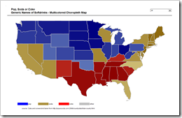
The Pop, Soda or Coke Visualization with Microsoft Excel
 The previous post discussed Choropleth Maps in general, briefly described how to implement them with Microsoft Excel and provided a couple of templates for free download.
The post was focused on the classic version of a Choropleth Map, visualizing the measurements of a statistical variable in different geographical regions on a map by color intensity: the greater the measurement, the darker the color.
The classic version is limited to one variable. This follow-up post describes how to enhance a Choropleth Map in order to visualize more than one variable by using several colors and includes the visualization of “The Great Pop vs Soda Controversy” as an example for free download.