Tag: performance gaps

  • Variations of Alternative Bullet Graphs in Excel

    Variations of the Alternative Bullet Graph Design: Visualization of Gaps and Exceedances, two Targets and two Gaps, conditionally formatted Actuals and dynamically sorted Multiple Rows Bullet Graphs

    Bullet Graph Variations

    One of the previous posts presented An Alternative Design of Bullet Graphs: no qualitative ranges, additional data labels and a visualization of the performance gap.

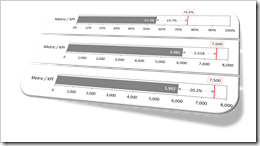
    These ideas can be taken a few steps further:

    • Bullet Graphs with a generalized visualization of the deviation of actual from target: display the gap, if actual is smaller than target and the exceedance otherwise
    • Bullet Graphs with two targets
    • Bullet Graphs with two targets and two gaps
    • Bullet Graphs with a conditionally formatted actual bar
    • Multiple rows Bullet Graphs in alternative design
    • Dynamically sorted multiple rows Bullet Graphs

    Today’s posts presents this set of possible variations of the alternative Bullet Graph design. As always, the article includes a link to download the Microsoft Excel template workbook for free.

    (more…)

  • Alternative Bullet Graph Design in Tableau

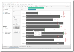
    How to realize an alternative Design of Bullet Graphs in Tableau

    Alternative Bullet Graph TableauThe recent posts suggested an Alternative Design of Bullet Graphs and an interactive version of a Bullet Graph. Both articles provided example workbooks in Microsoft Excel.

    These posts included three variations of the well known standard design of Bullet Graphs described in Stephen Few’s design specifications: no qualitative background areas (e.g. poor, satisfactory, good), data labels for actual and target as well as the visualization of the gap (target minus actual) with a data label and a span line to put the gap label into context, i.e. a thin line between actual bar and target line with arrows at the beginning and the end.

    How would this alternative design of a Bullet Graph look like in Tableau?

    Well, truth be told, I never managed to create an exact replica of my Excel implementation in Tableau. The Excel version is using error bars to display the span line of the gap. A comparable feature is not available in Tableau, but you can still realize the alternative design of Bullet Graphs in Tableau coming close to the Excel implementation.

    Today’s post presents a short description of how to realize my alternative design of Bullet Graphs on Tableau Public including the option to download the Tableau workbooks.

    (more…)

  • Interactive Bullet Graphs in Excel

    An interactive Multiple Row Bullet Graph in Excel displaying the gap and data labels only when hovering over a bar with the mouse

    The previous post presented An Alternative Design of Bullet Graphs in different versions and provided the implementation in a Microsoft Excel template workbook for free download.

    Long time Clearly and Simply readers and contributors Matt Grams (check out Matt’s guest post: Bullet Graphs for Excel: A Simple Way?) and Leonid Koyfman (Leonid’s LinkedIn Profile) liked the alternative design in general, but also came up with a justified and constructive criticism regarding the Multiple Row Bullet Graph:
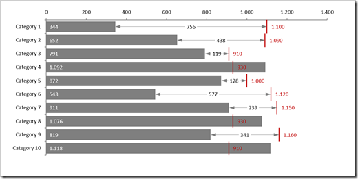
    Multiple Row Bullet Graph - click to enlargeThey noted that

    • the chart is too busy and a bit overloaded, especially if you are using it in a relatively small size, e.g. on a dashboard with other views
    • in certain edge cases, the data labels may overlap and become unreadable

    Valid points. I fully agree with Matt and Leonid.

    To make the chart less busy and more readable, Leonid suggested to turn it into an interactive Bullet Graph which displays the span of the gap (the thin line with arrows between actual bar and target line) and the data labels for gap and target only, if the user hovers over the bar with the mouse:
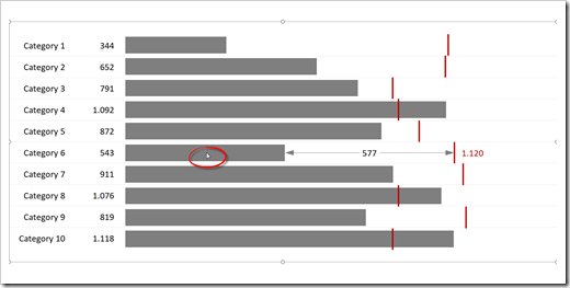
    Interactive Bullet Graph - click to enlargePlease note the mouse cursor over the bar of Category 6.

    The underlying technique and VBA code is described here: Mouse Driven Actions on Excel Dashboards.

    This interactive version definitely looks much cleaner, but it also comes with a few disadvantages:

    • The user has to activate the chart (click on the chart area) first to make the mouse hover action available
    • The approach is not applicable for dashboards delivered in a static version like PDF or printed. It only makes sense, if the user directly interacts with the chart in Excel
    • Unlike the original version, this solution requires VBA code
    • Because of the VBA code, it takes more time to transfer the template from the example workbook to your own model. You can’t simply drag the sheet over to your file, you also have to copy the entire code from all objects, modules and class modules
    • It requires Microsoft Excel 2013 or later

    Anyway, it still is a viable and interesting alternative to the original version.

    Here is the Excel 2013/2016 workbook for free download:

    Download Interactive Bullet Chart (zipped Microsoft Excel 2013-2016 workbook, 32K)

    Many thanks to Matt and Leonid for the feedback and suggestions. Much appreciated.

    Stay tuned.

  • An Alternative Design of Bullet Graphs

    An alternative design of Bullet Graphs: no qualitative ranges, additional data labels and a visualization of the performance gap (if applicable)

    Bullet Graph Alternative DesignMore than 10 years ago, Stephen Few of Perceptual Edge introduced the Bullet Graph: an alternative chart type to replace the formerly (and unfortunately sometimes still) popular gauges and speedometers on dashboards. A Bullet Graph visualizes a performance metric compared to a target (or other comparative measures) in a small, clear, simple and effective view. In the meantime, the Bullet Graph has become a widely respected, even standard chart type. Some major Data Visualization software applications like Tableau Software natively support Bullet Graphs.

    Back in 2009, Matt Grams described a possible solution of creating Bullet Graphs in Excel here on Clearly and Simply: Bullet Graphs for Excel: A Simple Way?

    I am using Bullet Graphs very often in my models for a very long time already, especially on Performance Measurement Reports and Dashboards. Starting with Stephen’s original design specification, I received a lot of feedback from my clients over the years. As a consequence, I made a few variations to the design of the Bullet Graph regarding the qualitative ranges, data labels and the performance gap (if applicable, i.e. if actual is smaller than target).

    Today’s article describes my variations of the original Bullet Graph design, explains the background why I made them, shows how to implement the charts in Microsoft Excel and provides the corresponding Excel workbook for free download.

    (more…)