Interactive radial or rectangular area selection on a map of the United States in Microsoft Excel
One of the recent posts demonstrated how to mimic Tableau’s rectangular and radial map selection features in Microsoft Excel:
Selecting and Highlighting Areas on Excel Charts
The example workbook used a map of Europe. Since more than 40% of my readership is located in the United States, I thought it might be a good idea to also share a template with a map of the USA. Here it is for free download:
Download Select and Highlight Areas on a US Map (zipped Microsoft Excel 2010 – 2013 workbook, 1.3MB)
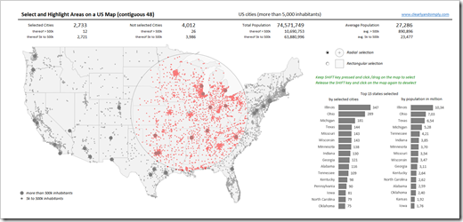
This is an example screenshot of the dashboard:
 The map (the contiguous 48 states, i.e. excluding Alaska and Hawaii) includes all cities in the United States with more than 5,000 inhabitants, divided into 2 categories (greater than or less than 500k inhabitants), visualized with different sizes of the dots.
To define a radial or rectangular selection (choose with the radio buttons), keep the SHIFT key pressed, click somewhere on the map with the mouse key pressed, move the mouse to span the selection area and – as soon as you are done with your selection – release the mouse key. The metrics above the map and the bar charts (selection statistics by states) right to the map are updated on the fly.
For more details on how to use the template and how this was implemented in Excel, please have a look at the original post.
I hope this will be helpful, especially for my friends and readers in the United States.
Stay tuned.
 The
The