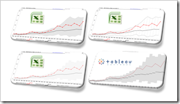
2 Alternatives to avoid cluttered Line Charts: a Band Chart and an interactive Line Chart highlighting one selected data series when hovering over
804 words, ~4 minutes read

A Line Chart is definitely the best way to visualize the development of a continuous metric over time for several categories. That being said, Line Charts easily get cluttered and even may become useless, if you have many categories. Now, what is “many”? In my humble opinion Line Charts are already hard to read if they show more than 6 to 8 data series. But what if you have way more than 6? Like all countries in Europe or all states of the US?
And then what? No worries, there are alternatives. Adding an interactive feature to your chart can solve the issue.
Today’s post describes two alternative options for Line Charts with many data series: an interactive band chart (without VBA) or a line chart highlighting one data series when hovering over (empowered by VBA). As usual, the article comes with the workbooks for free download.
(more…) Band chart, range chart, high-low line chart, corridor chart. I don’t know whether there is a standard term for this type of charts, so let me call it a band chart hereafter.