Spice up your interactive Excel Dashboards with dynamically changing Icons, Pictures or Charts
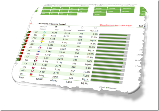
The Excel workbooks which came with two of my recently published posts showed dynamically changing flag icons inside of a dynamic table on an Excel dashboard.
Showcase for Table Slicers on Excel Dashboards
My 2 Cents on the COVID-19 Dashboard by JHU.
The tables visualized data per country and the flag icons next to the country names were automatically adjusted if the user filtered the data, changed the sort criterion or scrolled within the table.
This week I received some feedback on these workbooks and readers asked, if I could explain this in more detail. No sweat: todays post provides a step-by-step explanation of the technique and the according workbooks for free download.
