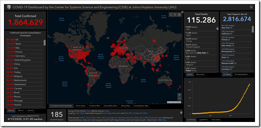
For what it’s worth: a few remarks on the currently extremely popular COVID-19 Dashboard provided by the Center for Systems Science and Engineering (CSSE) at Johns Hopkins University (JHU)
When the Corona pandemic started, I was tempted to build and publish a dashboard about the spread of COVID-19, too. But then I decided not to. Not only because much brighter people than me beat me to it, but also because the topic is very sensitive. People suffer and people die. Not the type of data I want to analyze and visualize. Hence, I stayed out, stayed home and wrote a few articles about something else (see my recent posts).
Today I changed my mind. I still don’t want to create a comprehensive COVID-19 dashboard, but I would like to add my 2 cents to the definitely most popular Corona Data Visualization: the COVID-19 Dashboard provided by the Johns Hopkins University:
 This afternoon, I read that this dashboard is currently clicked 1.2 billion (!) times a day.
First things first: it is a great dashboard providing the most important numbers at a glance and various options to drill down into the details. I am very impressed by its features, how quickly this visualization was made available and how often the underlying data is updated. My congratulations to the data science team of the JHU.
Having said that, I also see a few weaknesses and today’s post will discuss two of them.