Chandoo's KPI Dashboards revisited – the Box Plots
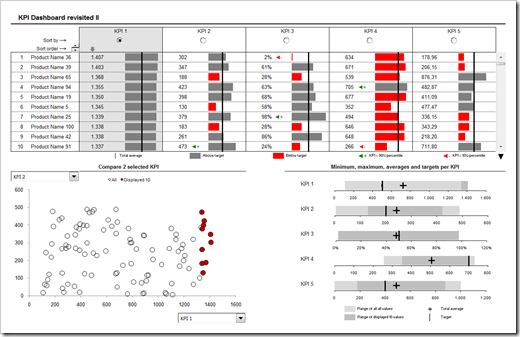
In summer 2008 my friend and Microsoft Excel MVP Chandoo was kind enough to give me the opportunity of contributing guest posts to his excellent blog Chandoo.org. Actually Chandoo even featured a whole 6 post series on how to create interactive KPI dashboards with Microsoft Excel. Here is a screenshot of the final dashboard:
The last part of the series was about box plots to visualize the distribution of the data (Box Plots Excel Dashboards Tutorial), including average and target values. At that time Chandoo and I decided to apply Occam’s razor and we restricted the tutorial to a simplified version of box plots, working only for data sets with positive values.
This follow-up post on my own blog is about how to create these box plots for all kind of data distribution, i.e. positive and negative values.
