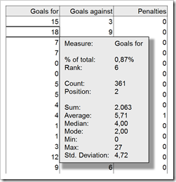
How to display Tooltips on Microsoft Excel Tables including additional information on the selected cell and aggregation results for the entire column
 Tooltips are a very helpful feature when exploring and investigating data. On charts and on plain data tables. When referring to tooltips, I am talking about additional details on the data currently selected or hovered over using the mouse. Tooltips could include other dimensions and measures, calculations or aggregated information like totals or averages.
Tableau Software provides very powerful and easy to use tooltips. If you are working with Tableau, I once again recommend having a look at Andy Cotgreave’s great Tableau tooltip articles on the Data Studio (Tableau Tooltips: Conditional Formatting or Charts inside a tooltip? Yes, we can.). Thanks again for sharing, Andy.
Compared to Tableau, Microsoft Excel’s tooltips functionality is next to nothing. We already had a post showing how to improve tooltips on Excel charts: Better Chart Tooltips with Microsoft Excel 2010.
However, tooltips can be very helpful in plain data tables as well. Sure, Excel automatically displays some calculated aggregations of the selected range in the status bar. Yet, this is not enough. Your eyes always have to jump down to the status bar to see the information, the displayed quick calculations are limited and inflexible and you always have to select the range first. If you are working with larger data tables, you may wish for tooltips providing additional information on the selected value (like the percentage of total, the rank, etc.) and on aggregations across the entire column (like sum, average, etc.).
Today’s post provides two slightly different approaches how to create better tooltips on Microsoft Excel tables. As usual including the Excel workbooks for free download.