• O’zapft is!

    The Development of the Beer Prices at the Oktoberfest – a Tableau Visualization and Analysis

    Oktoberfest Impressionen - Photographer: sanfamedia.com (flickr.com)At this moment Munich’s mayor Christian Ude opens the 179th Oktoberfest in Munich with the traditional shout “O’zapft is” after tapping the first barrel of beer.

    Prior to every Oktoberfest we have a reoccurring heated discussion on the beer price. And – except for the breweries and the tent hosts – we all agree that this year’s “drastic” rise of the beer price is inacceptable.

    No one really takes this discussion too seriously, but we are having it every year.

    So, today’s opening of the Oktoberfest is a good opportunity to have a closer look at the prices and the price development of beer at the Oktoberfest. This article provides an interactive Tableau visualization (beer prices since 2002), followed by an analysis of the price trend since 1952.

    (more…)

  • Web Page Objects on Tableau Dashboards

    Spice up your Tableau dashboard with a web page object showing additional web-based or other external information at your user’s fingertips

    A window too high / Photographer: ephotography (flickr.com)

    Tableau dashboards and all their built–in interactive features are a piece of art on their own.

    However, in certain circumstances (i.e. if your data and visualization is suitable), you can even top this by embedding a web page object into your dashboard and a URL action to hyperlink to additional web–based information outside of your data source, depending on your data and on the user’s selection.

    Google Map views of your geographical data, additional product information from the Internet, websites of other companies, content from your company’s Intranet or even folders and files stored on a file server.

    Today’s post is a step-by-step tutorial how to embed web pages into your Tableau dashboard and update the views depending on user inputs. Furthermore the article includes a couple of real life examples and a discussion of the pros and cons of using this technique.

    (more…)

  • Fast Choropleth Map with Enhanced Features

    Enhance a detailed Choropleth Map in Microsoft Excel with additional features

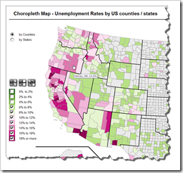
    Choropleth Map with enhanced featuresThe recent article Faster Choropleth Maps with Microsoft Excel provided a faster version of the VBA code to update a detailed Choropleth Map in Microsoft Excel.

    Leonid Koyfman, a faithful reader of Clearly and Simply liked this article. Leonid already contributed his invaluable ideas and insights here before (Excel Multiple Value Filters with Invert Selection). He had a couple of very interesting ideas for the fast Choropleth Map and he is kind enough to share them with us:


    1. Let the user filter the data by value bin and thereby highlight the bins of interest on the map
    2. Show tooltips when hovering over the map to display the name of the county and the unemployment rate in percent
    3. Let the user switch the level of detail: color the map by county or by state

    Today’s article describes Leonid’s enhancements and includes a link to the Excel workbook for free download.

    (more…)

  • Faster Choropleth Maps with Microsoft Excel

    An improved version of a Microsoft Excel Choropleth Map with a better performance for detailed maps

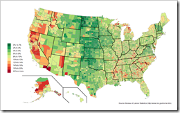
    Choropleth Map US Unemployment by CountyVery soon after starting this blog in 2009 I published a post with a set of Microsoft Excel Choropleth Map templates.  This post is still one of the most popular articles and downloads here.

    A lot of related posts followed and I am feeling very honored that my blogging colleague and France’s data visualization guru Bernard Lebelle of Impact Visuel used 2 of my maps published here on Clearly and Simply in his great new book “Convaincre avec des graphiques efficaces”. Bernard was kind enough to point his readers to my blog in the book. This is much appreciated. However, he should have heaped the praise on Tushar Mehta, who invented this technique. I only “stole” Tushar’s idea.

    Tushar’s approach works great and I know from comments and emails that a lot of my readers have used it with great success.

    There is only one minor drawback with Tushar’s approach: the performance decreases considerably when using it on a map with a lot of shapes, like the US by Counties.

    Today’s post tries to heal this. It discusses how to considerably improve the performance of a detailed map. The article describes the original approach, the optimization potential, the improved implementation and – as always – provides the Excel workbook for free download.

    (more…)

  • Microsoft Excel Check List Template

    A Microsoft Excel template for a structured Checklist with the option to check and uncheck by double clicking

    Checkmark / Photographer: Allen Mc Gregor (flickr.com)Unfortunately my blogging activities slowed down to a crawl during the last few months and I left you waiting for new posts far too long already.

    Be assured that this site is not dead. I will revive the blog during the next weeks and I am already working on a couple of new articles.

    For one of the planned next posts I needed a checklist template. There are tons of Microsoft Excel and Microsoft Word examples available for free.

    However, I couldn’t find a checklist template I really liked. Formats are always easy to change, but I was particularly looking for a checklist providing a convenient way to change the status of the checklist items. Furthermore it should be easy to use and easy to maintain. Some of the templates I found simply expect to type in an X (or something similar) to check an item, some are working with data validation lists, some have form control checkboxes. The one that came closest to what I was looking for is provided by my good friend Daniel Ferry, the Excel Hero here: Excel Dynamic Checkmark. Already pretty close to what I was after, but since it did not fulfill all of my requirements, I decided to create my own.

    Agreed, today’s post is a bit off topic regarding the focus of this blog. It has nothing to do with data analysis, data visualization or dashboards. However, a nice Excel checklist template is always a useful thing to have in the toolbox.

    With today’s article I am trying to kill two birds with one stone: to show a sign of life and to share my little checklist template with you.

    (more…)