Add context and interactivity to your Excel Dashboards with mouse hovering and clicking actions
 The previous posts Customizable Tooltips on Excel Charts and User-defined Excel Chart Tooltips showed how to provide insightful tooltips when hovering over a data point on an Excel chart.
The idea and its implementation can be taken one step further: instead of displaying a tooltip, hovering over or clicking on a data point of an Excel chart can send this information across your dashboard to other views (charts or cell ranges). I.e. you can select one data point out of many in one view and display detailed information on this selected data point in other views.
My other favorite data analysis and data visualization application, Tableau Software, calls this an action. This is a fantastic feature for data exploration and analysis, especially for larger data sets.
Today’s post shows how to mimic Tableau’s mouse hovering or mouse selecting actions on an Excel dashboard. As always, the Excel workbook is provided for free download.
The Example Data
At the risk of boring you, I stayed with the Gapminder data I already used in the Tooltip posts (Customizable Tooltips on Excel Charts and User-defined Excel Chart Tooltips) for the following reasons:
- the data suits very well to demonstrate the technique
- staying with the same data makes today’s approach directly comparable to the posts providing customizable and user-defined tooltips
- last, but not least, it was easier and more convenient for me: I had the data available and saved labor to look for and preprocess a new data source
Anyway, this and the previous posts aren’t about about the data and what it is telling us. The articles are focusing on the technique and implementation of tooltips and actions on Excel charts and dashboards. The data itself is less important. Replacing it by your own data shouldn’t be a big deal.
Dashboard Structure and Views
Before we come to the interactive features, let’s have a look at the dashboard first:
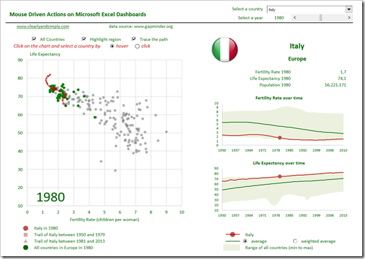
 It consists of two main parts: on the left side, you see the already known XY scatter chart, visualizing fertility rate and life expectancy of more than 200 countries in the world for one selected year (which is shown directly at bottom left of the plot area). The currently selected country is highlighted in red, all countries of the same region are colored in green and the development of the current country is visualized with two trails (before and after the selected year).
On the right side of the dashboard, various detailed information on the selected country are visualized: name, region, a flag icon, the exact numbers of the measures and two band charts show the development of the measures over time (more on the power of band charts here: An Underrated Chart Type: The Band Chart).
In a nutshell: the dashboard provides the overview of all data on the left side and the details for one selected data point on the right side. A powerful way to dynamically explore a large data set plotted on an XY scatter chart.
Interactive Features of the Dashboard
The main interactive feature is the selection of a country by hovering over a data point with the mouse cursor. This is along the same lines as in the tooltip examples (Customizable Tooltips on Excel Charts and User-defined Excel Chart Tooltips), but instead of showing a tooltip with additional information, the details of the selected country are visualized on the right side of the dashboard.
Please be advised that the chart has to be activated / selected to make the feature work (see also the red hint above the XY scatter chart). I added a line of code to the Selection_Change event of the worksheet, i.e. the chart should be automatically activated every time the user selects a cell on the sheet. However, if – for whatever reason – the chart is not selected, the user has to click on the chart first to make the mouse action feature available.
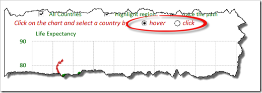
The hovering action is the most convenient, at least from my point of view. However, some users may prefer clicking on a data point to select it, especially in complex, calculation-intense models. To provide this option, the user can choose whether he wants to select by hovering or by clicking:
 At the top right of the dashboard, you can pick a year with the slider and a country with the drop down. I assume, you will mainly use the mouse driven actions to select a country. However, if you are looking for one specific country, the drop down selection will definitely be helpful:
 The three checkboxes above the XY scatter chart enable the user to easily decide what shall be displayed in the view: you can turn on and off the visualization of all countries, the highlighting of the region and decide whether or not the trails of the development over time shall be displayed:
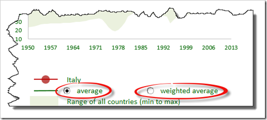
 Finally at bottom right, you can define which average lines shall be plotted in the band charts: the simple average (arithmetic mean) or an average weighted by population:
 The Implementation
Providing a detailed step-by-step tutorial how to build this dashboard would go far beyond the scope a blog post. So, unfortunately I can’t provide that, but here are at least a few hints how the model is implemented:
- The heart of the solution (the mouse actions) is done by mouse event subs of the Chart Object. Microsoft Excel MVP Jon Peltier provides the necessary VBA code for free here: Get XY on any Chart. Jon’s code handles all mouse movement and mouse click events and I simply added one line writing the index of the current data point to the worksheet (named range: myCurrentCountry). All formulas in the model then refer to this number to fetch the detailed information of the selected country from the data worksheet and visualizes them in cell ranges and charts on the dashboard.
- All other interactive features are realized with form controls. I am sure you know or can figure out how those work.
- The XY Scatter is based on 5 different data series which are consolidated on the worksheet [Calculations]. The user-defined view (all countries, regions, trails) is implemented with the usual chart data source trick: an IF clause and an NA() function. Nothing new under the sun.
- A few lines of extra VBA code and formulas make sure only appropriate parts of the chart legend are displayed.
- The charts on the right side of the dashboard are band charts, more here: An Underrated Chart Type: The Band Chart.
- Last, but not least, the flag icon is a camera object aka linked picture. It refers to a named formula called myFlag which takes a snapshot of the flag of the current country using an INDEX function.
Agreed, a very rudimentary explanation of how this is done. However, the workbook has no password protection, neither the worksheets nor the VBA code. So, if you are interested in the details, please download the workbook and dissect it for yourself. If you have any questions, please drop me a line in the comment section below.
Download Link
Here is the link to the workbook described above for free download:
Acknowledgements
It was again my friend Leonid Koyfman (Leonid’s LinkedIn Profile), who was kind enough to thoroughly review my workbook before publishing. Leonid found and fixed a few bugs and, even more important, provided me some great additional ideas I haven’t thought of. Many thanks for your time, Leonid. I owe you, big time.
Many thanks go also again to Microsoft Excel MVP Jon Peltier for his ingenious code. I made a ton of hay with it, so thank you very much, Jon.
Stay tuned.
Leave a Reply