Interactive Selecting and Highlighting Areas on an Map or an XY Scatter Chart in Microsoft Excel
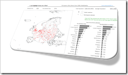 The previous post demonstrated an alternative technique to implement a direct interaction with an Excel chart using an ActiveX label control sitting on top of the chart. The example used in that post (a geography quiz) allowed a click on a map and evaluated the coordinates of the position the user clicked on.
The technique, however, can also be used in many more cases. If you are working with an XY scatter chart and especially if you are working with a map, interactive selecting and highlighting a user-defined area of the chart can be a very helpful feature for exploring and analyzing the data.
Tableau Software, for one, allows for different ways of selecting and highlighting areas. Microsoft Excel has no such features built in. With the technique described in the previous post and some additional VBA code, however, you can bluff almost the same functionality in Excel.
Today’s article describes how to implement selecting and highlighting features on Excel charts. As always the example workbook and the VBA code is provided for free download.
Tableau’s features to select and highlight areas on a map
First let’s have a look at Tableau Software as the shining model for great interactive features: Tableau always allowed to select and highlight rectangular areas on a map (and on other views, too). Since version 9, you now have the choice between a rectangular, a radial or a so called “lasso” selection using the fly out menu at top left of the map:
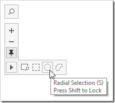
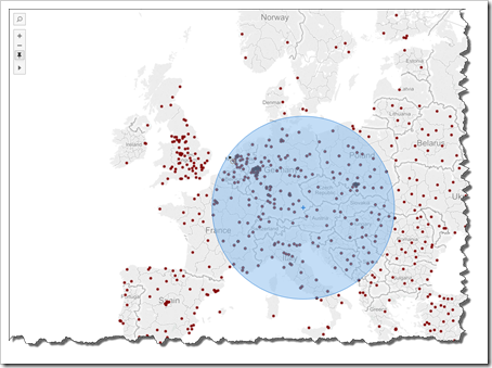
The rectangular selection is the standard feature and – as already mentioned – available in Tableau for a long time already. The new radial selection is great to select marks in a certain distance around a defined center:
The “lasso” makes the selection even more flexible and is a great option if you want to select an area which you can’t define with a rectangle or circle.
In a nutshell: Tableau provides great interactive selection features which would be very helpful on Excel dashboards, too.
Bluffing Tableau’s selection features in Microsoft Excel
The previous post (Another Technique for Interactive Excel Charts) describes how to implement an interactive map in Excel, enabling the user to click on any given location of the chart and detecting the coordinates of this position. The article on hand shows how to realize Tableau’s rectangular and radial selection features in Microsoft Excel building upon this implementation and technique.
I will skip the “lasso” option. Not because it is not interesting, rather because this is way more complicated to implement in Excel than the other two.
First, let’s have a look at the result and the features. Here is the dashboard:
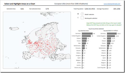 You see the map of Europe and its cities with more than 100,000 inhabitants at the left side of the dashboard. Now, here is how the selection works:
- With the option buttons top right to the map, you select whether you want to use the radial or the rectangular selection.
- Hover over the map with the mouse. The cursor changes to a hair cross. Keep the SHIFT key pressed, click wherever you want and move the mouse to span the selection area.
- If you chose the radial selection, click on the center of the area you want to select and move the mouse in any direction. You can expand the size of the circle only as far as the resulting circle still entirely fits on the map.
- If the rectangular selection is active, you can only span the area by moving the mouse right and down (i.e. to the East and South), so you have to start (click) at the top left corner of the area you want to select.
- During the selection process, the entire dashboard will dynamically be updated:
- The selected cities (inside the rectangle or circle) will be highlighted with a red fill color on the map
- The additional information above the map will be updated on the fly (count of selected and not selected cities and the total and average population of the selection)
- The bar charts right to the map (Top 15 countries by count of selected cities and sum of the population) will also be dynamically updated
- If you are ready, simply release the mouse button and SHIFT key.
- To deselect again, simply click somewhere on the map without keeping the SHIFT key pressed.
Truth be told, there is one downside: if you click first on the map, keep the mouse button down and then press the SHIFT key, the technique doesn’t work as expected. If this happens, simply release the SHIFT key, click somewhere and try again.
The Implementation
As mentioned above, the workbook is based on the example provided in the previous post, which explains the basic concept in detail.
Thus, I will restrict my explanations here to the necessary adjustments for the implementation of the rectangular and radial selection.
The basic idea is adding 3 more freeform shapes to the worksheet formatted with a light and half transparent fill color: a rectangle, a circle and a cross (indicating the center of the circle). The VBA code will make the shapes visible or invisible according to the user’s selection (the option buttons) and position and resize the shapes according to the mouse clicks and moves on the chart (more precisely on the ActiveX label control).
It is important that the label control is still sitting on top of the chart and the freeform shapes, so you may have to change the order of the shapes in the selection pane:
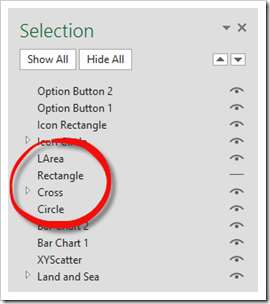
In the example shown in the screenshot above, the radial selection is active, i.e. the cross and the circle are visible, the rectangle is invisible.
The structure of the workbook and the worksheets
There are three worksheets in the workbook:
The worksheet [map] contains the map of Europe, which actually consists of several objects: the freeform shapes of Europe’s countries, the XY scatter chart displaying the cities, the rectangle, cross and circle shape and finally the label control. Furthermore there are the radio buttons (as described above), a few result cells directly linking to worksheet [control] and 2 bar charts.
The XY scatter chart displays 2 data series: the coordinates of all cities (defined on [data]) formatted in grey and the coordinates of the selected cities formatted in red. The data source of the selected cities is calculated on sheet [control] (see below). The data shown in the bar charts is also defined on worksheet [control].
The worksheet [data] contains the city data only, i.e. no calculations. Nothing to explain here, I think.
The [control] worksheet is divided into several sections:
- The first section (“Control parameters”) serves as the container for some parameter cells updated by the option buttons and the VBA code .
- The next section (“Geometrical calculations”) calculates the distance between the starting position (where the user clicked) and the current position of the mouse.
- In section “Displayed measures” the aggregated results are calculated: count of selected and not selected cities as well as sum and average of the population of the selected cities.
- The most important formula of the solution is in column C of the section “Selected cities”. It is a Boolean formula returning true, if the city is inside the selected area and false otherwise. The three columns right to it are using this result in a simple IF formula to define whether the city shall be highlighted in red or not and whether the population shall be counted or not.
- Finally, the last section on this worksheet (“Data preparation for sorted bar charts”) is the usual technique for sorting data by formulas and produces the list and data of the countries sorted in descending order. These results are then used as the data source of the bar charts.
The VBA code
You can find the entire VBA code in the worksheet object [map] of the workbook. It is only 112 lines of code and every sub, variable and code section is commented. I will not repeat this here. If you are interested in how the code works, please have a look for yourself. If you have any questions, please leave me a comment.
The Download Link
Here is the Microsoft Excel workbook for free download:
Download Select and Highlight Area on a Chart (Excel 2010-2013 workbook, 694KB)
Acknowledgements
I have done this in the previous post already, but I do want to thank Andy Pope again for sharing the stellar idea of using an ActiveX label control to implement interactive features for Excel charts. Thanks, Andy!
What’s Next?
That’s it for interactive selecting and highlighting in Excel. At least for the moment. Maybe I will come back to this topic some time later.
The upcoming articles will be about Cartograms in Tableau and Excel. Furthermore I am having a few posts about Tableau Calculated Fields in the pipeline.
Stay tuned.
Leave a Reply