How to transfer polygon data into freeform shapes in Microsoft Excel
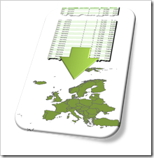 If you are a regular reader or even subscribed to this blog, you will not be surprised to hear that I am working on a new challenge regarding maps in Microsoft Excel.
We had a lot of articles already on how to create Choropleth Maps in Microsoft Excel. The new project is about using maps in Excel again, but with a different type of visualization.
Since I am just starting out on this challenge, I can’t provide more details yet.
Having said that, for the preparation of the new project, I had to work with geographical polygon data. Now, what’s this?
“A polygon is […] a plane figure that is bounded by a finite chain of straight line segments closing in a loop to form a closed chain or circuit.” (source: Wikipedia).
In the context of geographical visualization, a polygon represents a region (e.g. country) on a map. Such a polygon consists of a series of geographical points: pairs of latitude and longitude in a defined order (path). If you draw an outline through these points in the given order, you get a shape forming the boundary of this region.
And this was my challenge: transfer geographical polygon data into freeform shapes in Microsoft Excel. I am not sure, but I thought maybe some of you might be interested, so I decided to share my solution.
Today’s post first shows how to plot polygon data on standard Excel XY Scatter charts and then describes my solution to transfer the data into freeform shapes. As always, the article provides a link to download the Excel workbook for free.
The Data
The underlying database is a simple, but huge Excel table with the polygon data of the borders of all countries in the world:
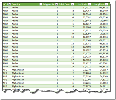
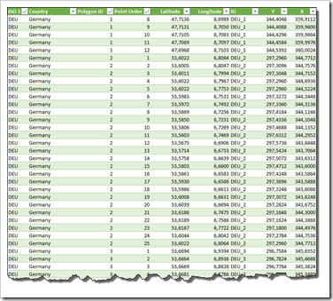
The table contains the ISO3 abbreviation, the country name, the polygon ID, the point order, the latitude and the longitude. As I said, simple, but huge: more than 400,000 rows.
I created this polygon data from an ESRI Shapefile of a world map using Richard Leeke’s fantastic ShapeToTab utility (more here: Create Your Own Filled Maps in Tableau). Many thanks go again to Richard for his fabulous tools TabGeoHack and ShapeToTab.
As you can see in the screenshot for the example of Aruba, the first and last point have identical latitude and longitude values: the 19 points make a closed chain, i.e. the polygon of Aruba’s boundaries.
Plotting Polygons in an XY Scatter Chart
You can directly plot the polygons on an XY Scatter chart in Excel. No data preprocessing or even coding necessary. All you have to do is to adjust the minimum and maximum values of the two axes. Let’s first try a smaller example than the world map. Here is the polygon of Austria plotted in an XY Scatter chart:
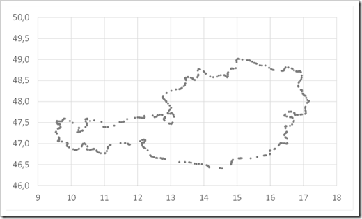
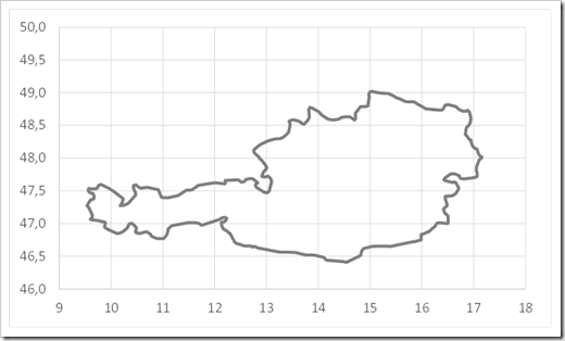
You can already recognize Austria, right? Changing the chart type to an XY Scatter with smoothed or straight lines and no markers makes it even clearer:
A short distraction, if you don’t mind: I love watching The Big Bang Theory, but I simply can’t see how Austria on a map looks like a Wiener:
What kind of Wiener are they eating?
Fun fact: in Austria, Wiener are actually called Frankfurter. But I am digressing. “Focus attenuation” (fits well, doesn’t it?). Reading the last paragraph back, I noticed I am sounding like Sheldon already. So, back to the polygons and maps.
Let’s have a look at Germany. The simple XY scatter:
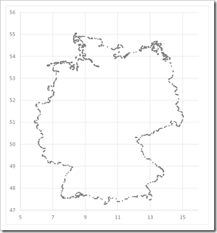
And the same data plotted on an XY Scatter with lines and no markers:
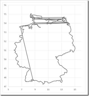
What is going on here? Well, unlike Austria, Germany consists of more than one polygon (23 to be precise):
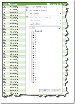
Since all data is plotted in one data series, Excel is also drawing lines between the start and end points of the different polygons. To avoid this, we would have to plot the data in 23 separate data series or remove the unwanted lines manually or by VBA.
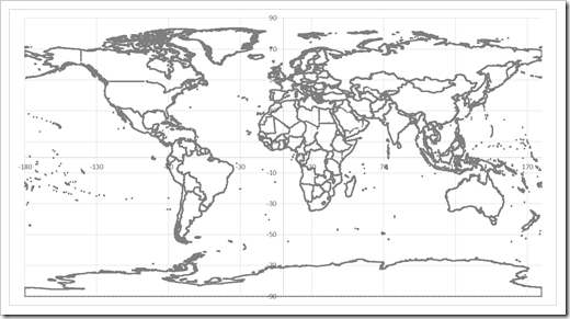
This becomes a real problem, if you have a lot of polygons in your data. The world map, for instance, consists of 3,775 polygons. Since the maximum number of data series in an Excel chart is 255 (Excel Specifications and Limits), the option of having one data series per polygon is out of the picture. A VBA routine to delete all unwanted connection lines between the polygons is the only reasonable way to solve this issue.
Having said that, with very large data sets like the world map, you may even go with a XY Scatter chart with markers only and no lines:
So much for plotting polygons on Excel charts.
The Challenge
The problem I was facing in my project was different. I didn’t want to plot polygons on an XY Scatter chart. I rather needed to transfer them into freeform shapes. A picture says a thousand words: this is what I was after:
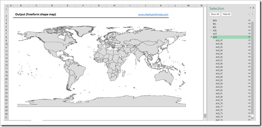
A map in Excel made of freeform shapes (exactly like the ones we used in all the Choropleth Maps in Microsoft Excel posts) automatically created from the raw polygon data table shown above.
The Implementation
Before starting to code the VBA subs, we have to do a few enhancements on the worksheet:
- add a unique identifier for every polygon (ISO3 abbreviation followed by an underscore followed by the Polygon ID). A simple string concatenation
- add two columns to transfer Latitude and Longitude into positive values in points on a worksheet. The formulas are very simple: basic arithmetical operations based on maximum and minimum values of Latitude and Longitude and three parameters (scale, top and left offset)
Now on to the VBA code.
The heart of the solution is the Shapes.AddPolyline Method. Calling this method with “an array of coordinate pairs that specifies the polyline drawing’s vertices” creates a freeform shape of the closed polygon. This method makes the implementation a walk in the park:
The sub to create freeform shapes simply loops through the entire data table, transfers the X and Y points of each polygon to an array and calls the .AddPolyline method with this array to insert the freeform shape.
The VBA project is open, the code is commented and very slim (132 lines). I think I do not have to go into the details here. If you are interested, download the workbook (download link at the end of the post) and have a look. If you have any questions, please feel free to leave me a comment.
How to use the Tool
The workbook (download link see below) consists of only two worksheets: one with the polygon data and a few simple calculations and an output sheet for the freeform shapes.
On the data sheet, the first 6 columns of the table contain the polygon data. The next 3 columns create a unique ID for each polygon and transfer Latitude and Longitude into valid positions (points) on the output sheet using simple formulas (see section above):
The VBA procedures can be started from an extra tab on the ribbon (POLYGONS 2 SHAPES):

A click on one of the first three buttons on this tab starts the VBA routines:
- Transfer the polygon data into freeform shapes on the output sheet
- Delete all shapes on the output sheet
- Create groups of shapes for each country (if the country has more than one polygon)
Clicking on the last icon is simply sending you to this blog. You see, I am desperately looking for options to increase the traffic here.
If you want to use the tool for your own polygons, you simply have to clear the first 6 columns of the table on the data worksheet, copy in your own data, resize the table and finally click on the first icon of the POLYGONS 2 SHAPES tab. That’s it. A few seconds later you should have the freeform shapes on the output sheet.
The Disadvantage: Performance
The code isn’t optimized for performance and it takes some time to transfer the polygon data into freeform shapes. The polygons of Europe (without Russia and Greenland), for instance, consist of more than 55,000 rows. Creating 476 freeform shapes of 52 countries takes between 5 and 6 seconds on my machine. Not really fast, but sufficient for my purposes.
The Download Link
Here is the Excel workbook with the polygon data of Europe (without Russia and Greenland) for free download:
Download Create Shapes from Polygons (zipped Excel 2010-2013 workbook, 4.4 MB)
Stay tuned.
Leave a Reply