Tableau vs. SAP BO Dashboards (powered by Graphomate) – a Tableau version of Lars Schubert’s Facebook Dashboard
") A couple of weeks back, my Tableau blogging colleague Ben Jones had two excellent posts over at Data Remixed on how to create a waterfall chart with Tableau: A Facebook Waterfall and How to Create a Tableau Waterfall Chart.
A couple of weeks back, my Tableau blogging colleague Ben Jones had two excellent posts over at Data Remixed on how to create a waterfall chart with Tableau: A Facebook Waterfall and How to Create a Tableau Waterfall Chart.
Ben used the Facebook financials to demonstrate the technique.
Lars Schubert, an outstanding SAP and data visualization expert (no, this is not an oxymoron, at least not in all cases), stumbled across Ben’s visualization and developed a couple of excellent ideas how to improve it. He completely revamped the dashboard using SAP Business Objects Dashboards (formerly known as Xcelsius) empowered by his own add–on called Graphomate. Earlier this week Lars published his version on the Graphomate company blog (the blog is in German).
So far, so good. However, Lars decided to use a pretty provoking title for his article: Xcelsius vs. Tableau. Being the Tableau aficionado I am and – to my knowledge – the only German native speaker blogging about Tableau so far, I felt the ball being in my court.
With today’s post I am taking up the challenge: the article discusses Lars’ great ideas for improvement (including his dashboard) and my answer to it using Tableau Software.
The Original – The Data Remixed Facebook Financial Dashboard
Ben Jones over at Data Remixed used the Facebook financials data as an example to show how to make a waterfall chart in Tableau.
Here is a link to Ben’s original dashboard:
Data Remixed Facebook Financials
I would assume Ben was focused on showing the technique of creating a waterfall chart and not so much on publishing a comprehensive dashboard visualizing Facebook’s financials.
Against this background Ben did a fantastic job, no doubt about it.
Lars’ Suggestions
Then Lars stumbled across Ben’s blog post and he had a couple of excellent ideas how to improve the visualization:
- Vertical instead of horizontal waterfalls
- Two waterfall charts to allow a comparison of the values for two selected years
- No color coding of the waterfall bars, since the bars already represent the values
- Identical axes scales for all views (charts) of the dashboard
I do not fully agree on the last one, but especially Lars‘ suggestion of implementing a second waterfall for comparison is stellar.
The SAP Business Objects Dashboards Solution powered by Graphomate
Lars used SAP Business Object Dashboards (formerly known as Xcelsius) empowered by his own add–on called Graphomate and he came up with this dashboard:

If you want to play around with the dashboard, here is the link to the interactive version:
SAP BO Dashboards – Facebook Financials
Here are the main enhancements:
- Comparison of waterfall charts for two selected years, including the differences between the years in USD and in percentages
- The axes of all charts are using the same axis scale
- The bar (column) charts are used to select the two years for comparison by clicking (first year) and CTRL clicking (second year)
- No visualization of costs in the revenue and net profit view, since the difference between the two values are already representing the costs
- Additional bar charts to visualize user development of Facebook, Twitter and Google+ to add more context
A great dashboard. Fantastic work, Lars. Many thanks for sharing.
My Tableau Version
Taking up the challenge, here is my Tableau version:
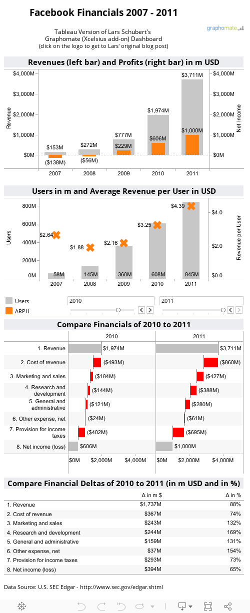
Of course it would be best practice to position the deltas right to the waterfall charts. Unfortunately the real estate on my blog is very limited. Thus, the differences are shown beneath the waterfalls. As I said, this is just a real estate issue. Here is a link to a wider implementation of the same dashboard, showing the deltas where they should be:
Facebook Financial Dashboard wide version
Not yet into Tableau?
Get started with Tableau Public today (free download) or download a full functioning free trial version of Tableau Desktop and Tableau Server.
What I did and what I didn’t
Some things I adopted from Lars’ dashboards as they stand:
- A bar (column) chart to show revenues and net income over time
- Comparison of two years visualized with waterfall charts
- Vertical waterfalls
- Differences between the two years in USD and percentages
- An additional chart showing the development of users over time. This is where I also added one thing: the average revenue per user (ARPU), since the ARPU is one of most important performance indicators for mass customer business
I also changed some things:
- Lars’ dashboard lets the user select the years for comparison by clicking and CTRL clicking on a bar of the bar charts. A nifty little feature and very well done, but from my point of view, only the clicking is intuitive. You have to know about the CTRL clicking feature. Lars explains this in a textbox directly on the dashboard. This is good, but in my humble opinion two interactive control features (the sliders) directly above the waterfall charts are easier to understand and do not need additional explanations.
- Lars shows the differences between the two years with bar and square charts. For very large values (outliers), he replaces the bars and squares by rectangles, indicating that those values are way larger than the others. An interesting way of doing this. However, I caught myself always looking at the numbers, simply ignoring the bars and squares. The visualizations of the differences obviously didn’t tell me much. Thus I decided to go with a simple table of numbers showing the deltas in million USD and percentages.
- I did not include the user development of the Facebook competitors. Why? Because I think a dashboard should be focused on one major topic or question. This dashboard is focused on the development of Facebook over time. If you want to compare the major social networks, the dashboard should provide views comparing the competitors regarding all measures, i.e. not only the user development but also the financials of all competitors.
- In his article Lars emphasizes on the importance of axes scales. He claims all axes of all views on a dashboard have to have identical scales. As you can see from his dashboard, he is eating his own dog food. I see his point. However, I do not fully agree on this: having the same axis scale on the bar charts and on the waterfall charts does not add any value. You can’t compare e.g. the vertical bars of the revenue / net income chart with the horizontal bars of the waterfall charts, anyhow.
With regards to the two waterfall charts, I think scaling the axes to the possible maximum is even counterproductive. Select 2007 and 2008 on Lars’ dashboard, for instance. All you see is a lot of white space at the right of each waterfall chart and the bars are too small to provide any visual insight. I fully agree with Lars that the two waterfall charts have to use the same axis scale. But I would definitely not scale the axes according to the absolute maximum values (i.e. 2011 in our example).
Finally, I can’t tell you no lies. There is one feature I love about Lars’ dashboard which I was not able to reproduce in Tableau: The bar charts are showing horizontal lines, an arrow and the differences in absolute values and percentages of the two selected years at the right side of the chart: an excellent additional feature. Agreed, the information is redundant since the differences are also shown in an extra table (at least for revenues and net income), but having this additional information available at a glance in the bar charts is great. I don’t have a clue how do this in Tableau, but this doesn’t mean it is impossible. It is just above my head. Maybe the real Tableau experts like Joe Mako and Richard Leeke will take up this challenge.
The Tableau Implementation
The Tableau workbook includes a few very simple tricks, so I guess I do not have to go into the details.
Here is just an overview of the used techniques:
- Dual axes views and Multiple Mark types for the revenue / net income and the users / ARPU views
- The Gantt Chart trick for waterfall charts in Tableau Joe Mako and Ben Jones already described
- Two parameters to let the user select the years to be compared
- Two Calculated Fields to get the amounts (revenues, costs, net income) for the two selected years (based on the parameters)
- Calculated Fields to get the differences between the two selected years
- A Boolean Calculated Field used as a filter to constrain the waterfall chart view to the selected years
- A Calculated Field to define the sort order of the years on the waterfall chart view (e.g. if the user selects 2011 as the first year and 2007 as the second one, 2011 will be shown on the left side and 2007 on the right side)
Maybe these are already advanced Tableau techniques, but no big deal. If you are interested in the details, simply download the Tableau workbook from the Tableau public visualization above and have a look for yourself. If you have any questions, please drop me a line in a comment.
A Personal Note on Waterfall Charts
Although waterfall charts are very popular especially for visualizing financial data, I do not like them very much. Many clients ask for waterfall charts and I do not refuse to implement them, but I am always a bit reluctant.
Why? Well, actually waterfall charts are a great way of visualizing a series of intermediate positive and negative values turning an initial value into a final value. However, very often the underlying logic is well known. Who doesn’t know that revenue minus cost results in net income? So what is the big thing about visualizing this logic?
More important to me is one major drawback of waterfall charts: the floating bars make a comparison of the values hard, since the bars have no common baseline. For instance, if I want to compare the Marketing and Sales cost to the R&D costs, the bars do not show me this at a glance and I have to read the labels / numbers.
So, waterfall charts are of course better than pie charts, but I never really had a crush on them. To be very honest, I think they are overrated.
What do you think about waterfall charts?
Stay tuned.
Leave a Reply