How to display Tooltips on Microsoft Excel Tables including additional information on the selected cell and aggregation results for the entire column
 Tooltips are a very helpful feature when exploring and investigating data. On charts and on plain data tables. When referring to tooltips, I am talking about additional details on the data currently selected or hovered over using the mouse. Tooltips could include other dimensions and measures, calculations or aggregated information like totals or averages.
Tableau Software provides very powerful and easy to use tooltips. If you are working with Tableau, I once again recommend having a look at Andy Cotgreave’s great Tableau tooltip articles on the Data Studio (Tableau Tooltips: Conditional Formatting or Charts inside a tooltip? Yes, we can.). Thanks again for sharing, Andy.
Compared to Tableau, Microsoft Excel’s tooltips functionality is next to nothing. We already had a post showing how to improve tooltips on Excel charts: Better Chart Tooltips with Microsoft Excel 2010.
However, tooltips can be very helpful in plain data tables as well. Sure, Excel automatically displays some calculated aggregations of the selected range in the status bar. Yet, this is not enough. Your eyes always have to jump down to the status bar to see the information, the displayed quick calculations are limited and inflexible and you always have to select the range first. If you are working with larger data tables, you may wish for tooltips providing additional information on the selected value (like the percentage of total, the rank, etc.) and on aggregations across the entire column (like sum, average, etc.).
Today’s post provides two slightly different approaches how to create better tooltips on Microsoft Excel tables. As usual including the Excel workbooks for free download.
The Challenge
You are certainly aware of the fact that Excel automatically shows some information on the aggregation of the currently selected cells in the status bar:

In Excel versions prior to 2007, the status bar was limited to one calculation, but you could still switch from the default sum to something else. Since 2007, you are able to show several calculations simultaneously. This is a very helpful feature for ad-hoc data analysis. Comparable to Tableau’s Summary Card.
However, it is designed to show the quick calculations for the currently selected cell range. If you are working in larger data tables, you are probably interested in aggregations of the entire active column without being forced to select the column first. Sure, you can add additional cells including the aggregation formulas e.g. above the data table and I guess this is what most people do.
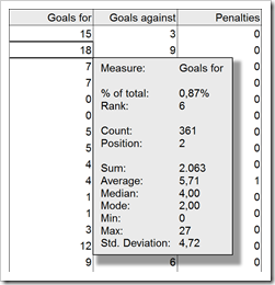
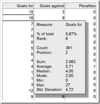
Yet, if you are short of real estate on your worksheet (a dashboard, for instance) or if you want to add additional information on the active cell (like the percentage of total), a tooltip can be a viable alternative:
As soon as you click on any cell within the data table (excluding the headers), a tooltip appears with additional information on the selected cell (% of total, rank within all data entries of this column, etc.) and aggregated measures of the entire column (sum, average, minimum, maximum, etc.):
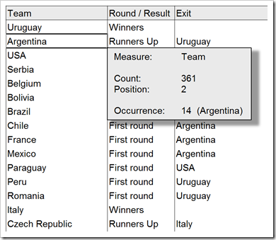
 If you select a column with non-numeric data, a different tooltip is displayed:
 As soon as you click outside of the data table, the tooltip automatically disappears.
Basics of the Implementation
The basic idea is as simple as can be: add a textbox to the worksheet and use VBA to
- show the textbox if the active cell is within the data table and hide it otherwise
- position the textbox at the bottom right of the active cell
- calculate some additional information on the active cell and some aggregations for the entire column and display it in the textbox
Approach 1 – VBA only
The approach does almost everything in the VBA code. All you need in the worksheet itself is the data, a name for the data range (e.g. “myDashboardTable”) and a text box with a name (e.g. “myShpTooltip”).
The VBA code will then show or hide the tooltip, relocate it, do the calculations and show the results in the textbox. Here are the main steps of the VBA:
- Check if the active cell is within the data table. If not, hide the textbox and exit the sub
Otherwise
- Define the range of the active column
- Check if the active column contains numbers or alphanumerical data
- Calculate aggregation values based on the result of the previous check (numbers or text values)
- Create a string to be shown in the tooltip
- Assign this string to the textbox
- Relocate the textbox to the bottom right of the active cell
- Resize the textbox
- Show the textbox
This procedure is defined in the event sub “Worksheet_SelectionChange” of the worksheet containing the data. This way, the tooltip is updated (or hidden) every time the user selects another cell (with the mouse or the keyboard).
Approach 2 – VBA and Worksheet Calculations
Approach 2 uses the same basic principle and VBA procedure. However, the content of the textbox is not created using VBA. Instead, there is a second worksheet called [calculations]. The VBA updates 2 cells with the row and the column of the active cell. The aggregations and other calculations are then conducted by formulas on the worksheet and the VBA simply refers to the results of those formula cells to create the string displayed in the tooltip.
The advantage of this approach is the fact that changing the content of the tooltip is much more convenient, since you only have to change the cells on sheet [calculation] instead of being forced to adapt the VBA. The disadvantage of approach 2 is the additional worksheet and more named formulas. From my point of view, it is easier to implement and easier to maintain. Thus, I would recommend using approach 2.
Both approaches require only relatively small VBA routines: 61 respectively 54 lines of code (excluding empty lines and comments). No big deal. If you are interested in the details, download the workbooks and have a look. The workbooks provided below are without any protection.
The Performance
I implemented and tested the VBA code using an extract of an example data set of the FIFA World Cup results (1930 to 2006), which I already used for a Tableau post here: FIFA World Cup Statistics with Tableau. With this limited set of data (361 data rows), the performance of the tooltips is very good.
If you are using a larger data base (I also tested it with a database of 65,500 rows), the performance of the tooltips in text columns is still acceptable. The numeric columns are a different story. Doing all the recalculations required for the columns with numerical data takes a few seconds. Check it out and decide for yourself. If the performance is too slow for your data, you could still delete some of the calculations shown in the tooltip.
The Download Links
Here is the Microsoft Excel workbook of approach 1 (VBA only) for free download:
Download Excel Table Tooltips VBA only (Microsoft Excel 2003, 93K)
And here is the workbook using approach 2 (VBA and worksheet calculations):
Download Excel Table Tooltips Worksheet and VBA (Microsoft Excel 2003, 100.5K)
Enjoy…
…and stay tuned.
Update on Friday, May 06, 2011
I just noticed one weakness in the workbook provided above, if you are using Microsoft Excel 2003 or earlier. The implementation works in general, however, the tabs inserted by the VBA code (vbTab) to nicely align the values are not working in Excel versions prior to 2007. Instead, you see an ugly squared box (representing a non-printable character) and the headers and the values are not aligned.
Thus, I implemented a different approach to make the table tooltips look nice in Excel 2003, too. To get there, I am using 2 textboxes, one with the headers and one with the values. Some more VBA required, but still pretty straight forward. Have a look:
Download Excel Table Tooltips Worksheet and VBA 2003 (Microsoft Excel 2003, 119K)
Leave a Reply